Natalija
Forum Replies Created
Viewing 16 posts - 1 through 16 (of 16 total)
-
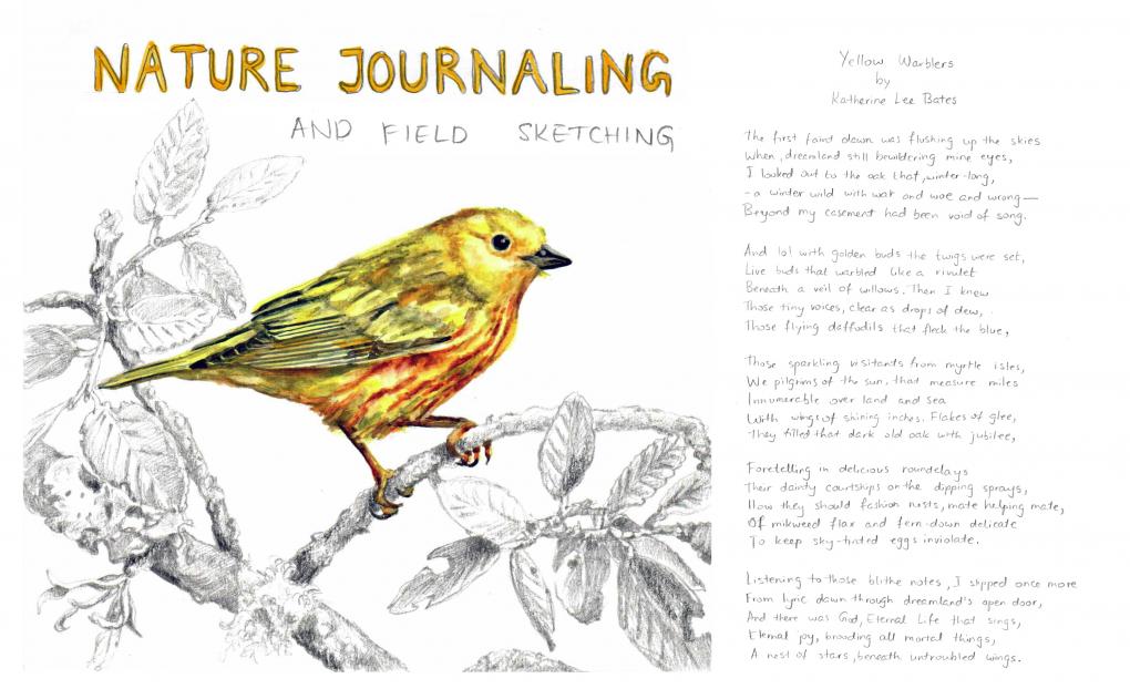
NatalijaParticipantOne of my favorite book is The Country Diary of an Edwardian Lady or the facsimile reproduction of a naturalist's diary for the year 1906. Edith Holden recored in words and paintings the flora and fauna of the British countryside through the changing seasons of the year. Her diary inspired the outlined lettering I created for the title of this journal page and the the addition of a poem titled Yellow Warbler by Katherine Lee Bates next to my Yellow Warbler painting/drawing.
 in reply to: The Power of Reflection #880156
 -
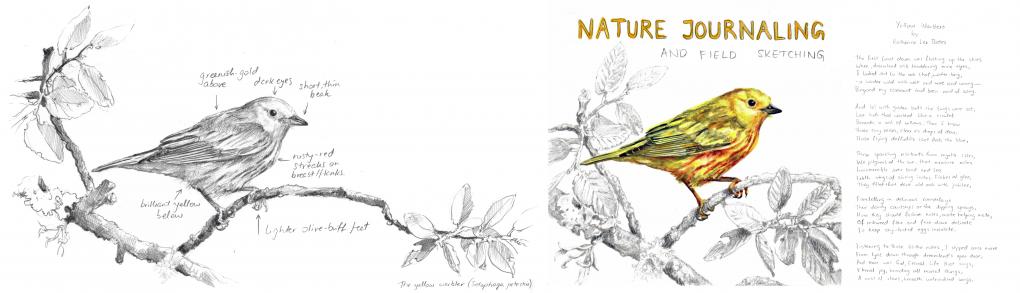
NatalijaParticipantPlacing my two Yellow Warblers side by side I can really see the benefit of adding color to parts of my journal. I still like using pencil to show detail and I like how the two techniques work together. I felt more comfortable using the photograph as a reference but arranging its elements on the page to suit the story I wanted to tell. I would like to keep working on different ways of combining these techniques and adding background washes too. in reply to: See How Far You’ve Come #880143
-
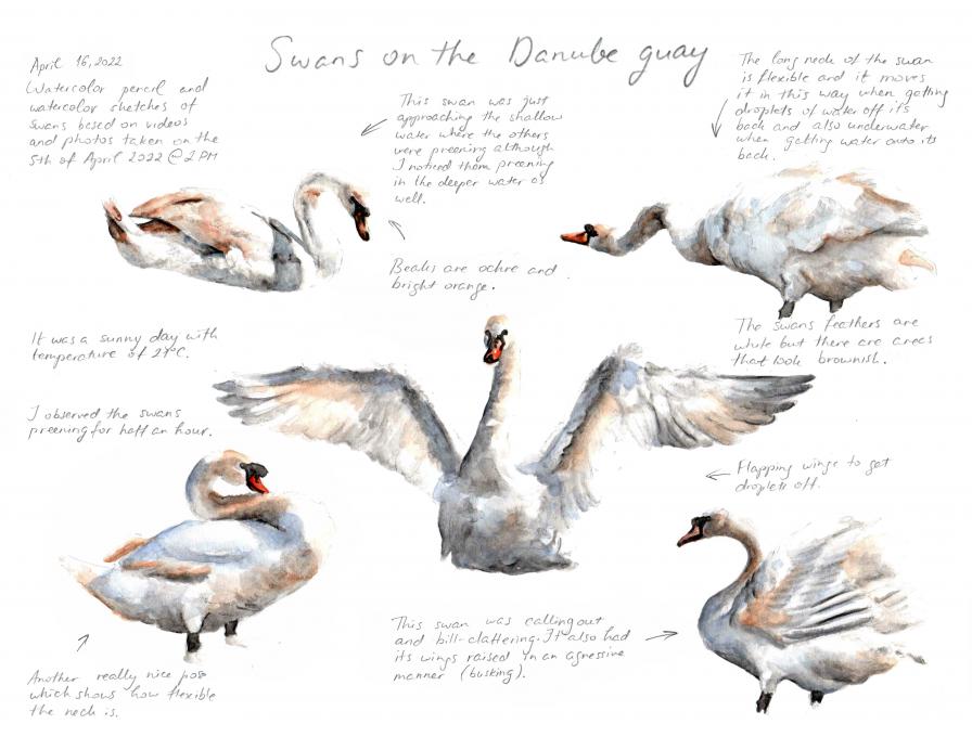
NatalijaParticipant1. My tip would be to try out watercolor pencils which I used for the page below as they don't require a palette or even water in the field. They can be used as colored pencils and activated later in the studio. 2. For this exercise I used photos and videos I took a few days back. I think that writing notes while I was observing, photographing and filming the swans helped me to later pick the right photos and video frames which showed the behavior I found interesting. I also noted questions which a little bit of googling later answered (e.g. their aggressive behavior is called busking) 3. As for the technique I started with with warm and cool grey watercolor pencils and added burnt sienna for the brownish feathers which appear on the head and neck and ultramarine for the coolest shadows. I mostly used wet on dry, a little bit of wet on wet, some blending and a lot of glazing. in reply to: Filling Your Sketches with Color #880039
-
NatalijaParticipant1) I tried all three of the mentioned techniques on quick sketches of the two photos we were given in the previous topic.
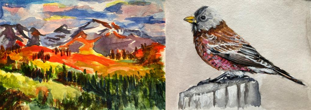
I used the wet on wet for the clouds in the landscape and for the underpainting of the bird. The dry brush I used for the trees in the landscape and for the white of the feathers. 2) I usually don't use wet on wet of dry brush but this exercise has shown me where they can be applied to great effect. I will definitely be using more of them in my journaling projects.
* I also managed to use a wash for the bird background, blending for the feathers and some glazing in the mountains of the landscape. in reply to: Getting Comfortable with Watercolor #879851
-
NatalijaParticipant1) I have used watercolors before. I find it very useful to mix and find the right color on a test sheet before applying it to a painting. 2) I created color palettes for the above provided landscape and bird photos. For the landscape the top tow shows the colors that appear in the sky, the second row the colors of the second plan and the third row the first plan. For the bird photograph the first row shows the three colors that appear in the beak. The second row has the pinks, purples and browns that appear on the chest, abdomen and flank. The column on the right is Payne's grey with more and less water which I found appears on the head and wings. The black appears only in a few of the darkest feathers. 3) I like the two examples that we were given because of how different they are. The first photo had me using almost the entire palette, light and dark colors, while the second was more restricted and had a narrower tone range. in reply to: Capturing Nature’s Color Palettes #879839
-
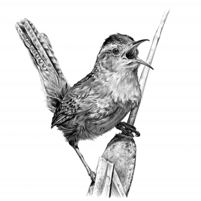
NatalijaParticipantI really enjoyed refining this drawing. Getting the values right is always the most challenging and it is important to know when to stop and not overdo it. I think the use of a Staedtler Mars Lumograph Black 6B and 8B pencil on top of a drawing done primarily with a mechanical 0.5 F pencil helped me a lot in achieving this. in reply to: Giving Your Drawings Depth #879346
-
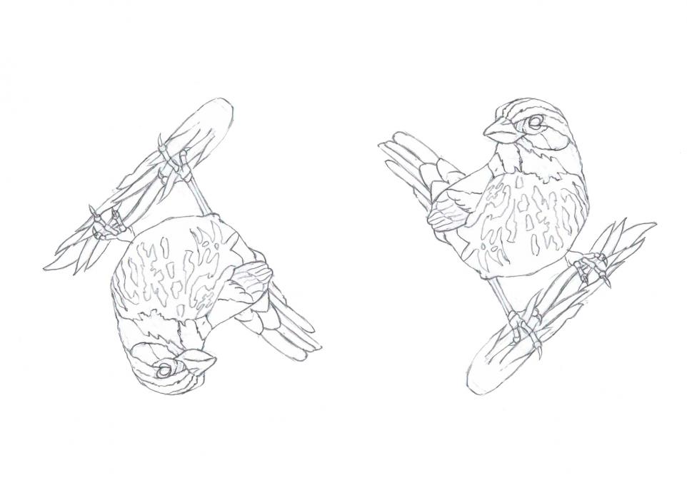
NatalijaParticipantThe upside-down drawing was easy and a lot of fun. I was pleasantly surprised at how thinking about the individual shapes and not the big picture made the drawing process more relaxing. in reply to: Drawing What You See – Upside Down Drawing #879081
-
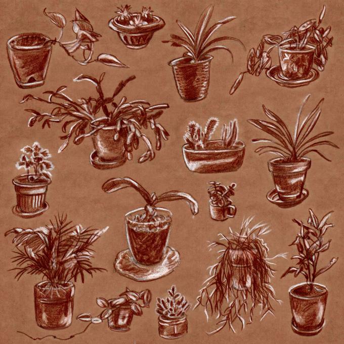
NatalijaParticipantFor this exercise I chose to practice measuring proportions on my houseplants. I measured the height of each pot using a ruler and divided the length by 5 to get their height for my illustrations. Then the hight of the flower pots served as a reference for everything else. I used eyeballed or used the finger trick to get the width of each pot and the hight and width of each plant. For a change I drew these on toned paper with a Blick Terracotta color pencil and used a Prismacolor white color pencil for the highlights. in reply to: Getting the Proportions Right #879042
-
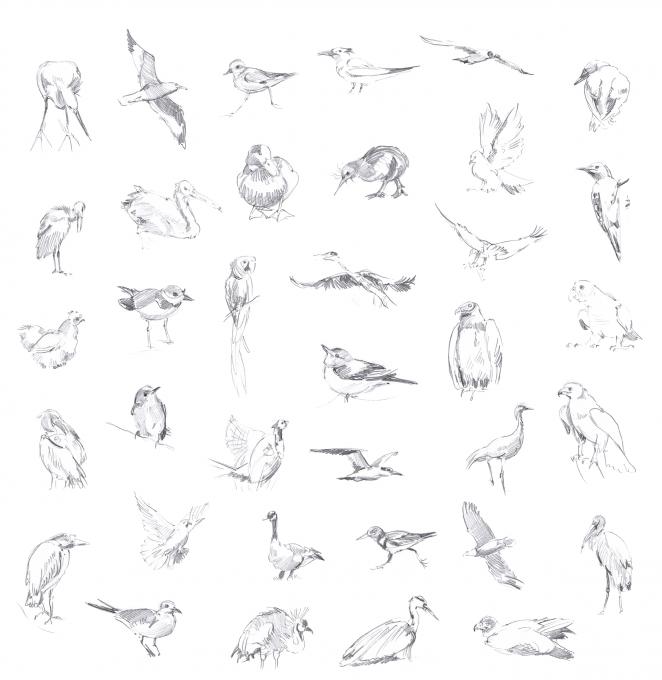
NatalijaParticipantGesture sketching is an amazing way to capture the essence of a subject! I practiced drawing birds in 60s intervals using line-of-action.com. For each drawing I tried to focus on direction, the big shapes, proportions and finally a few characteristic details. I also added some quick shading where it mattered to suggest form or darker plumage. in reply to: Capturing Behavior – Gesture Drawing #878654
-
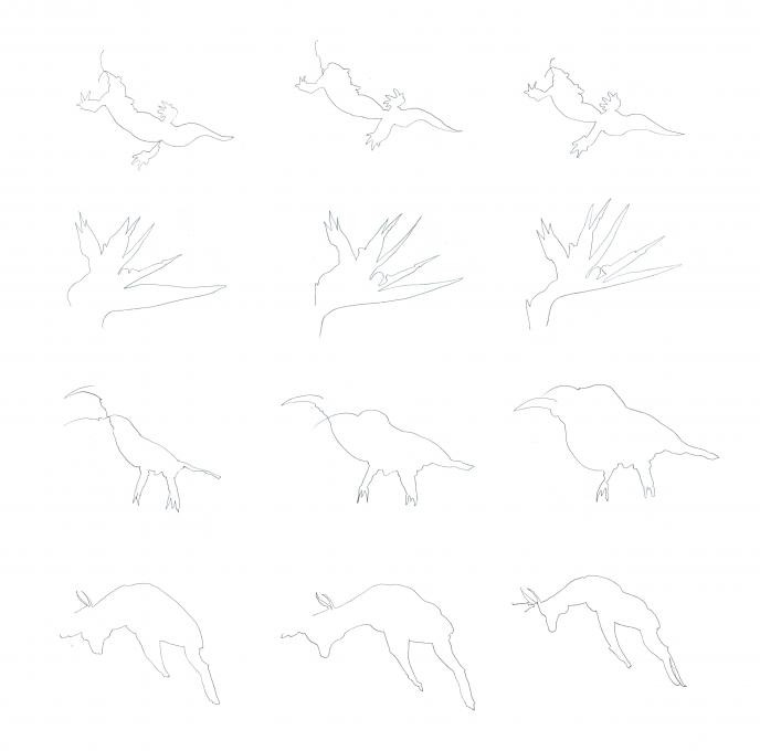
NatalijaParticipantI found this experience just a little frustrating but mostly amusing. It served its purpose, really helping me focus on the subject. I found the bird of Paradise to be the easiest probably because of its straight lines. I think that the more I focused on the details the further my line ended up from being enclosed. in reply to: Focusing on Your Subject – Blind Contour Drawing #878485
-
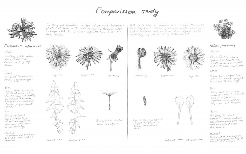
NatalijaParticipantFor my comparison study I chose to compare the Daisy and Dandelion which are around the same size and very often found next to one another in fields and parks. 1.) I learned that my two specimens have a lot in common and yet they can easily be differentiated. 2.) Because I had a fair amount of text I omitted numerical data. Although I kept the vertical division of the page I decided to arrange everything on the right as a mirror image of what I had on the left. This helped bring an even greater balance between all the elements, textual and illustrative. in reply to: The Power of Comparison #878323
-
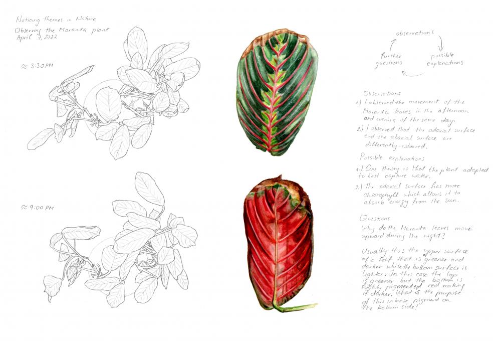
NatalijaParticipantAs I sat at my desk thinking what to choose for my subject, it presented itself with a rustle. Namely, I have a Maranta plant in my room and every now and then its leaves will move making a rustling sound!
While observing my Maranta's leaves in the afternoon and evening I noticed the change in their position and that there is a pattern to their movement: upward during the night and downward during the day. I also noticed the drastic difference in color between the top and bottom side of the leaves. I noted my observations and the possible explanations (one of several theories which states that they move upward to conserve moisture). I ended up with the following questions: What other theories about the leaf movement are there? It is usually the top part of a leaf that is more intensely pigmented so as to trap more light energy, while the bottom is less pigmented and lighter. Does the dark red bottom side of the Maranta leaf have a hidden function? in reply to: Noticing Themes in Nature #878048
-
NatalijaParticipantAfter a chilly weekend the weather was finally warm and sunny today. Perfect for a backyard sit spot experience. I sat for a while and noted the date, time, temperature, followed by the sounds and smells. The first sound I heard was the chattering of a magpie, the second the distinct whirring of a wild pigeon's wings followed by its cooing. Both birds were high up in the branches of trees and on rooftops so I could not see them closely. After sitting for a while I decided to take a walk around the yard followed by my two curious cats who had their nose in anything I grabbed to take a closer look at. I drew a dry leaf, a violet flower, white feather, Thuja cones, empty snail shells, ivy climbing up the oak tree and a swarm of midges. The dry spider I picked up using a small piece of paper. A magnifying glass helped me see more of its details. Finally I added some color swatches using watercolors. As a conclusion the observation and drawing of objects that I could pick up and hold was much easier than drawing things that were far away. I barely caught a glimpse of the birds I heard. Binoculars would have been very useful. in reply to: Opening Your Senses #877437
-
NatalijaParticipantI chose to represent the curious Citrus medica var. sarcodactylis, or the fingered citron.
The mark making techniques I used are top row from left to right: outline, side shading, contour shading; mid row left to right: cross hatching , watercolor pencils, stippling; bottom row left to right: scribbling, blending, side shading. Perhaps my outline drawing would have been better without the horizontal lines. I think I need to work on the contour shading because there are areas where I overlap lines and get crosshatching. And my cross hatching is never just bidirectional rather diverse. I like how blending using a blending stump turned out. I was taught never to use this technique in school, but it is described as a technique used by scientific illustrators in the Guild Handbook of Scientific Illustration! So I guess I will be blending away in the future. As always, I am pleased with the Faber-Castell Albrecht Dürer Watercolor Pencils. If there is lack of detail it is due to the brush I used. All in all, an interesting exercise and I look forward to the next one! in reply to: Illustrating the 3D World #876285
-
NatalijaParticipantThe advantages of the photos over the drawings and vice versa? The photograph has great detail and color information that a drawing done on a smaller format using only graphite lacks. Nevertheless it makes the subject look flat. Although the photograph is focused on the bird a draftsperson has more control over which part of the picture he can add detail to as well as what to omit.
1. I felt comfortable drawing from the photograph because the subject wasn’t moving. Getting the proportions and the main pose of the bird was easy, however it was difficult to capture all the detail that I saw in the photograph. I think I should have drawn the bird at least twice as big. Also it was a challenge to capture the brightness of the bird's feathers. I think I would have been more comfortable had I been working on toned paper or if I had added a tone to the entire background (the photograph background is a medium tone and green in contrast to the yellow of the bird so that it really stands out).
2. Drawing from this photograph made me observe each part of the bird for a longer period of time than I would have just casually looking at it. This allowed me to notice the detail of the feathers around the eyes, the subtle color difference between the birds above and below feathers and the peculiar shape of the top part of the beak. I think that observing the subject for longer periods of time certainly makes a difference and it would do so in nature journaling as well. in reply to: Jump Right in! #872570
-
NatalijaParticipantHello fellow natural journalers! 1. I am currently enrolled in The University of Newcastle, Australia course called Drawing Nature, Science and Culture: Natural History Illustration. It was while searching online for the topic of field sketching (which is the third week homework) that I stumbled upon this Nature journaling course. I have always been fascinated with nature journals and the way they combine text and illustration. Seeing as I am used to drawing from photographs at home, what inspired me to take this course is the desire to get out, observe firsthand and finally create a nature journal of my own. 2. My idea is to try to focus primarily on landscapes, plants and various small natural objects that I run into. I know that I would like to combine several drawing (graphite pencil, colored pencil and pen) and painting techniques (watercolor and gouache) and quick gestural sketches with sustained drawings. I would also like to work on good composition, informative notes and accurate illustrations. 3. I like that some of the journalers recorded the date, time, weather and location in their journals and some colour notations. Not my idea but I have seen in other journals scale references and dissections of plants that illustrate their structure. These are some things that I would like my nature journal to include. I have attached an example of a page that I was recently working on for the above mentioned course. It is drawing natural objects and all of them were done at home on a desktop with desk lamp lighting. Additionally I scanned and arranged the drawings and hand written text in Photoshop. I look forward to starting my nature journal and seeing how the immediacy changes my drawings, my style, composition and most importantly the new ideas this experience will spark! in reply to: Style Your Journal Your Way #870237
 I used the wet on wet for the clouds in the landscape and for the underpainting of the bird. The dry brush I used for the trees in the landscape and for the white of the feathers. 2) I usually don't use wet on wet of dry brush but this exercise has shown me where they can be applied to great effect. I will definitely be using more of them in my journaling projects.
* I also managed to use a wash for the bird background, blending for the feathers and some glazing in the mountains of the landscape.
I used the wet on wet for the clouds in the landscape and for the underpainting of the bird. The dry brush I used for the trees in the landscape and for the white of the feathers. 2) I usually don't use wet on wet of dry brush but this exercise has shown me where they can be applied to great effect. I will definitely be using more of them in my journaling projects.
* I also managed to use a wash for the bird background, blending for the feathers and some glazing in the mountains of the landscape. 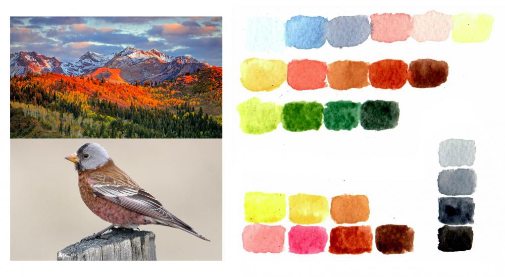
 While observing my Maranta's leaves in the afternoon and evening I noticed the change in their position and that there is a pattern to their movement: upward during the night and downward during the day. I also noticed the drastic difference in color between the top and bottom side of the leaves. I noted my observations and the possible explanations (one of several theories which states that they move upward to conserve moisture). I ended up with the following questions: What other theories about the leaf movement are there? It is usually the top part of a leaf that is more intensely pigmented so as to trap more light energy, while the bottom is less pigmented and lighter. Does the dark red bottom side of the Maranta leaf have a hidden function?
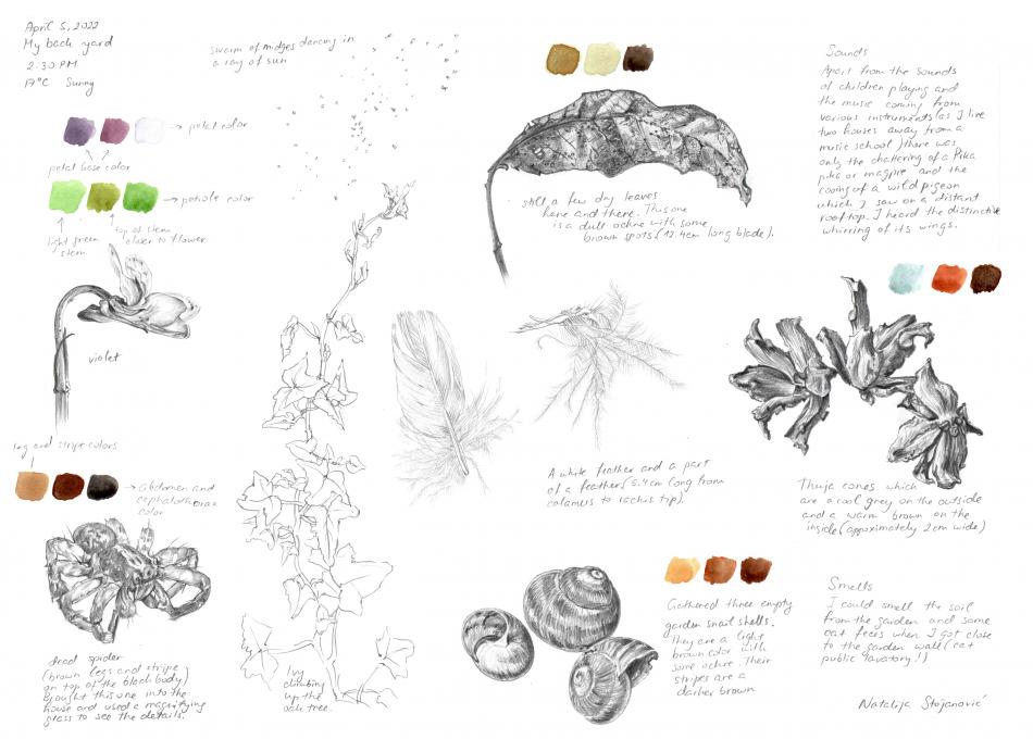
 The mark making techniques I used are top row from left to right: outline, side shading, contour shading; mid row left to right: cross hatching , watercolor pencils, stippling; bottom row left to right: scribbling, blending, side shading. Perhaps my outline drawing would have been better without the horizontal lines. I think I need to work on the contour shading because there are areas where I overlap lines and get crosshatching. And my cross hatching is never just bidirectional rather diverse. I like how blending using a blending stump turned out. I was taught never to use this technique in school, but it is described as a technique used by scientific illustrators in the Guild Handbook of Scientific Illustration! So I guess I will be blending away in the future. As always, I am pleased with the Faber-Castell Albrecht Dürer Watercolor Pencils. If there is lack of detail it is due to the brush I used. All in all, an interesting exercise and I look forward to the next one!
 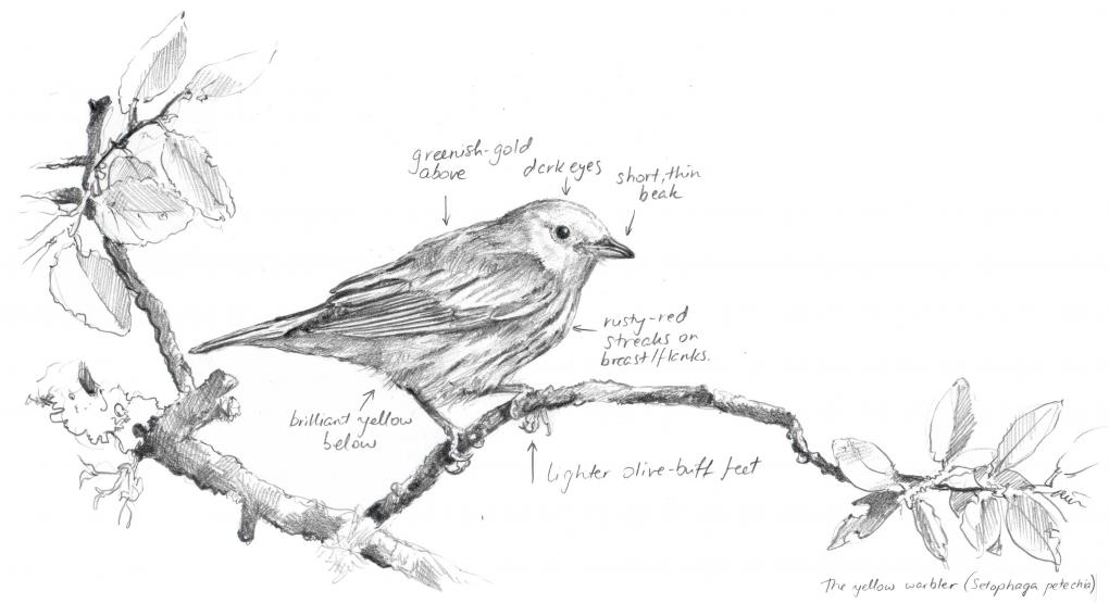 1. I felt comfortable drawing from the photograph because the subject wasn’t moving. Getting the proportions and the main pose of the bird was easy, however it was difficult to capture all the detail that I saw in the photograph. I think I should have drawn the bird at least twice as big. Also it was a challenge to capture the brightness of the bird's feathers. I think I would have been more comfortable had I been working on toned paper or if I had added a tone to the entire background (the photograph background is a medium tone and green in contrast to the yellow of the bird so that it really stands out).
2. Drawing from this photograph made me observe each part of the bird for a longer period of time than I would have just casually looking at it. This allowed me to notice the detail of the feathers around the eyes, the subtle color difference between the birds above and below feathers and the peculiar shape of the top part of the beak. I think that observing the subject for longer periods of time certainly makes a difference and it would do so in nature journaling as well.
1. I felt comfortable drawing from the photograph because the subject wasn’t moving. Getting the proportions and the main pose of the bird was easy, however it was difficult to capture all the detail that I saw in the photograph. I think I should have drawn the bird at least twice as big. Also it was a challenge to capture the brightness of the bird's feathers. I think I would have been more comfortable had I been working on toned paper or if I had added a tone to the entire background (the photograph background is a medium tone and green in contrast to the yellow of the bird so that it really stands out).
2. Drawing from this photograph made me observe each part of the bird for a longer period of time than I would have just casually looking at it. This allowed me to notice the detail of the feathers around the eyes, the subtle color difference between the birds above and below feathers and the peculiar shape of the top part of the beak. I think that observing the subject for longer periods of time certainly makes a difference and it would do so in nature journaling as well. 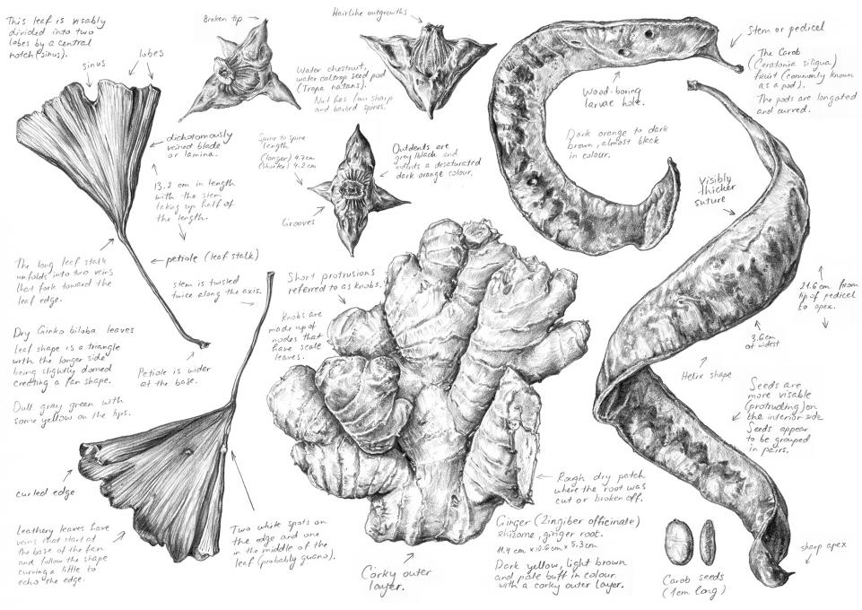
Viewing 16 posts - 1 through 16 (of 16 total)