The Cornell Lab Bird Academy › Discussion Groups › Nature Journaling and Field Sketching › Capturing Nature’s Color Palettes
-
Bird AcademyBird Academy1. Was this your first experience with watercolors, or have you used them before? Was it easier or more difficult than you expected?
1. Share and/or tell us about the color palette you created. What was the subject? Were you able to achieve the colors you wanted? How? Any challenges?
3. When focusing so closely on the colors you were observing, did any discoveries, patterns, relationships, or questions come to mind?
You must be enrolled in the course to reply to this topic. -
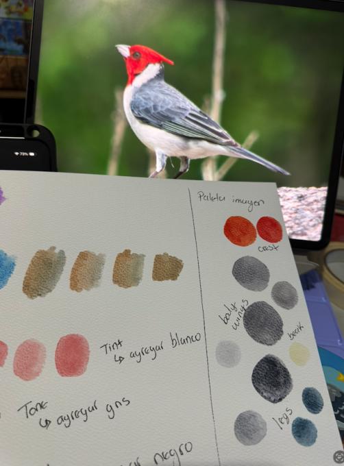
I tried to replicate the colors of this Red-Crested Cardinal. It was harder than it looked!

-
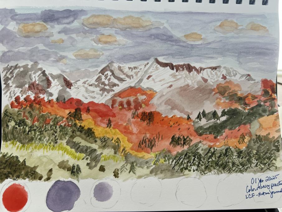
This was my first experience with watercolors. I was only planning on mixing the colors but I just started sketching the photo. Lots to learn, it was fun. Challenges was getting wrapped up in the details. Wasatch Mountains. The color mixing was fun, yes there were definitely challenges. The colors in the image below are showing much darker than they do in my painting.The
-
This was my first experience with watercolours. I really enjoyed mixing the colours, and I found it quite intuitive and satisfying to nudge them this way or that way toward greater accuracy. The reference for my own palette was a bird feeder out my window. The sunlight changes quickly this time of year and there are also shifting clouds today, so I couldn't linger for long on mixing a colour before it changed. When mixing colours from my surroundings instead of a photo I really noticed how much light impacts colour. Also, something I rediscovered during this exercise is that snow has colour!
-
I have used watercolours before but still found it challenging to get even close to the colours and everything was too watery as well. I extended the project to cover tools I use more frequently, Tombow pens and iPad with Procreate app. Gee, that was tough too, lots to learn about colour mixing for me. I did like limiting myself to only 5 colours for each picture. -
I enjoyed mixing colors but I couldn’t stop myself there, I was too excited to try watercolor painting with the colors I had mixed. I think I went a little overboard though! 🤣 I even painted the bird too!!! I enjoyed painting but can’t help thinking how much nicer it would be with brushes and actual watercolor paper. I had a tough time controlling the water flow with the water brush and getting the paint to go where I wanted it to. Anyway, Here’s my first real attempt at watercolor painting:
-
1. I had used watercolors before, but it was my first time mixing colors, and, trying to get to "the" color I wanted. This was fun, but also harder than I had expected.
2. I went outside and found a wall next to a tree, covered with some green plants and a bougainvillea*. A few challenges: getting "the" color I was looking for, especially in some colors - greens were harder than others, and I need to keep practicing; using the brush without adding too much water; finishing mixing colors before sunset (even though I took a photo, and finished painting later, I found out I don't like the way artificial light presents colors to my eyes). Another challenges: was (is) having enough "space area" to mix and test the colors; and, using a watercolor pocket with only 12 colors.
3. I discovered a lot of colors, when observing in a focused way, and taking my time. A question that came to my mind was: if I was to paint (the mountain image), where should I start?
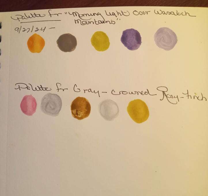
(A) Gray-crowned Rosy-Finch (Hepburn’s)
(B) Morning Light over the Wasatch Mountains :
* (C)
-
I really loved this activity - it made blending through observation and trial and error feel much more accessible. Excellent exercise and introduction to watercolors.
-
I have several years of experience with watercolors, but i have only practiced them more seriously for the past 4 or so years. They are so much fun and i loved this exercise! Mixing and experimenting with colors is always interesting, and may be one of my favorite parts of the painting process.
For the mountain image, i chose the beautiful color of the sun’s reflection on the landscape, the lime-y yellow-green in the trees, the underside of the clouds’ color, and the deep green of the evergeen trees. (Whew!) In the picture of the finch, i picked the rosy side-patch, the soft grey on the head, brown of the back, and yellow-gold color of the bill to reference my colors. Finally, i went outside to pick some colors from my backyard landscape: the mountains, roses, hydrangeas, and butterfly bush flowers. I am very happy with the colors that i achieved, especially the pale lime, purplish rose, grey, and blues. I noticed that the darker, more saturated colors like the red and dark green ended up blotchy, whereas some of the lighter colors were very smooth and even, especially the ones that i added white to. Also, as i was mixing the blue mountain color, I realized that it actually needed more green rather than ultramarine as i had originally thought. -
This was a lot of fun. The only challenge was using a very old watercolor set.
-
-
-
I tried watercolors before, and they are really fun to play with. But I found out that it is hard to mix the right color in a short time (so I really enjoy the time playing around with the colors)
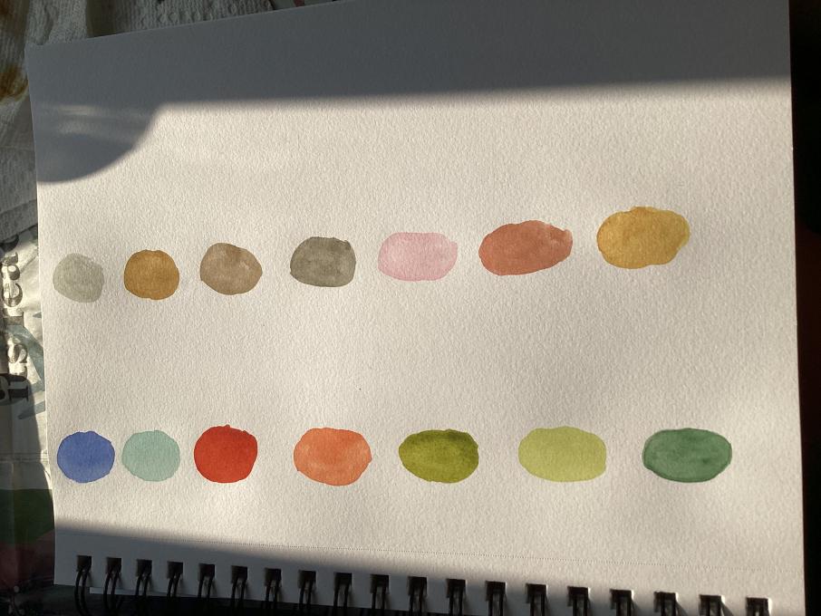
I mix the colors for the golden light on the mountain, the orange light in the cloud, the deeper blue of the cloud, the light part of the snow on the mountain, and the rocks of the mountain. (3rd column)
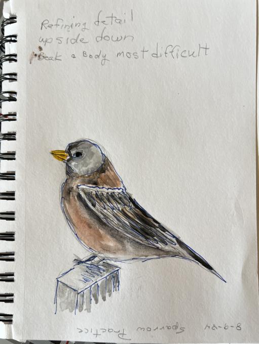
2nd column is the colors of the bird (grey & pink for the belly, brown for the chest, deeper brown for the wing feathers, light grey for the head, and yellow for the bill)
Then I try for a new picture (first column)-I found out that even a brownish bird can have multiple colors.
One challenge I found was that the color would fade out after the watercolors dried, so I think I should make the color deeper next time when I mix the colors. -
-
This was my first experience. I am not sure I enjoyed it. It lacks refinement. I was never able to create something like a brown colour. I have redone the exercice with coloured pencil. Skills are closer to the ones used in drawing.
-
-
This was not my very first time with watercolours but it was my first time with colour mixing. It was challenging and I’m not super happy with the outcome but I guess (read: hope :D) it’s first and foremost a matter of practice. With some shades it was easier, especially when it was mostly a matter of adding shade or tint. With others it was hard to tell what colour it was (e.g. the lower breast of the rosy-finch), so I added here and there till I thought I had it, but the colour on paper wasn’t as I expected.
Something else I noticed is that, once it dries, the colour looks a little different from when it’s still wet, and that too at times tricked me into believing I’d got the colour right, but then it turned out to be too light.-
Hi Giorgia, I found/learned that mixing complementary colors is the best way to get to a nice vibrant brown. You can either mix pigments up front, or for transparency and oomph, apply the lighter pigment first then glaze over w the darker pigment.
-
-
As a child, I painted a lot with watercolors and knew how to mix the colors I wanted. Back then, I had two yellows, two blues, two reds, white and black. Now, 40 years later, I have completely different watercolors, including greens and browns, but not all the colors I was familiar with before. I was able to achieve the color tones in the pictures for the assignment easily, but I had more difficulty with my own flower picture. I have many peonies whose colors can't be properly brought out on camera. I thought that by painting I would be able to capture the color tones better, but it still requires a lot of practice.
-
The colors look really nice! I like that you added your flower watercolor too! Looks beautiful!
-
-
My first experience of watercolours and mixing colours, some took a lot of trial and error to even get vaguely close. That said, I really enjoyed the whole thing and look forward to learning more.
-
This was the first experience I have had with watercolors. It was a little difficult creating the color I was going for, some I was happy with, some I was not. Watercolor will be a challenge for me, but I am looking forward to continue to learn about the medium. I have used acrylics and colored pencil alot, but not watercolor.
-
-
I like how you kept it nice and simple. The pink tone is perfect on the finch. I also like how you got the orange to be so vibrant it really stand out like in the picture of the mountains.
-
-
-
First experience with water colors.Easier than expected Colors were for greenish white hydrangea and for fern leaf. Used 3 colors for hydrangea 65, 114, and 003 made it just right. For fern used 92 and 251, grey for the dark green color.
-
I’m very happy with how my color palates turned out. Using complementary colors to achieve toned down versions of colors is such an effective technique!
 The
The 


Read More: