The Cornell Lab Bird Academy › Discussion Groups › Nature Journaling and Field Sketching › Illustrating the 3D World
-
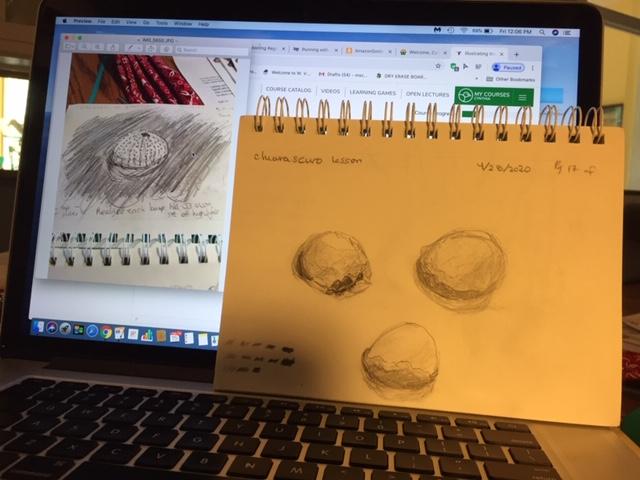
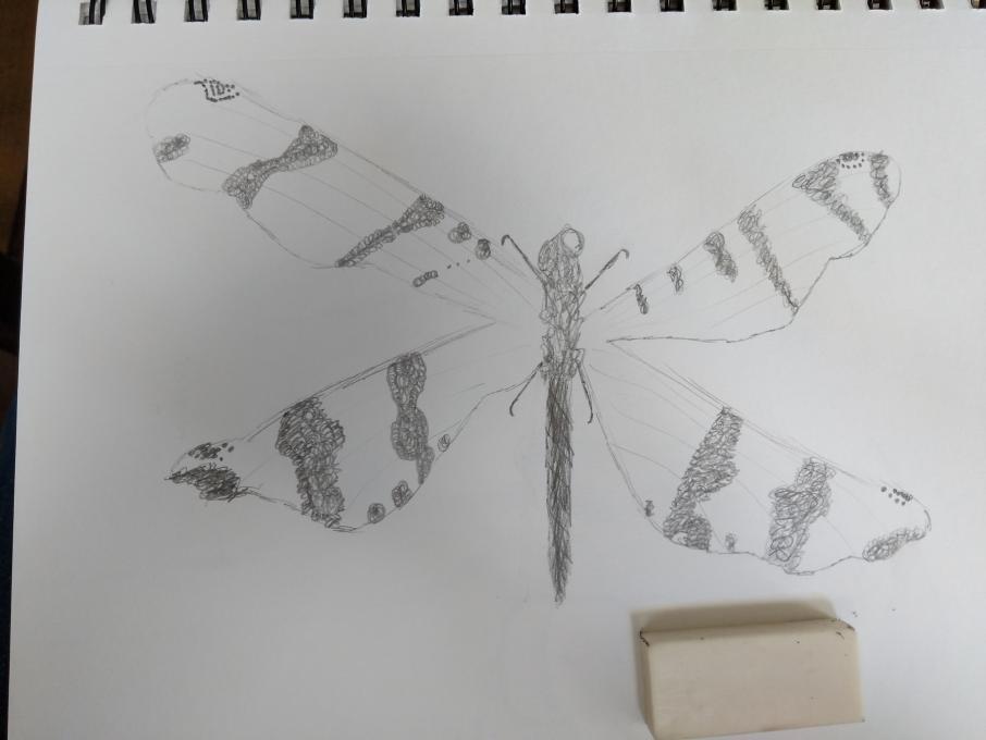
After six months (!) of neglecting this class, I decided to get back to work. I've been having a great time today picking it back up, and am pretty happy with the results. I think I need confidence in making darker marks, and just overall practicing for confidence. I couldn't resist adding color and ink to this one, where I was practicing values.
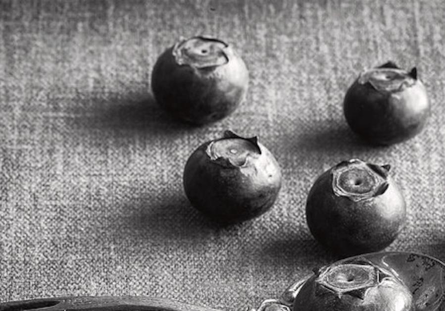
 Chiaroscuro is tricky! By the time I got to the blueberry, I think I was starting to get the hang of it. I found a good black & white photo with strong shadows to use for practice.
-
Hi Anne. Your blueberries are gorgeous and the use of chiaroscuro in it makes them leap off the page. It took me a long time to practice as well with the darker lines to get comfortable. You’re right about it being tricky.
-
@Colleen This is something that will require continued practice. Moving on to something that isn't round is a bit intimidating to me!
-
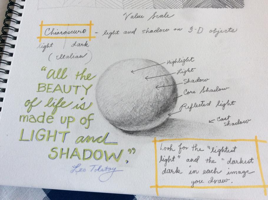
Anne, I like that you made a diagram of Chiaroscuro. I think that will be helpful for me too. I am excited to move on but I think some more time with this lesson will help in the long run
-
@Deb Thanks Deb! I'm hoping to get out into my yard to practice this in a natural setting. Definitely a skill that will take a lot of practice!
-
-
I had to laugh when my husband told me my eggshells looked like hamburgers. I experimented several more times, but have not quite mastered (well, not even close!) the values that make such a difference in definition for sketches. I know what I need to do, but can't quite meet the goal yet. I'll keep the lessons learned in this section as I go along.
-
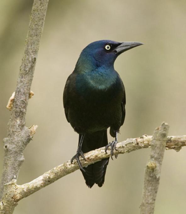
I am amazed to see improvement in my drawings with the few cues I just learned. The chiarocuro really helps in giving a 3D look. I was aware of that but was not comfortable applying it. To me, there was only 3 shades. Dark, mid, light. Also, I was not that good at seeing them. I never noticed the reflected light under the subject. Amazing! I still wonder how to combine chiaroscuro and the rendering of colors. But one thing at the time. As for the filling strokes, I don’t have the patience of doing straight lines or crossed lines... and it looks ugly when I try it. I would say that my technique is a mix of scribbling and blended lines... I don’t know if it is good or not but I have more fun drawing like that.
-
Hi Marjolaine. That’s awesome. I can see how the stokes make the detailed feathers in your drawing. That’s something that I just have not seemed to figure out yet. Thanks for sharing this.
-
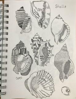
@Colleen Hi Colleen! Thank you for your comment! Drawing the feathers is a big challenge for me too. The interesting thing is that I was not trying when I drew this grackle. The only thing I was focusing on was the chiaroscuro. I scribbled with the pencil... using some blending and some contour sketching too, but in a very rough way. But you are right, there is a feel of the feathers texture after all... it is a surprise for me! Your shells are very stylish, I love them!
-
@Marjolaine Thanks. I am noticing that the chiaroscuro is making a huge difference in my drawings.
-
-
It was a little bit. I am feeling more comfortable putting marks on the page. I still need to work on feather features on birds.
-
Your lines are so sharp and detailed. You have composed almost photographic images here.
-
@Cynthia Thanks Cynthia for your comment. I feel much more comfortable with using chiaroscuro in my drawings, but sometimes I feel that I am pressing too hard (almost imprinting) or should add color, which is not something that I am currently confident about. I was pleasantly surprised with this one when I did it.
-
-
I found this very challenging but was amazed how the grapefruit took shape. Its a relaxing exercise to closely observe such everyday objects. I found this time of day( late afternoon)the light changed quickly so I just had to pick one and go with it.
-
Not to say I am proud of everything on this page, but I am excited that I filled a sheet of paper with my learning.
-
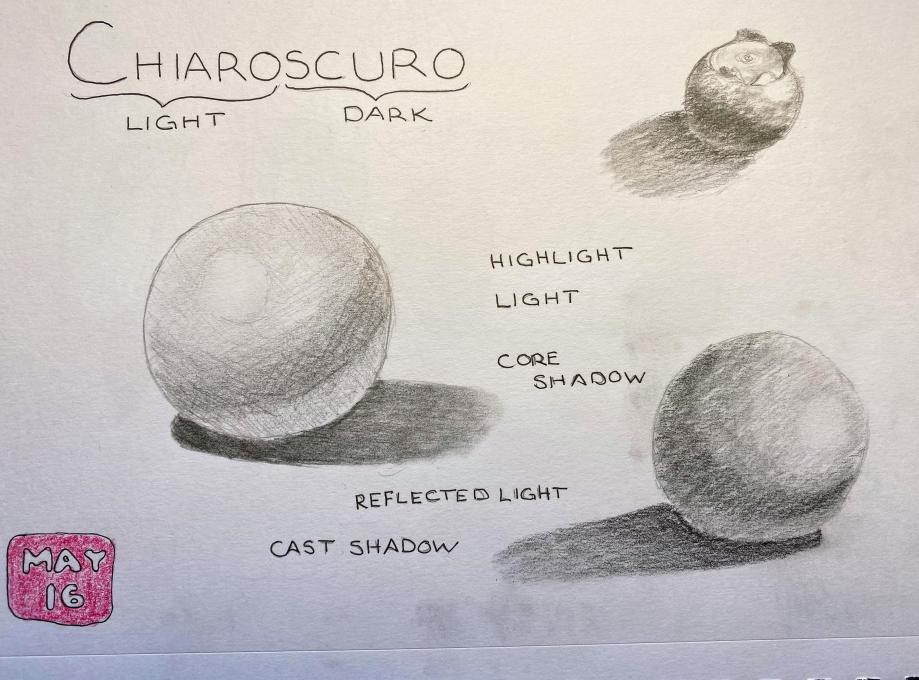
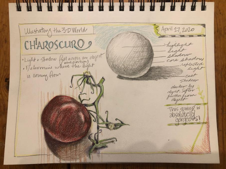
It is really like a revelation for me to define the chiaroscuro concept into 6-7 distinct zones. I was already aware of some of it, but to put it all together so neatly is great.
-
I'd like to work on the perspective.
-
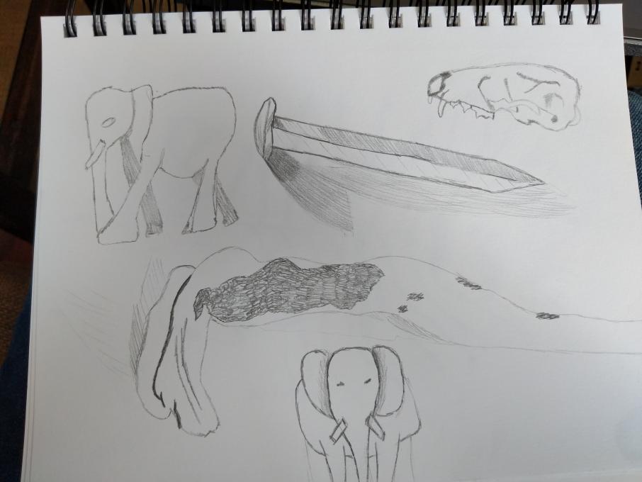
Here are some of my random sketches of things I have easy access to. The elephant on the bottom of the second page came out cuter than I thought it would.
-
I love the animal skull! The nail/iron spike is pretty on target also. Elephant is cute! Good work!
-
-
I'm a perfectionist and often don't start things because I can't decide the best way to go about it or the best thing to draw or whatever. One reason I wanted to take this course is to draw more things without my own restrictions on whether or not it's a "good" subject, or if it's going to make a "good" finished piece. I used to work in an art museum and I did drawings and wrote in sketchbooks a lot over those years, and I have gotten away from it and want to get back.
-
Hi Morgan, I see so many different kinds of mark in use here and the values are so clear. You skills are still with you!
-
@Cynthia :) thank you!
-
-
I really had to force myself to relax. I found that once I did relax, things went much better. I like the shading process.
-
Love how you included the objects and your sketches. Nice!
-
-
I found this hard - it takes patience to observe the nuances of the light. Something I am trying to develop.
-
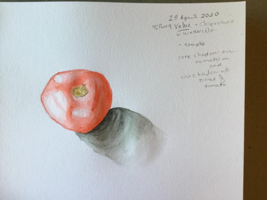
Sort of ok. Needs tabletop for context, so it isn’t floating in space like the ghost of tomatoes past.
-
It was fun trying to get the lights and darks right. As I was drawing the light started changing and the highlights started shifting around. More practice would be good! I liked the explanation of how to look for the lights and darks and where you may expect to see them.
-
Hi, Ruth. Your tomato is beautiful. Maybe it has some eggplant in it? Your vines and stalks are especially interesting and it’s the way that you include unexpected details that draw the viewer in and make your drawing come to life. ❤️
-
-
Taking the photo of my drawing made me realize that I would like to practice getting more definition in the middle values. I like the way you pointed out that when you squint you may be surprised by some of the bright and dark spots. I also kept smearing the pencil marks as I was drawing (haha...accidentally blending where I didn't want blending).
-
I keep forgetting about using stippling and I love the daisy technique you showed us. I still want to work on ALL of them!
-
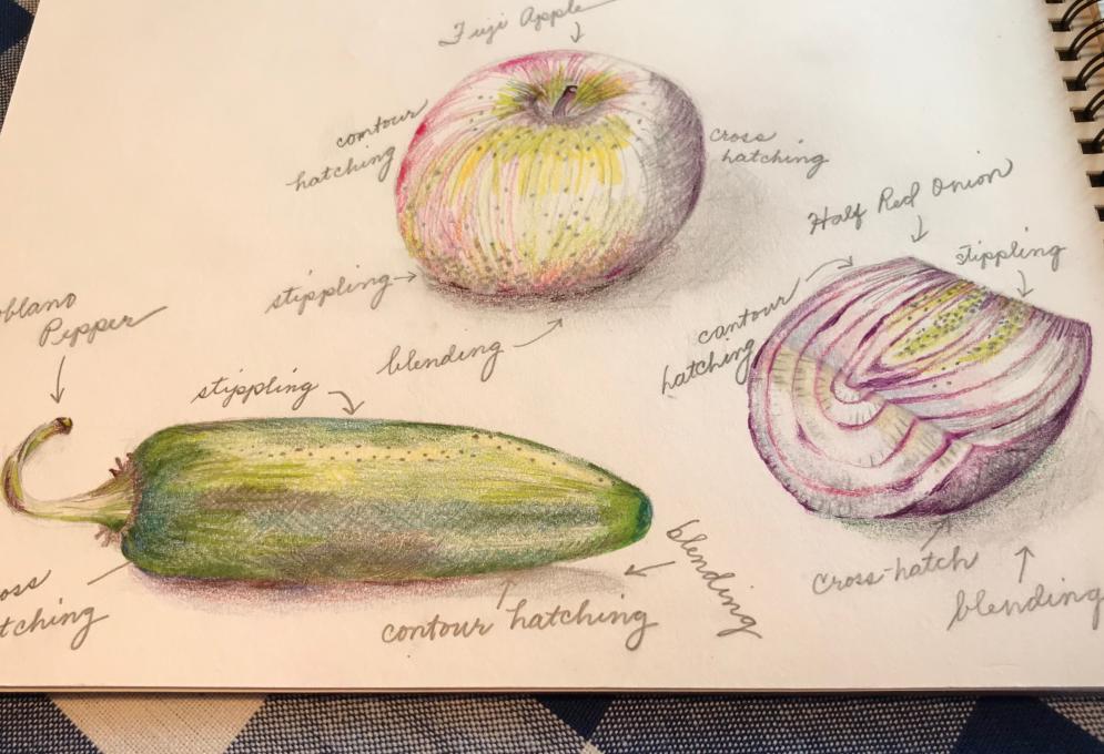
First try at chiaroscuro. More successful in pencil than colored pencil, I think. The contrasts on the pepper were much more dramatic and yet I had trouble capturing that. Maybe because it needs more blending? I like to look at what others have done and I saw some comments that others felt their own drawings suffered in comparison to others. When I feel that way, I remind myself that comparison is the thief of joy. We will all improve and as someone else pointed out, we are not all starting from the same place on the path. I am enjoying re-discovering this part of myself.
-
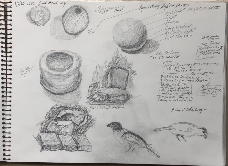
Representing Lights and Darks: the Squint Test
I continue to have to make conscious choice each time I set out to draw: discouragement and frustration, or discovery and curiosity. It is not easy, but is a valuable skill. Drawing is completely new to me, and I find it more than a little difficult to make accurate representations of shapes and proportions. I can see where and how they are wrong, but can not replicate them. It is an interesting look into the brain. Meanwhile, I have now dedicated a full sized new eraser to my drawing box!
I am also very slow. It would take several more sessions to "finish" my stick (which is how I did my "Jump Right In" warbler), but sometimes I don't want to spend repeated sessions on one drawing. If you are slow and outdoors, the light changes faster than you can capture it. However, the squint test really works! Sometimes squinting helps me "find" the shape, as well.
I added a scribbly background of a tree trunk, palo verde sapling, brush pile, and bird boxes, which is not actually behind my "value stick" but was to my right. You can do that when drawing, unlike photography! (Photoshop not withstanding.)
I hope my skills improve on shapes and proportions.
Next up: chiaroscuro.
-
-
-
Hi Leonora, your chieraschuro is very well done and informative. I love the red onion and the pepper, nicely done. The colors are outstanding and the tiny details add so much to making them appear real.
-
I like the way you have used all the different types of marks so effectively, and the way the objects you drew are positively glowing. It is interesting how just bits of color really bring the drawings to life.
-
Thank you for sharing your drawing. Your notes make it a lesson in itself! I am so interested in the way you used all of the different marks!
-
-
-
(Still haven't been able to upload images) It wasn't difficult to see where each could be applied and I'm starting to feel more comfortable doing anything! Unfortunately, I think I chose natural items that were too complicated for my initial practice. The areas of light/dark were too small for me to really distinguish the different effects - kind of frustrating but interesting - so instead I applied different shadings to a stuffed toy penguin to build confidence. Better. It is still tough to maintain proportions, even with short pencil strokes. I use the eraser a lot. I expect everyone comes up with their own process - where to start, what comes next, etc. My question - are there guidelines about this for starting out? I am really enjoying this course.
-
Yes! I had to choose my "Light and Dark" objects carefully to keep it from getting too difficult!
-
-
-
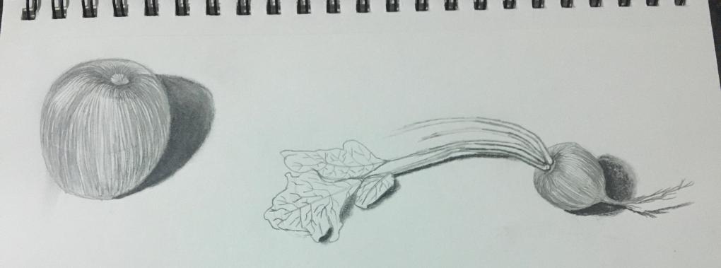
Nice radish!
-
-
Actually, I don't feel comfortable putting marks on the page. The chiaroscuro is not really clear to me and i feel rubbish about it. I have seen the others are they are really good, while mine is a bit ugly
-
Please be gentle with yourself, as we’re all on the same journey. Some are farther down the path and some not as far as your are. We all started at different times and different places. The very fact that you have committed to taking this class at this time shows a determined interest and desire to create art. Just stick with it. If you don’t understand a lesson, message our instructor and ask her for help. She can refer you to other available sources (maybe a YouTube video or a website) that may reinforce the particular skill or lesson that is challenging you. Sometimes your progress may seem minimal. Then one day, you’ll make a big leap. I’m rooting for you, Stefania.
-
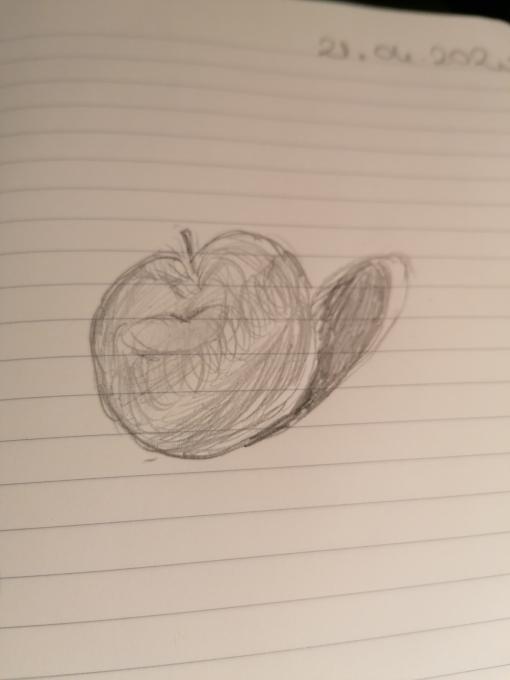
As I've said in my own posts: EVERY time I sit down to draw, I quickly come to the point where I have to make a conscious choice between frustration and discouragement vs. discovery and curiosity. It is not easy. I have to tell myself "I can do it!" Meaning I can make the choice, not necessarily draw what I set out to draw. You have captured the round nature of your apple, rather than having it look like a flat circle. That is a success! You, too, can succeed in making a positive choice!
-
Hi Stefania, I agree with Paula and Leonora. There are people in this class with much higher skills than mine, but we need to keep that from discouraging us. Like Paula, I have to tell myself, "I can do this!" I have to practice, and as I go I will see more, and refine my skills. So will you. Your apple, by the way, looks like an apple. Check my "eggshells" which to my husband, look like hamburgers! The chiaroscuro is very hard for me too. We'll see and understand it better as we practice. I'm rooting for you too!
-
I feel just like you! Over and over I remind myself I am a beginner and my drawings are those of a beginner and that is OK! My doubts make it more difficult right now, but what if I conquer this? better yet, what if I learn to enjoy this? What if I am the best mediocre nature journalist I know? I'll take happy over perfect any day.
-
@ANDREA Andrea, I love your take on this journey - "I'll take happy over perfect any day." I'm going to say that to myself every day. I really am so happy when I 'm drawing!
-
-
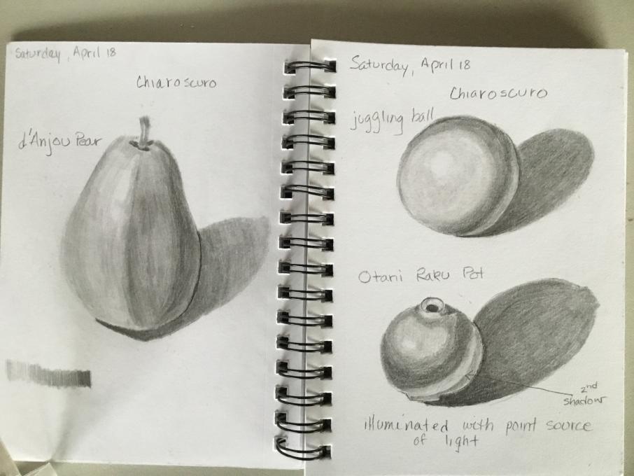
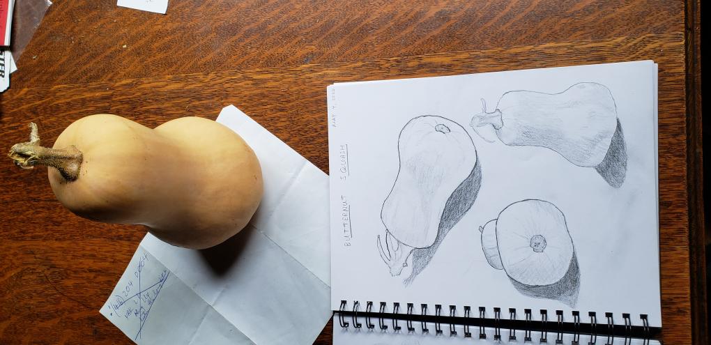
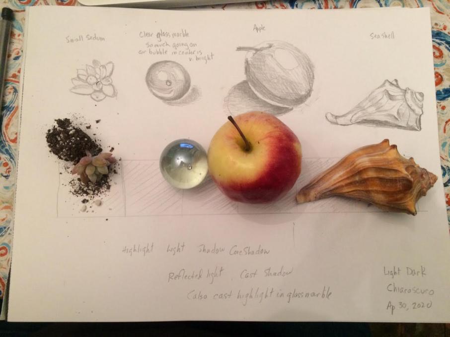
I began with the pear, using a 5” circular fluorescent bulb for illumination, which gave a strange shape highlight. I then moved on to the juggling ball with the same lamp. The Roku pot was illuminated with an LED point source and the texture of the pot resulted in a second shadow below the reflected light.
-
very nice
-
 Chiaroscuro is tricky! By the time I got to the blueberry, I think I was starting to get the hang of it. I found a good black & white photo with strong shadows to use for practice.
 I had to laugh when my husband told me my eggshells looked like hamburgers. I experimented several more times, but have not quite mastered (well, not even close!) the values that make such a difference in definition for sketches. I know what I need to do, but can't quite meet the goal yet. I'll keep the lessons learned in this section as I go along.
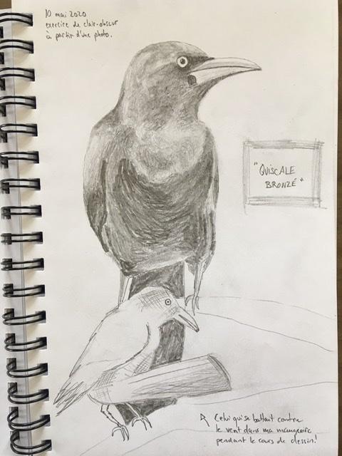
 It was a little bit. I am feeling more comfortable putting marks on the page. I still need to work on feather features on birds.
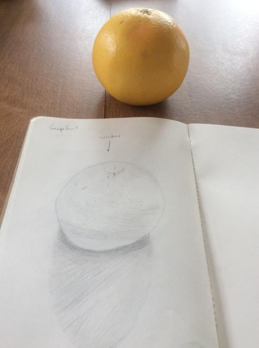
 I really had to force myself to relax. I found that once I did relax, things went much better. I like the shading process.
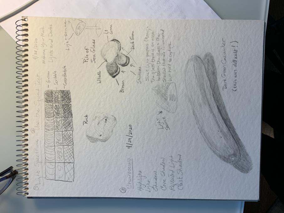
 It was fun trying to get the lights and darks right. As I was drawing the light started changing and the highlights started shifting around. More practice would be good! I liked the explanation of how to look for the lights and darks and where you may expect to see them.
 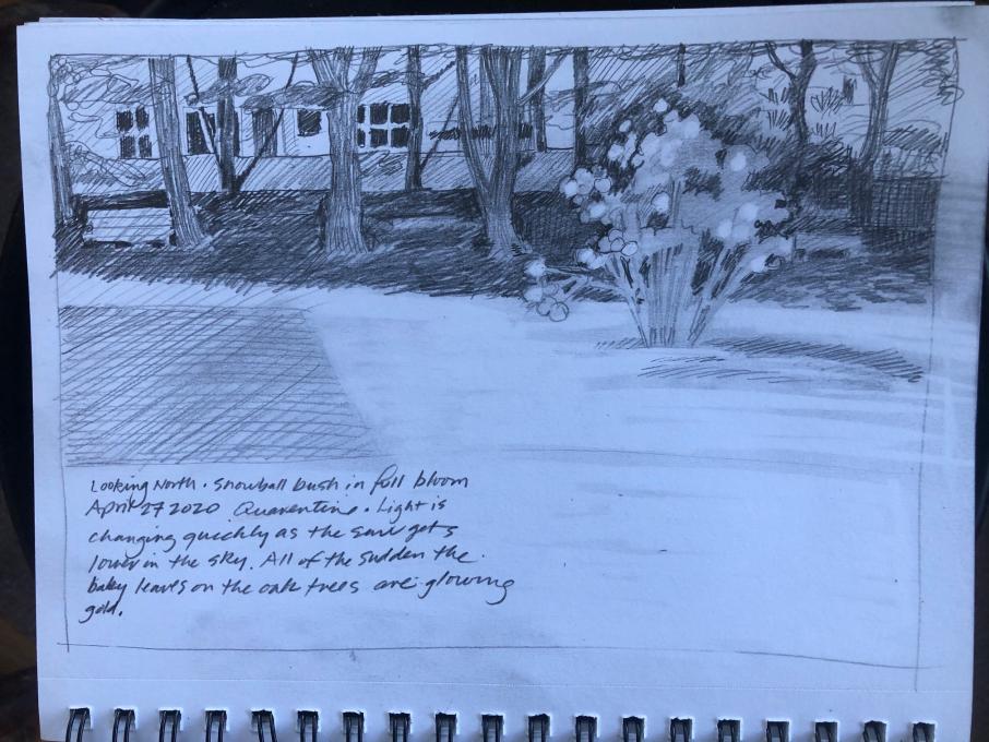 Taking the photo of my drawing made me realize that I would like to practice getting more definition in the middle values. I like the way you pointed out that when you squint you may be surprised by some of the bright and dark spots. I also kept smearing the pencil marks as I was drawing (haha...accidentally blending where I didn't want blending).
 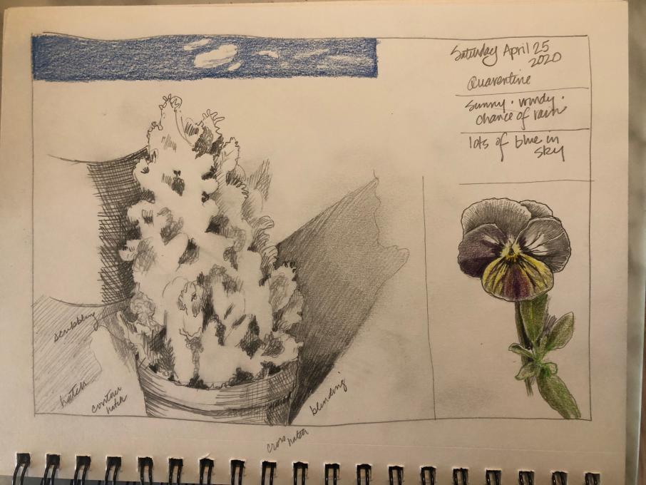 I keep forgetting about using stippling and I love the daisy technique you showed us. I still want to work on ALL of them!
 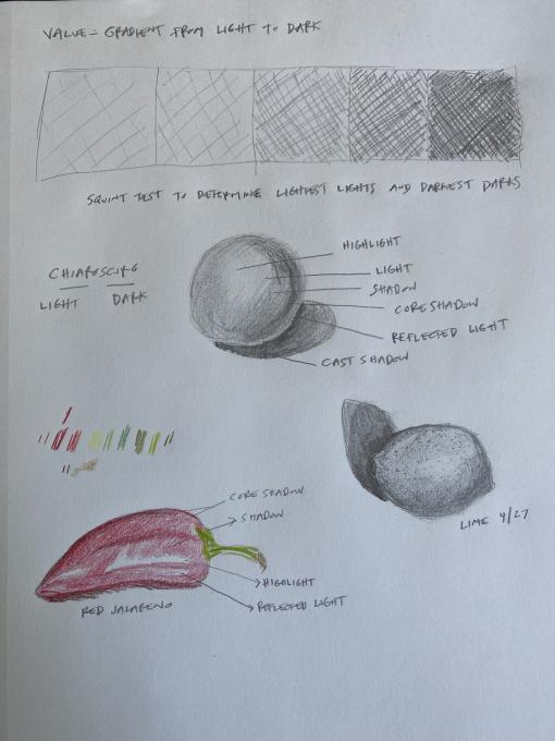 First try at chiaroscuro. More successful in pencil than colored pencil, I think. The contrasts on the pepper were much more dramatic and yet I had trouble capturing that. Maybe because it needs more blending? I like to look at what others have done and I saw some comments that others felt their own drawings suffered in comparison to others. When I feel that way, I remind myself that comparison is the thief of joy. We will all improve and as someone else pointed out, we are not all starting from the same place on the path. I am enjoying re-discovering this part of myself.
 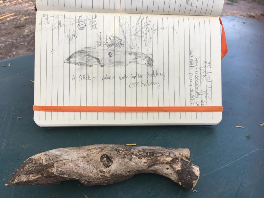 Representing Lights and Darks: the Squint Test
I continue to have to make conscious choice each time I set out to draw: discouragement and frustration, or discovery and curiosity. It is not easy, but is a valuable skill. Drawing is completely new to me, and I find it more than a little difficult to make accurate representations of shapes and proportions. I can see where and how they are wrong, but can not replicate them. It is an interesting look into the brain. Meanwhile, I have now dedicated a full sized new eraser to my drawing box!
I am also very slow. It would take several more sessions to "finish" my stick (which is how I did my "Jump Right In" warbler), but sometimes I don't want to spend repeated sessions on one drawing. If you are slow and outdoors, the light changes faster than you can capture it. However, the squint test really works! Sometimes squinting helps me "find" the shape, as well.
I added a scribbly background of a tree trunk, palo verde sapling, brush pile, and bird boxes, which is not actually behind my "value stick" but was to my right. You can do that when drawing, unlike photography! (Photoshop not withstanding.)
I hope my skills improve on shapes and proportions.
Next up: chiaroscuro.
Representing Lights and Darks: the Squint Test
I continue to have to make conscious choice each time I set out to draw: discouragement and frustration, or discovery and curiosity. It is not easy, but is a valuable skill. Drawing is completely new to me, and I find it more than a little difficult to make accurate representations of shapes and proportions. I can see where and how they are wrong, but can not replicate them. It is an interesting look into the brain. Meanwhile, I have now dedicated a full sized new eraser to my drawing box!
I am also very slow. It would take several more sessions to "finish" my stick (which is how I did my "Jump Right In" warbler), but sometimes I don't want to spend repeated sessions on one drawing. If you are slow and outdoors, the light changes faster than you can capture it. However, the squint test really works! Sometimes squinting helps me "find" the shape, as well.
I added a scribbly background of a tree trunk, palo verde sapling, brush pile, and bird boxes, which is not actually behind my "value stick" but was to my right. You can do that when drawing, unlike photography! (Photoshop not withstanding.)
I hope my skills improve on shapes and proportions.
Next up: chiaroscuro.