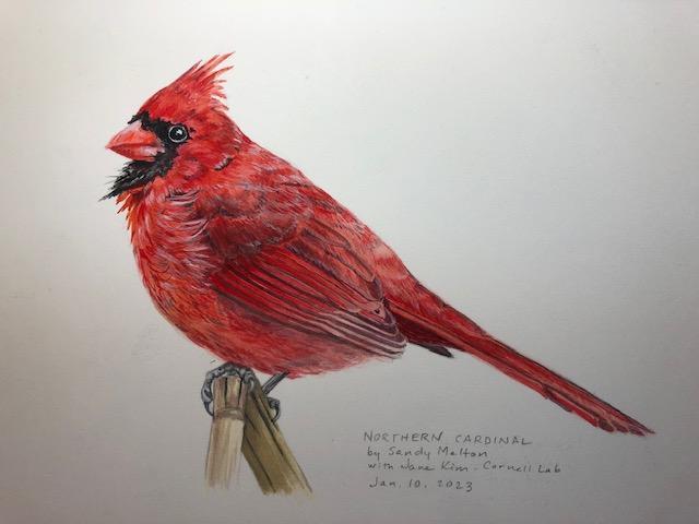
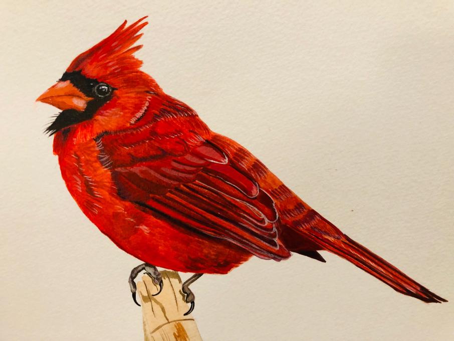
The Cornell Lab Bird Academy › Discussion Groups › How to Paint Birds with Jane Kim › Paint: Northern Cardinal
-
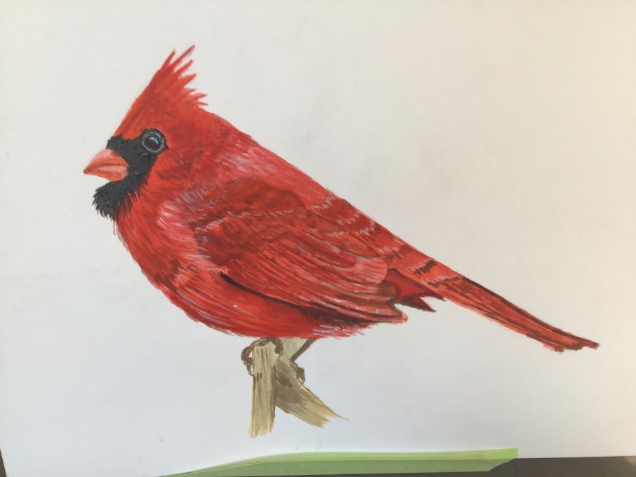
Having issues uploading this.... This was the first attempt following Jane's advice to paint what I see. Did it in a bit of a rush. Will try again following her example. Did use her colors.

-
Your colors are really nice! Love it
-
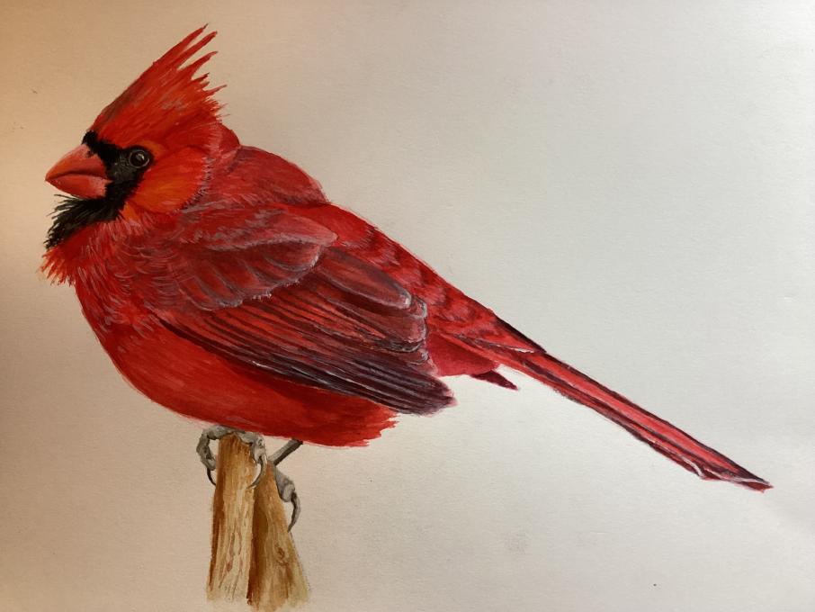
@Donna Thank you. He is very fluffy. Must be winter!
-
It does look like winter :-). I like how you painted the different feather groups, they really stand out and show a lot of depth. Lovely!
-
I love the depth of field in your wings, they really stand out. They look so real, just like a photograph. Wonderful job.
-
-
My first experience with acrylics. Loved the class. Thank you!
-
Thank you for the course!
-
This is so lovely!
-
Beautiful! This would make a wonderful Christmas card :-)
-
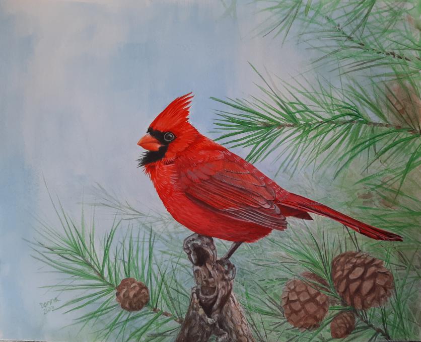
@PL I agree with PL it is beautiful and would be a lovely Christmas card. I always notice how skillfully Donna paints.
-
@Maureen A very beautiful cardinal and background!
-
Loved the base the bird is on and a great choice of background !
-
-
I really enjoyed this course and will now continue to sketch and paint other birds. I'm looking forward to you offering additional painting courses in the future!
-
Your bird has a lot of personality, he looks a bit mischievous :-). Nice job!
-
-
Cardinal is finished! This one is again done in gouache. Still waiting on a few acrylics and the handy palette from Blick which has been on backorder. Gouache is more challenging than watercolor because it moves at the first drop of water, so I ended up learning more about this medium along the way. I really enjoyed working on this bird and breaking down the feather groups, coloring, and really analyzing the photo we were working with. I also really enjoyed that I had the opportunity to go at my own pace to work out coloring and approach and put what we learned into practice. Thanks, Jane!
-
Am I finished? I am terrible at keeping the paper clean and the edges of the paint and the white space are making me crazy. I am thinking about sketching in big box distribution centers that are cropping up all over the landscape here in Kentucky. I may glaze wings a couple of more times to refine the shapes. Super challenging and fun exercise! Thanks, Jane!
-
So rich! Great work! -jane
-
-
My cardinal is more red than orange and not exactly a precise copy …
-
Sometimes they are! Beautiful range of hues from orange to red. -jane
-
-
-
This was fun to do! I am becoming more familiar with the acrylics and water brushes, which helps :)
-
Look at all those lovely highlights! So happy to hear this one was fun. 💗 -jane
-
-
The wing feathers and tail details were the most challenging! I enjoyed experimenting with colour mixing, and found I mostly used pyrrole red, pyrrole orange, quinacridone magenta and the ultramarine blue. Thanks again Jane for this excellent lesson! Alisha
-
Wonderful work! All red subjects are difficult and you have a nice range of reds! -jane
-
-
-
Beautiful! I love the bit of purplish red on the scapulars. -jane
-
 My first experience with acrylics. Loved the class. Thank you!
 Thank you for the course!
 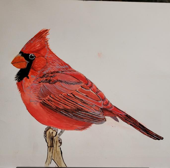 I really enjoyed this course and will now continue to sketch and paint other birds. I'm looking forward to you offering additional painting courses in the future!
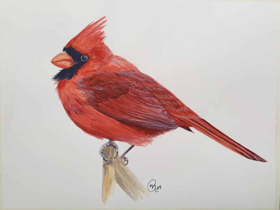
 Cardinal is finished! This one is again done in gouache. Still waiting on a few acrylics and the handy palette from Blick which has been on backorder. Gouache is more challenging than watercolor because it moves at the first drop of water, so I ended up learning more about this medium along the way. I really enjoyed working on this bird and breaking down the feather groups, coloring, and really analyzing the photo we were working with. I also really enjoyed that I had the opportunity to go at my own pace to work out coloring and approach and put what we learned into practice. Thanks, Jane!
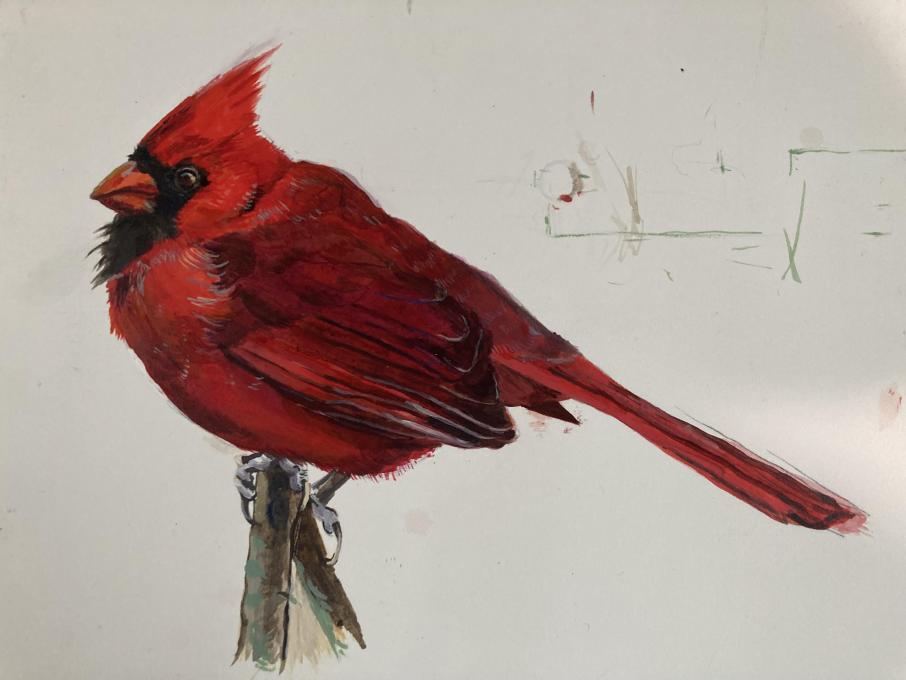
 The wing feathers and tail details were the most challenging! I enjoyed experimenting with colour mixing, and found I mostly used pyrrole red, pyrrole orange, quinacridone magenta and the ultramarine blue. Thanks again Jane for this excellent lesson! Alisha
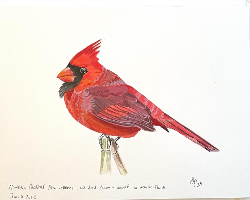
Read More: