The Cornell Lab Bird Academy › Discussion Groups › Nature Journaling and Field Sketching › See How Far You’ve Come
-

-
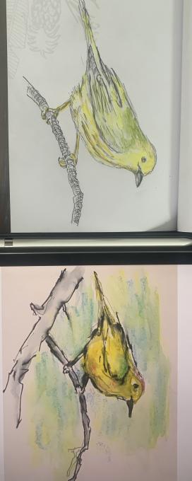
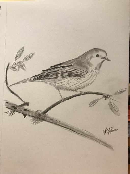
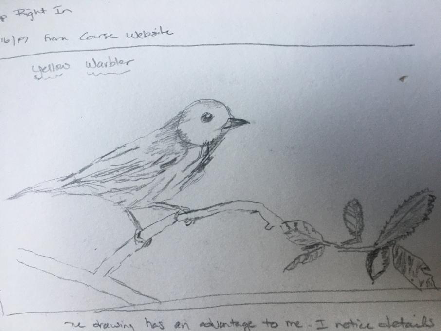
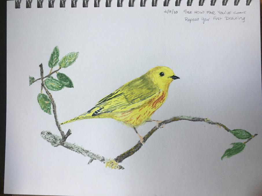
I tried to use most of my new learned techniques. Loved layering of colors, I spent a lot more time on the sketch itself, focusing on shapes, negative space, measuring to get proportions. I really struggled with the beak and eye, did not feel I got it correct. But happy with the rest of the drawing, better depth, color and value to my picture.
-
I think it shows progress. First drawing was a flat bird. This one is a much more rich bird. But you can say it better than I.
-
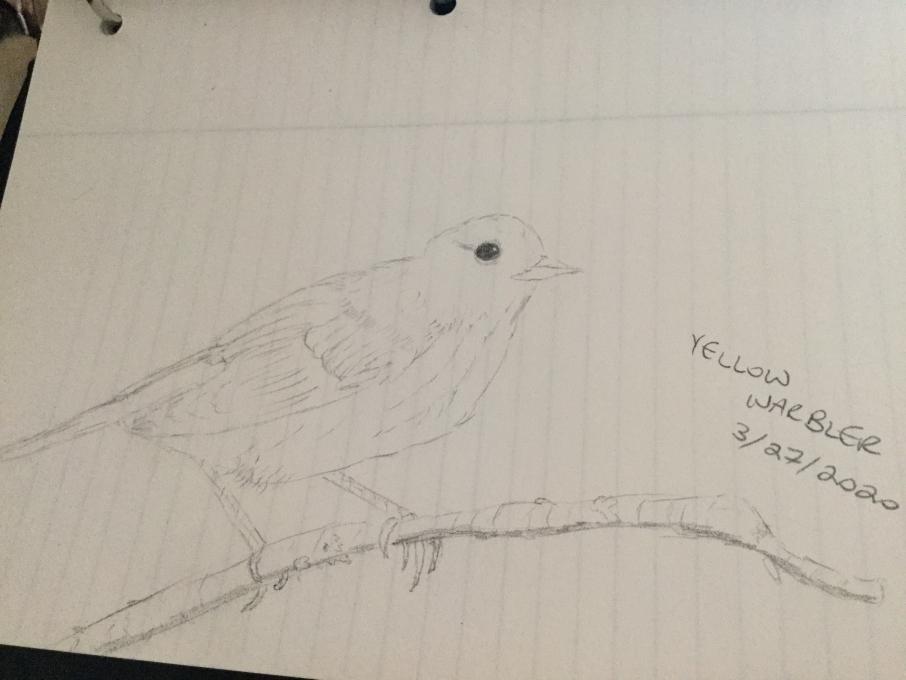
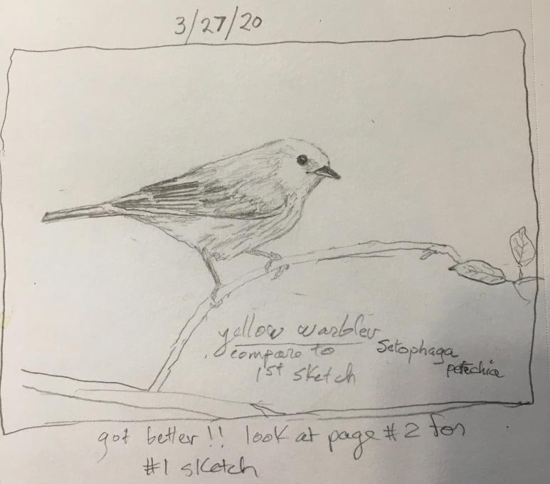
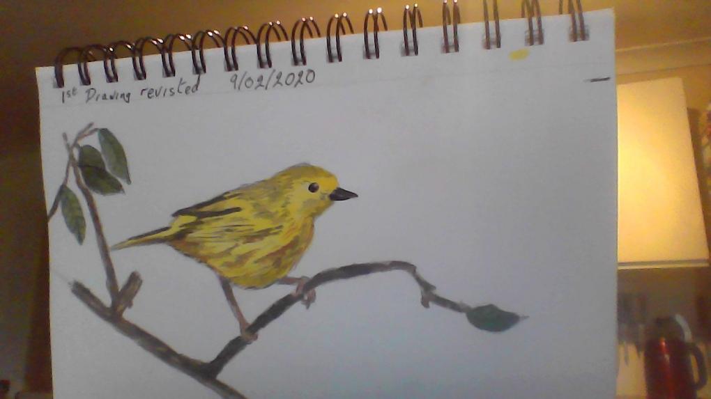
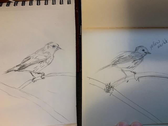
My first drawing is on the left. Current one is on the right. I see improvement in use of color and some details. What this course taught me is priceless. I learned about negative space decades ago. Now I am constantly reminding myself on taking another look for the details. I really
-
Certainly no LCF but I feel pretty good about my progress in the course. Three months ago I had never held a watercolor brush in my hand so anything is progress! But I am feeling better about some of the color blends I am getting and I plan to keep sketching and painting. Thanks Liz!
-
-
So I did the first one (on the left) back in December. The one on the right I did just now. There is certainly some progress. I am going to try the watercolor next, but I do struggle with that a lot. We shall see!
-
wow, big change in sketch.
-
-
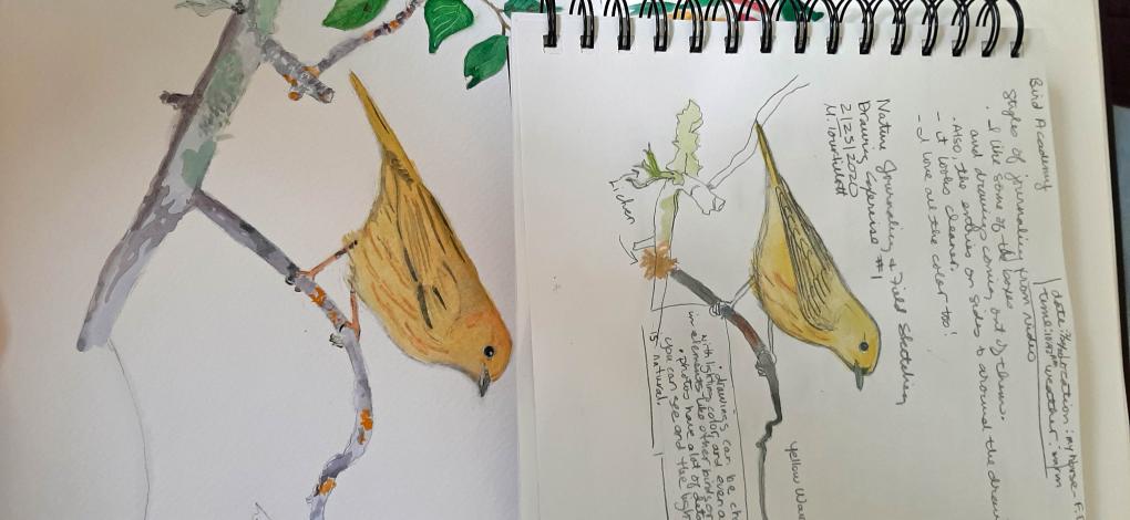
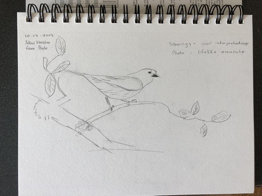
After some delay, I am working through final exercises. I tried the reflection drawing two ways and will post the watercolor example as that was a skill I had never tried before this course. I started at "how do I hold the brush; how much water makes the watercolor 'work'?", to at least trying some levels of color match and brush control. My second (unposted) repetition was to sketch the same photo using colored ink drawing over the pencil sketch. In the watercolor, I was pleased that the elements of background, tree, leaves, and bird are represented well enough to be pleasant to view. In the repeat ink-sketch, what I noticed most is that my attention to the "whole" was better than in my original sketch, where I focused only on the bird and slightly on the branch but without detail. Overall, wonderful course and experience. I hope to keep access to the course for a bit longer as I might want to review occasionally. Thank you!
-
-
-
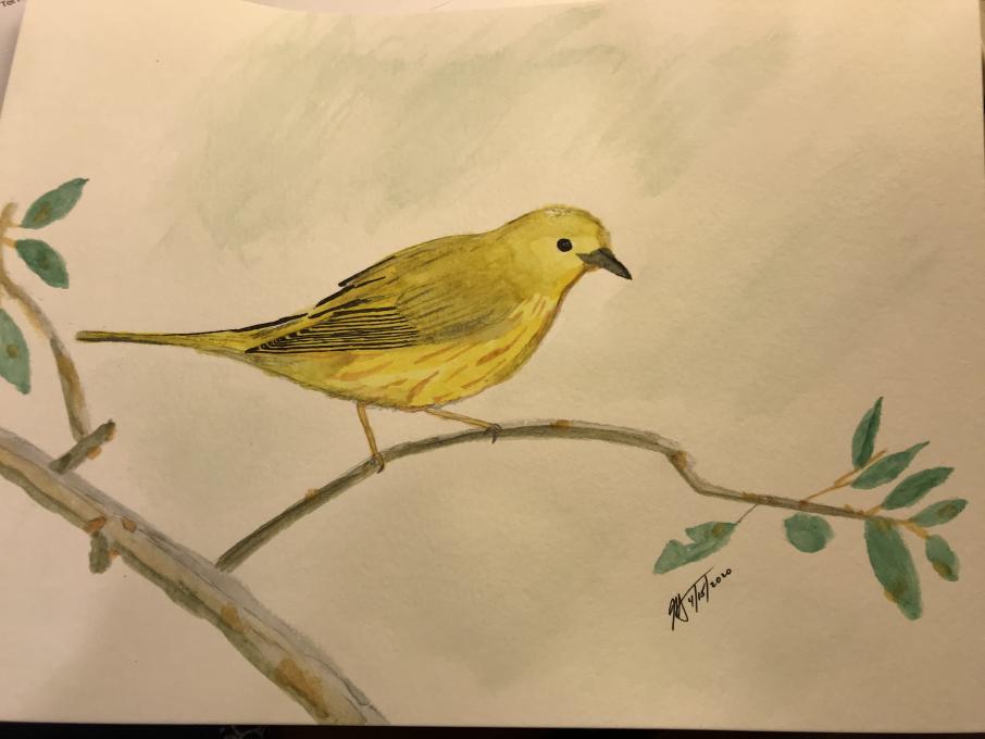
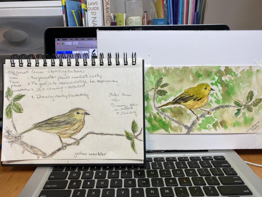
I’m very happy with my progress. My sketch on the left was done with colored pencils. The one on the right was done with a pencil drawing on 130 lb. textured watercolor paper, and watercolors which I’ll tape onto a page in my mixed media Nature Journal. I used wet on wet for the background, wet on dry for most of the bird, and dry brush on details of the bird and branches/leaves. I’m really happy with creating a 3D feel to the bird using shades and highlights.
-
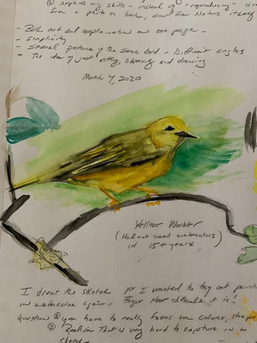
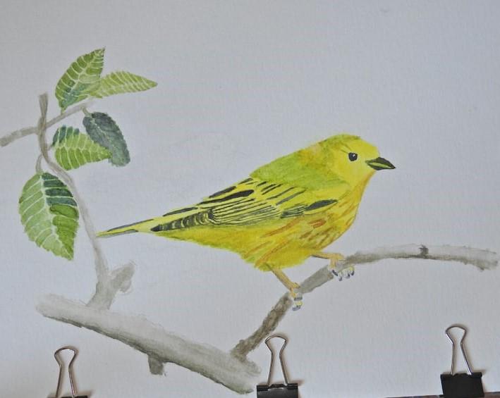
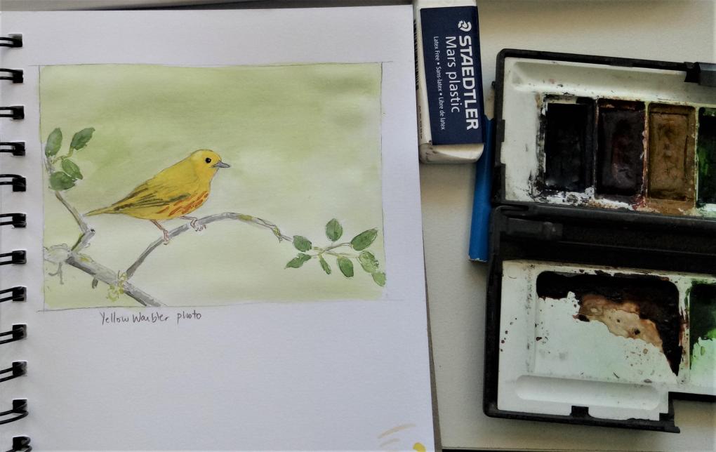
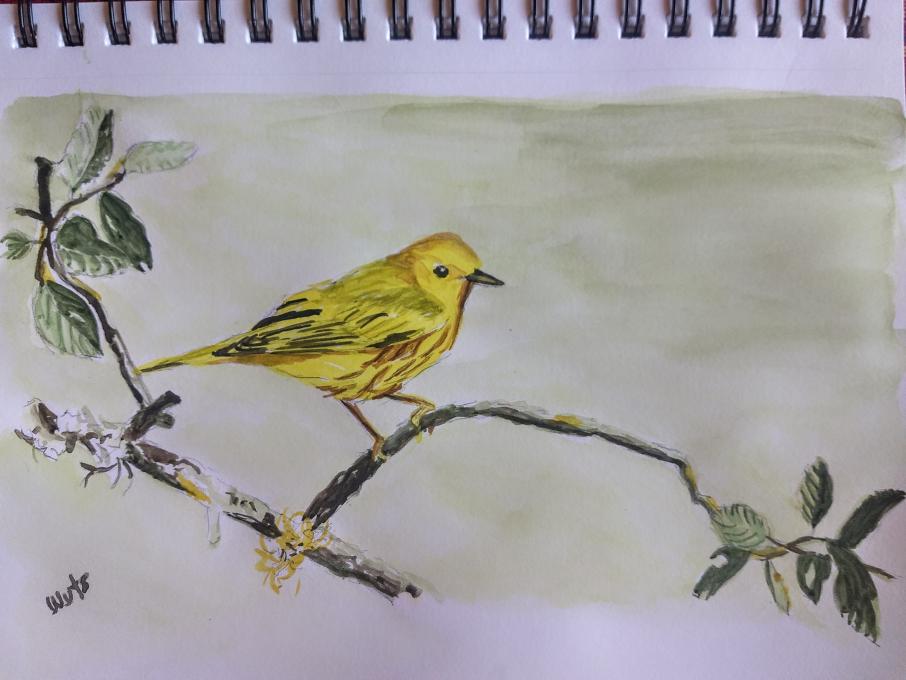
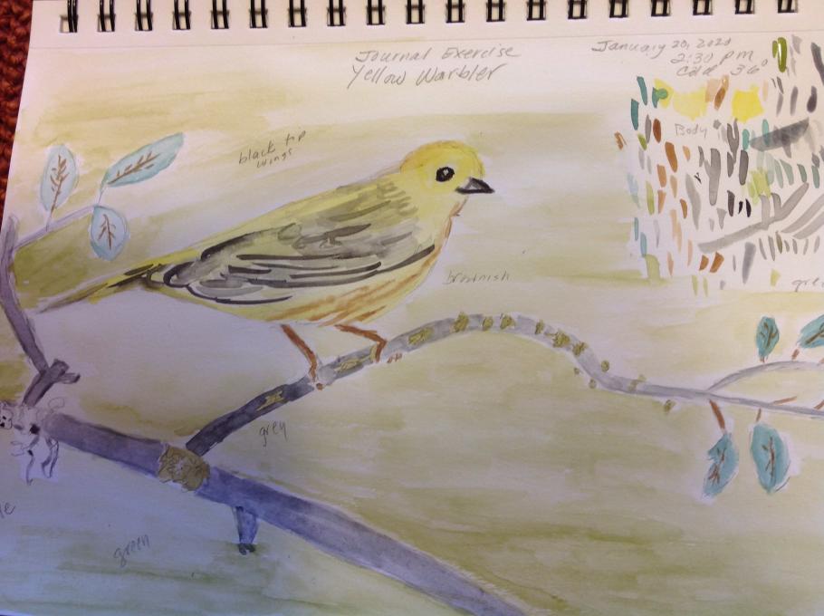
Here is my new yellow warbler. I used the three techniques of tint, tone, and shade to make the yellows and markings of the bird more nuanced. I used the same techniques with the branch as well. I never used white to tint before. I used to just add lots of water which sometimes washed out the color. Using white works very well. I used Payne's gray to tone and a color called ivory black to shade. I see improvements but still need to work at it. -- Trudy
-
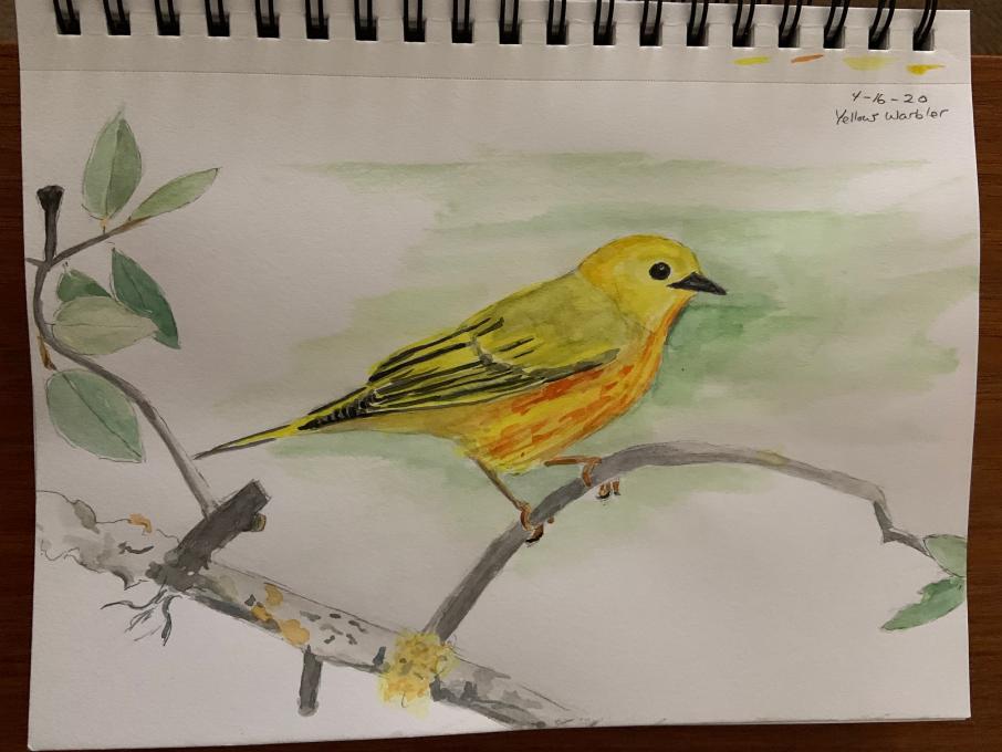
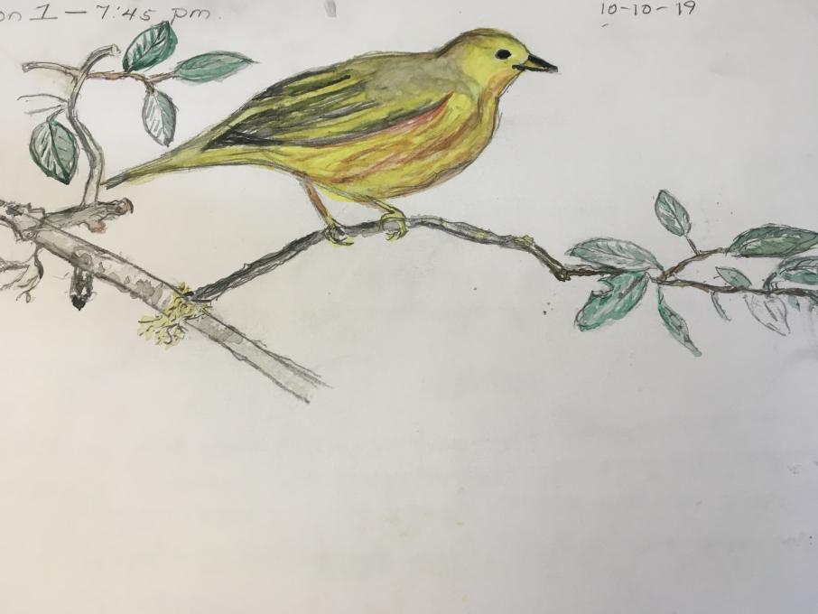
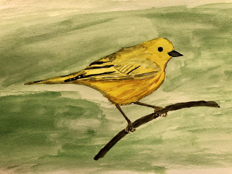
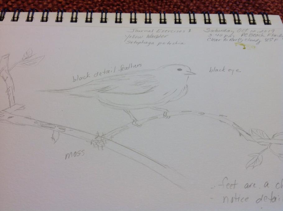
This is my second yellow warbler attempt that I used the watercolor on. I have never used the water brush before so IAm trying to get used to it . It was a medium brush. Perhaps a fine would be better for details. I used the contour lines in the drawing but when I tried the contour lines with the brush, I think my lines ran together and I wa not as pleased with the results as with the plain line drawing. More practice!!
-
I have come a long way due to the instruction of this course. My first try looked cartoonish, while my second drawing looks more like a real bird. I’m trying to get proportions close and shadows too. It was a super fun class, thanks Liz!
-
Really great!
-
-
-
Definately did get better!
-
Gah, totally impressed with your ability to capture the head partly turned. My efforts at that gesture failed, sigh.
-
-
I think that I improved on the sketching and definitely caught the green light through the foliage in the background better. Still can improve on the overall watercolour techniques.
-
I aplied the watercolor and the quick-draw. I still want to work with the watercolor.
-
I tried to apply all drawing and coloring techniques. I have seen huge improvements and will continue to practice what I have learned and review course content. I have thoroughly enjoyed this course!
-
-
This was a fantastic course. The drawing techniques, proportion measuring, and color mixing were so very helpful! Since it’s winter here and nature consisted mostly of snow and dried plant-life, I focused mostly on my drawing and watercolor skills. I'm looking forward to spring when I can get out and really observe nature. I can't wait to fill up my sketchbook with observations!
-
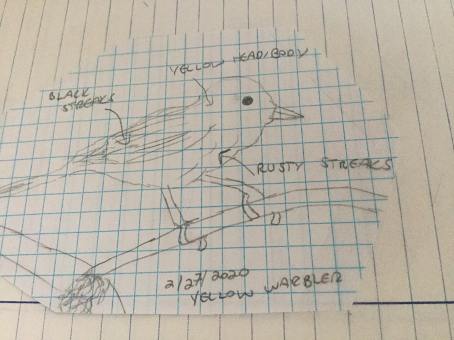
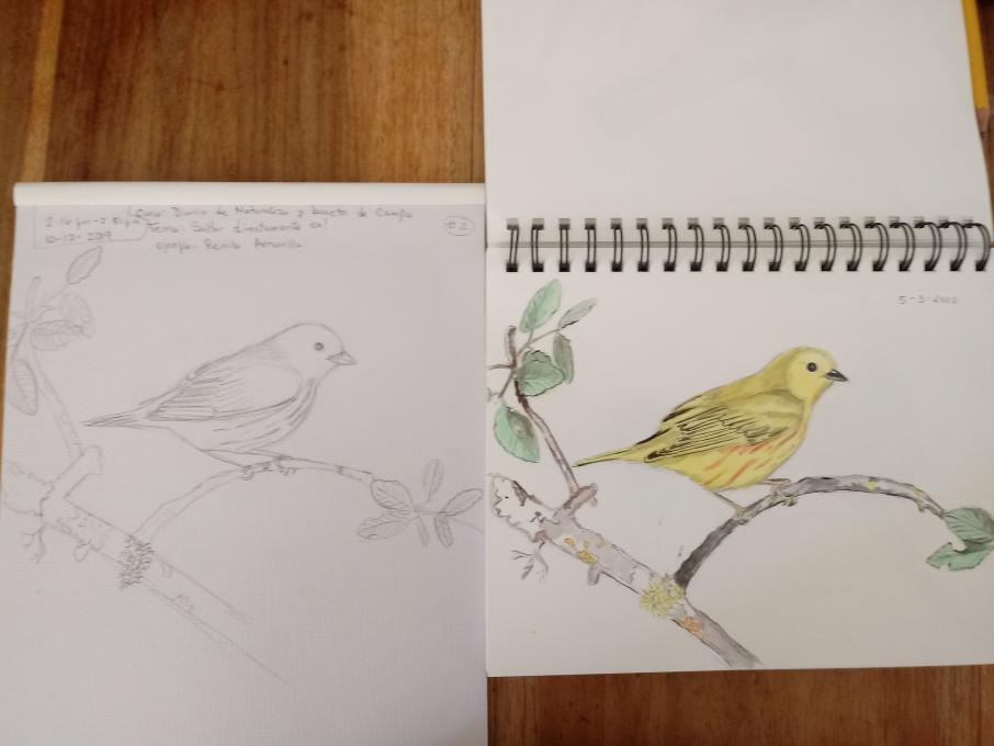
I think the proportions were a bit off on the first sketch. It came out squashed in the vertical. Because I planned on adding watercolor to the new piece, I used a 4H pencil and kept the lines light. Still not sure if I should have gone for the best pencil drawing I could muster, then add color. For this I tried to let the color define the bird rather than the drawing. I do need a fine point paint brush, for sure, but I think it came out nice.
-
In making the second drawing, I used negative space, proportions, shadow/depth, watercolor (mixing colors, glazing, dry on dry for detail and texture. I am pleased with the improvement in proportions and detail--I never even noticed the different layers and the arrangement of the feathers before. I still want to work on the detail if the bird. And, despite the improvement, it still looks very two-dimensional. But overall, I am really happy with my improvement.
-
I think there's quite a bit of good change there!
-
-
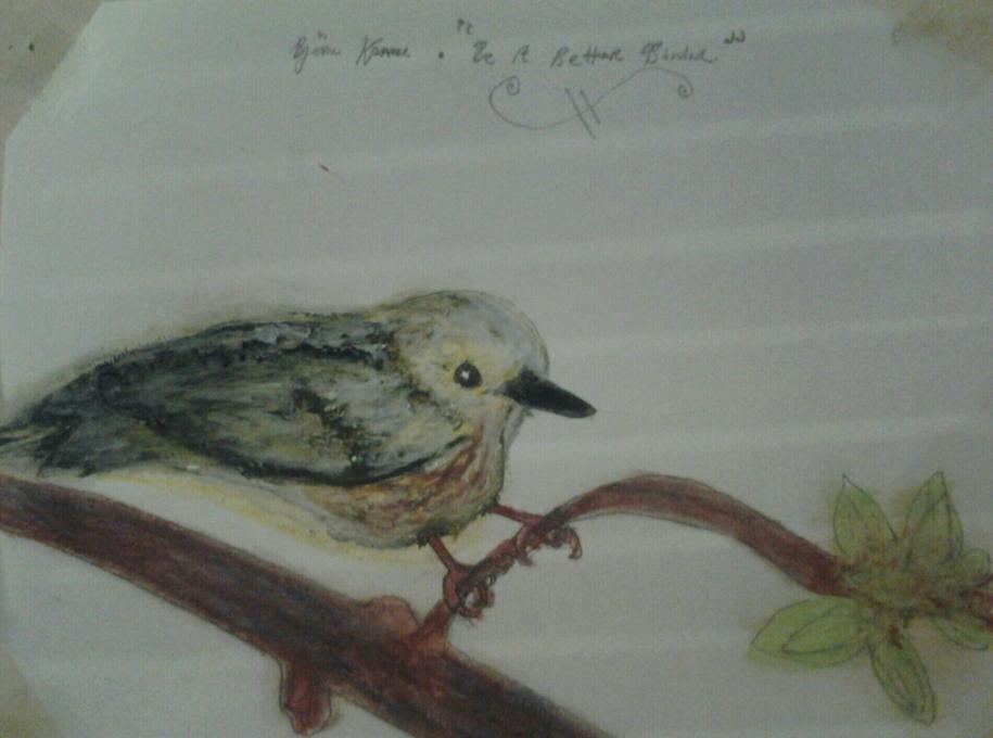
Have enjoyed the processes developed during the course. In addition. I feel as though course has vastly improved my knowledge of the various techniques, which has in turn allowed me to understand my previous drawing mistakes. I can see significant changes in both the form of the drawing and also the finished drawing. I feel a lot more confident in using colour and in mixing pen and watercolour to achieve the required effect in the drawing. But as can be seen some work still required on achieving the 3D effect especially, but other area's too.
-
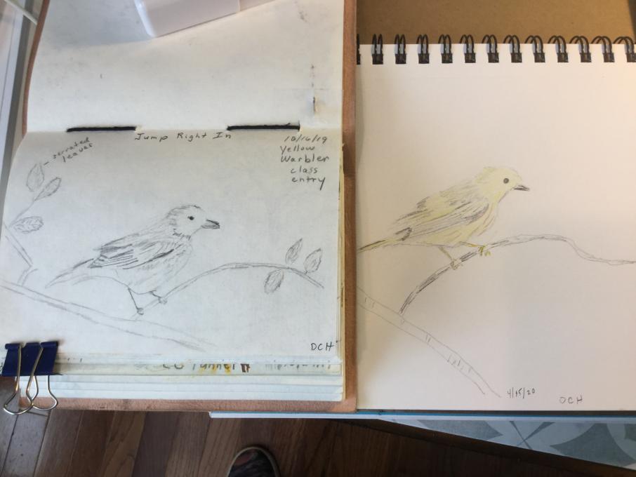
My before and after is right to left. It was easier to get the birds closer for the picture by laying them out backwards. I was able to apply scale/measurements. What a fantastic technique. I also applied negative space, especially between the legs.While not great, my first bird looks more cartoonish...a cute cartoon, but not proportional or close to the real thing. My second image looks more like the reference. It looks like a yellow warbler. The first one looks like a generic cartoon bird. I'm going to go back into the latest one and finish it, but thought the comparison worked now because it's a line drawing like the first one and easier to see the differences. I feel good about the sketch. I think I could go back in an increase values with confidence. I really need to work on watercolor technique. It was fun doing the washes and techniques, but when I tried to apply it to my work, I struggled with details. I
-
-
I enjoyed this class and would like more! I am still working on getting the colors right, but feeling confident with experimenting with the different combinations. It all requires a lot of practice. Thank you Liz for your expertise and demonstrating the act of patience.
 I tried to use most of my new learned techniques. Loved layering of colors, I spent a lot more time on the sketch itself, focusing on shapes, negative space, measuring to get proportions. I really struggled with the beak and eye, did not feel I got it correct. But happy with the rest of the drawing, better depth, color and value to my picture.
 Certainly no LCF but I feel pretty good about my progress in the course. Three months ago I had never held a watercolor brush in my hand so anything is progress! But I am feeling better about some of the color blends I am getting and I plan to keep sketching and painting. Thanks Liz!
 -
So I did the first one (on the left) back in December. The one on the right I did just now. There is certainly some progress. I am going to try the watercolor next, but I do struggle with that a lot. We shall see!
-
So I did the first one (on the left) back in December. The one on the right I did just now. There is certainly some progress. I am going to try the watercolor next, but I do struggle with that a lot. We shall see! 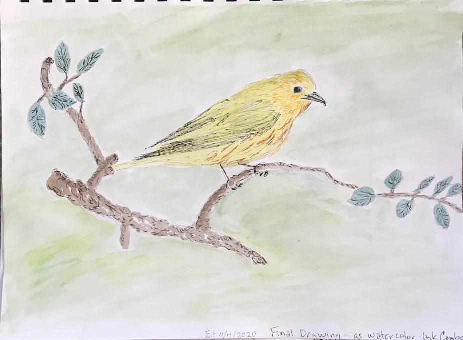
 I’m very happy with my progress. My sketch on the left was done with colored pencils. The one on the right was done with a pencil drawing on 130 lb. textured watercolor paper, and watercolors which I’ll tape onto a page in my mixed media Nature Journal. I used wet on wet for the background, wet on dry for most of the bird, and dry brush on details of the bird and branches/leaves. I’m really happy with creating a 3D feel to the bird using shades and highlights.
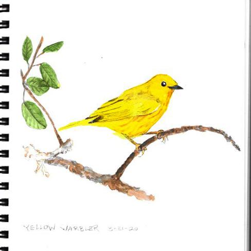
 I have come a long way due to the instruction of this course. My first try looked cartoonish, while my second drawing looks more like a real bird. I’m trying to get proportions close and shadows too. It was a super fun class, thanks Liz!
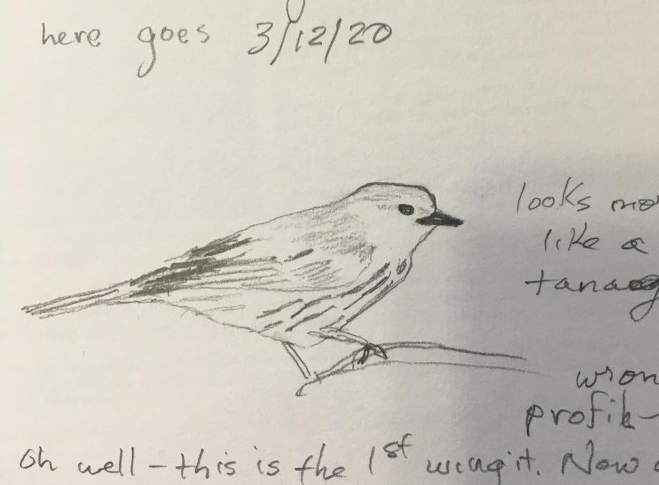
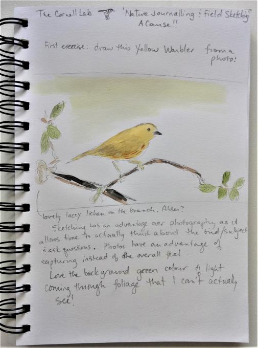 I think that I improved on the sketching and definitely caught the green light through the foliage in the background better. Still can improve on the overall watercolour techniques.
 In making the second drawing, I used negative space, proportions, shadow/depth, watercolor (mixing colors, glazing, dry on dry for detail and texture. I am pleased with the improvement in proportions and detail--I never even noticed the different layers and the arrangement of the feathers before. I still want to work on the detail if the bird. And, despite the improvement, it still looks very two-dimensional. But overall, I am really happy with my improvement.
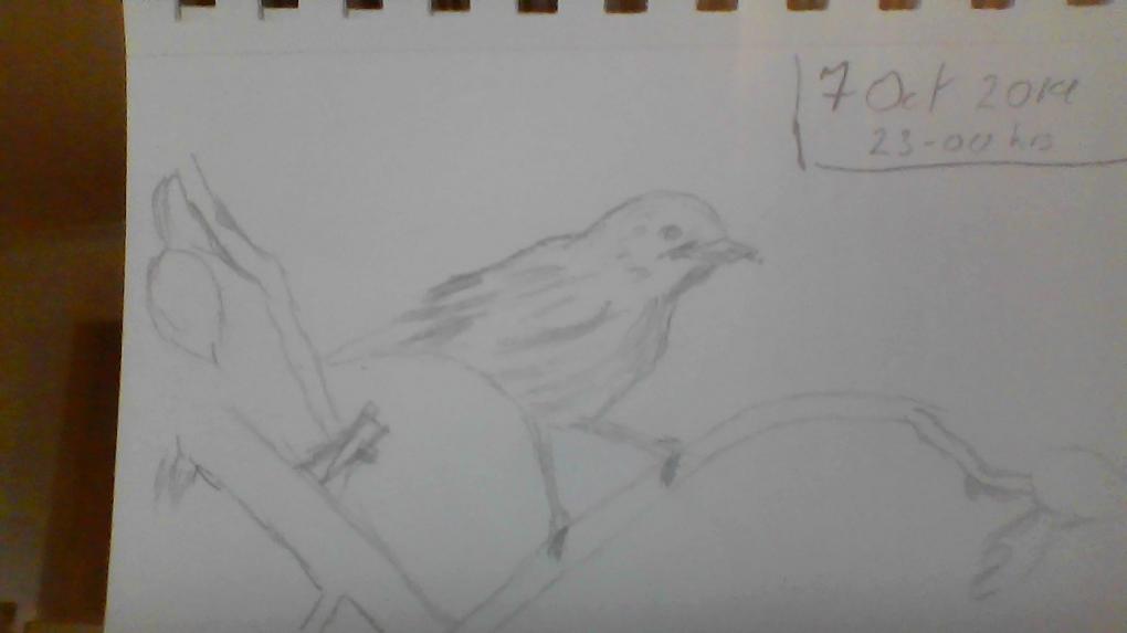

 I enjoyed this class and would like more! I am still working on getting the colors right, but feeling confident with experimenting with the different combinations. It all requires a lot of practice. Thank you Liz for your expertise and demonstrating the act of patience.
 Read More: