The Cornell Lab Bird Academy › Discussion Groups › Nature Journaling and Field Sketching › Illustrating the 3D World
-
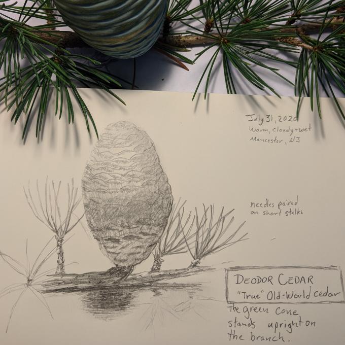
Since it's a rainy day, I chose to draw an exotic ornamental just outside my home. The intricate pattern of the scales and the harsh indoor lighting made it a bit more of a challenge.
 FYI: This tree holds a special place in my heart. The top is dead and makes a great perch for Merlins, Coopers Hawks and Great Horned Owls.
 -
I have really enjoyed my drawing practice, I usually work with colors not only in my paintings, but also in my Photography. Going back to the basics is like opening a window to when I was younger and I sketched everything I saw.


-
This is amazing!!
-
Wow!
-
-
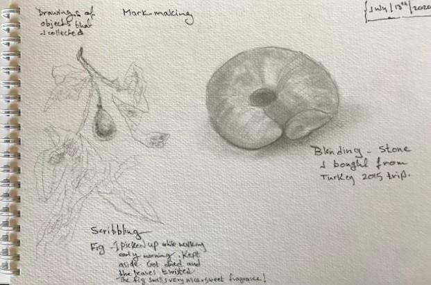
While looking at objects trying to capture each on 2-D paper, it was a bit challenging to decide which mark- making technique to choose. When the pencil touched the surface of the paper, it kind of depicted shapes and tones swiftly. I found it really nice to experience each technique by itself, then compare and contrast between drawings. It helped to draw after Liz to get a since of the techniques, looking at her drawing and then looking at mine, then work on a new drawing while putting techniques together. It was hard at the beginning. It took time. Yet, the result was rewarding. The stippling is the technique that needs more effort because the dots sometimes had a tail to it. Sometimes when lifting my pencil it sketched a mark showing a spot that looks like a tail to the dot.


-

 Really fun. Such a good teacher. I'm learning lots. Needing much more practice.
 -
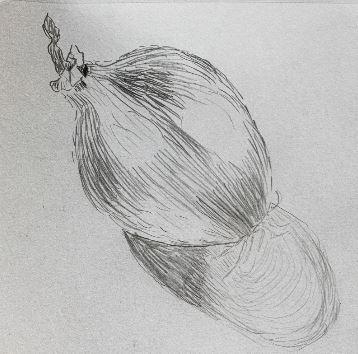
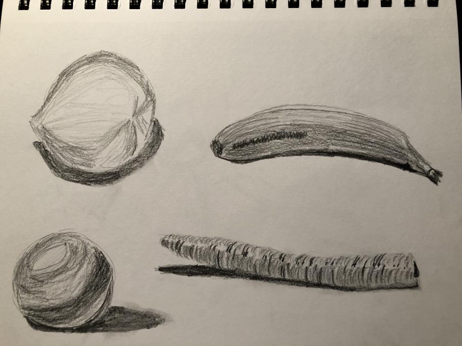
 Wonderful course, I'm learning a lot! In drawing this onion and pair of magnified coffee beans I too was chasing shadows (similar comments below). Not so easy to capture the chiaroscuro effect on the round onion... I'm pleased with how the drawings turned out all the same.
 -
I love your detail on the onion skin!
-
-
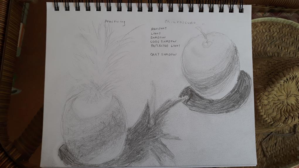
This is my first drawing course. These new drawing skills were helpful but challenging for me. They definitely made it easier and as a result I feel more comfortable. I would like to work on chiaroscuro & finding shadows. I found the pineapple very challenging to draw.
-

-

-
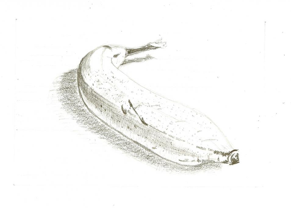
I like this banana! It has so much energy.
-
-
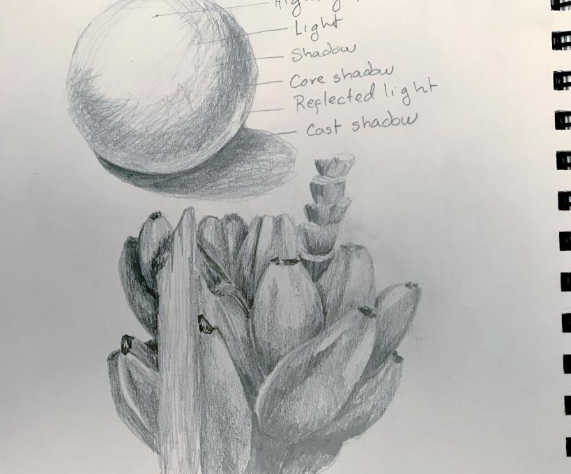
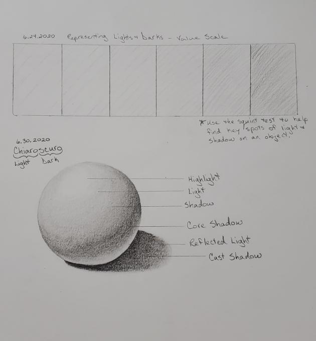
I actually found it relaxing drawing a 3D ball. I'm not new to art but it's still a good reminder to go back to the basics sometimes, I tend to forget about the reflected light.

-
I must confess that life got in the way of continuing with the course as I had planned, but cheers to coming back.
 Wanted to share a sketch of an egg from back in March. I remember feeling like I was improving and I am excited to continue to practice and actually take my journal out in nature. My journal is pristine and I've been nervous to break it in, but it is happening - taking it on my 3-day backpacking trip starting tomorrow! Nature sketches to come!
 -
I still want to work on everything! But I took my first-ever drawing class in the fall and was introduced to most of these concepts. So I was not completely uncomfortable or unfamiliar with them. My goal is 'not pathetic.'


-
I still struggle with value - my range seems to be medium dark to medium to medium light - I don't get the contrast I'm looking for.
-
-
I tried using the marks and very much enjoyed the exercise and it was fun to walk around looking for objects. I found it challenging to complete my drawing before the light changed. I realized I was chasing shadows a few times. I walked around the neighborhood squinting at everything, I looked like I needed a new pair of glasses. I took my glasses off and I get the natural blur so I can see the lights and darks without squinting. I just have draw blind! I need to work on seeing the shadows and getting the right proportions. Pat

-
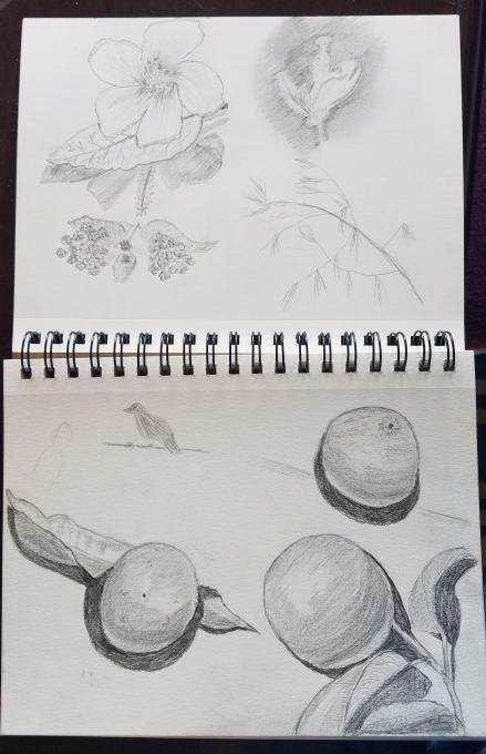
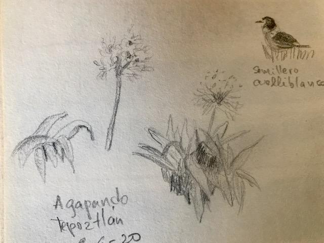
I found the techniques very helpful although I am working in a small scale which I imagine is easier. I have trouble with the squint test
 but I imagine it is a question of practice.
 -
Since we are limited to 3 images per reply, thought it would be better to share the ones I had issues with.
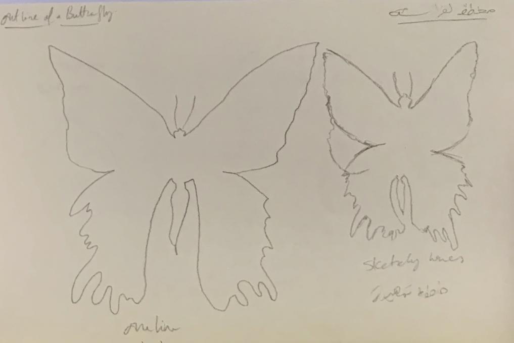
 Sketching with a continuous one line gave me a sense of confidence. On the other hand, the sketchy lines technique hindered me; the more I sketch a new line the more I hesitant in visualising the shape I wish to sketch. I faced this problem while outlining all of the subjects: the daisy, the acorn, the gingko and the butterfly. Have you faced the same issue, anyone?
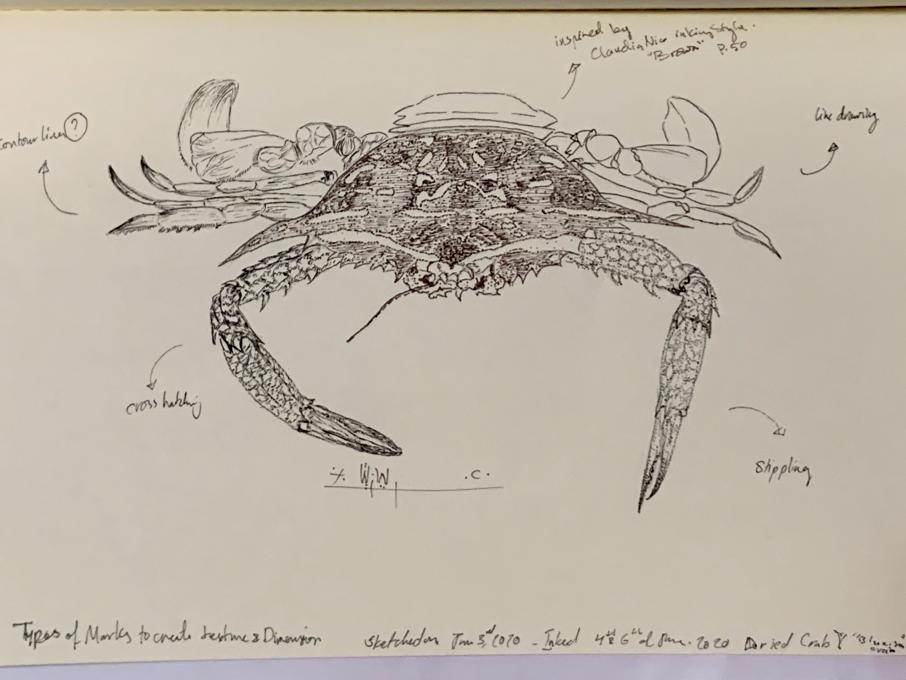
 With the type of marks in sketching -- I sketched a blue sea crab; luckily, I found a dried one. I divided it into 5 parts to experiment with the marks ' types. I'm sharing the result with you. I'm not sure if I did well with the marks -- I tend to use tinny tip of the fine-liner pens; 0.05 and 0.1. Perhaps I need to try and sketch with a thicker pens/pencils to see the difference.
 This is my attempt to try and look at the shades of a subject. I tried with this shell; Ancilla Glabrata. I used an artificial source of light instead of the sunlight - this shouldn't affect the result much but looking at the final result, I think if I was after the shades, then I should have tried to sketch it with one pencil colour.
-
My continuous line outlines came out better than my sketch line outlines. One line looks much more confident but requires careful observation.
-
I like to use the scribble and spotting technique. The blending technique is what I probably use most. I find the crosshatching the most difficult to achieve what I want.

-
I enjoy sketching and the lesson on contour and shading was very helpful to me. The 3D part of it will take me quite a bit more time to learn.


-
Having never taken a drawing course, I've never actually learned any of the techniques in the "Making Your Mark" lesson set. I found, however, that I remembered hearing many of my watercolor mentors talk about stippling, hatching, blending, and the like, when referring to the consideration 0f value as a means of infusing light into a painting. I'm now feeling a little more comfortable with using value observations and techniques to help make a shape seem to be 3-dimensional.
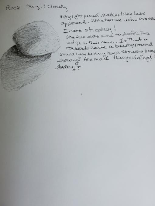
 I started with "Drawing Basics" on February 23rd, after posting my Yellow Warbler entry, did a bit more on the 26th, then didn't return to finish the lesson set until May 20th. Now it's already June 2nd and I'm only just posting this entry. I tried to apply the techniques of hatching and stippling recently, when I was drawing some rocks. It takes SSSsssooo... long to draw a rock as a sketch the size of a postage stamp on paper. I really do KNOW that practice makes perfect, and that I should practice every day. In real life, though, it's not possible - especially not in the current state of world affairs, when I find myself practicing child care all over again with my grandson, while his parents are telecommuting because of the COVID 19 pandemic.
 -
I feel pretty good sketching, I tend to use multiple textures and finish up with blending. I could still use the pencil more and make hard lines.


-
I’m starting to feel a little more confortable with lights and shadows without color. I still think my drawings are too light.

-
I really like the stippling and blending but my son likes to use cross-hatching and contour hatching and we're both enjoying practicing the new techniques together!


-
The more time I spent the more I began to see how to use the different marks. As in the last assignment, I began to see the differences in values as I drew...training my eyes I guess. One of the most helpful ideas was how to use the "flower" dots to apply stippling...thanks for that!

-

-
After six months (!) of neglecting this class, I decided to get back to work. I've been having a great time today picking it back up, and am pretty happy with the results. I think I need confidence in making darker marks, and just overall practicing for confidence. I couldn't resist adding color and ink to this one, where I was practicing values.
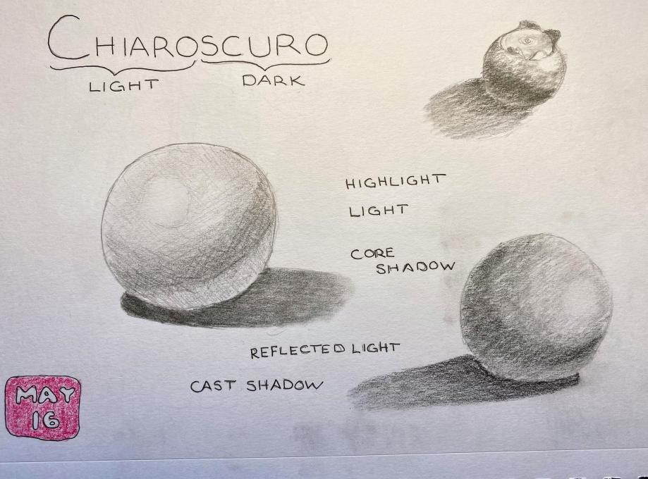
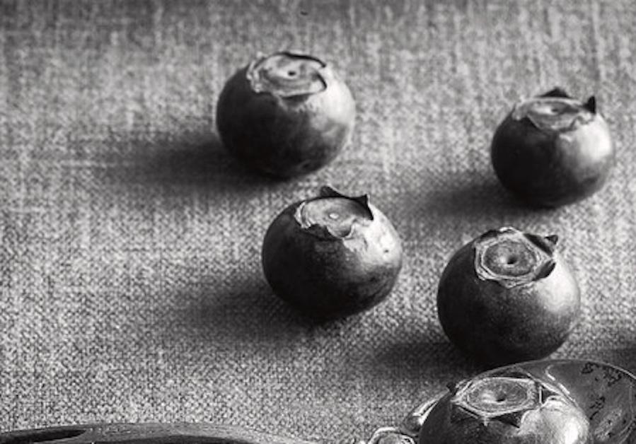
 Chiaroscuro is tricky! By the time I got to the blueberry, I think I was starting to get the hang of it. I found a good black & white photo with strong shadows to use for practice.


-
Hi Anne. Your blueberries are gorgeous and the use of chiaroscuro in it makes them leap off the page. It took me a long time to practice as well with the darker lines to get comfortable. You’re right about it being tricky.
-
@Colleen This is something that will require continued practice. Moving on to something that isn't round is a bit intimidating to me!
-
Anne, I like that you made a diagram of Chiaroscuro. I think that will be helpful for me too. I am excited to move on but I think some more time with this lesson will help in the long run
-
@Deb Thanks Deb! I'm hoping to get out into my yard to practice this in a natural setting. Definitely a skill that will take a lot of practice!
-
-
 I had to laugh when my husband told me my eggshells looked like hamburgers. I experimented several more times, but have not quite mastered (well, not even close!) the values that make such a difference in definition for sketches. I know what I need to do, but can't quite meet the goal yet. I'll keep the lessons learned in this section as I go along.
Read More:
 FYI: This tree holds a special place in my heart. The top is dead and makes a great perch for Merlins, Coopers Hawks and Great Horned Owls.
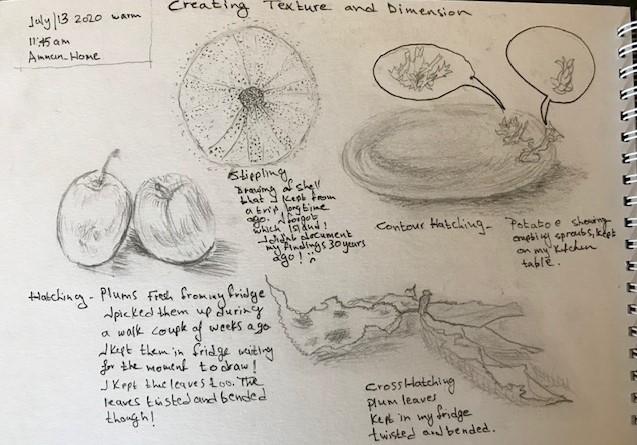
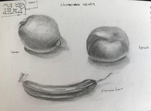
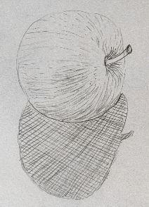 Really fun. Such a good teacher. I'm learning lots. Needing much more practice.
 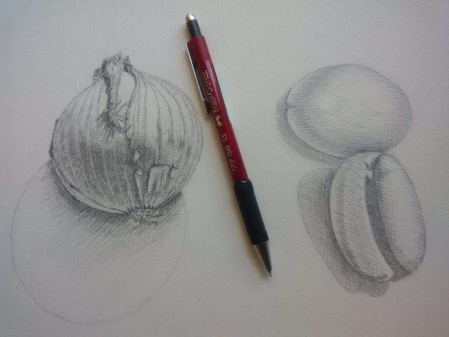 Wonderful course, I'm learning a lot! In drawing this onion and pair of magnified coffee beans I too was chasing shadows (similar comments below). Not so easy to capture the chiaroscuro effect on the round onion... I'm pleased with how the drawings turned out all the same.
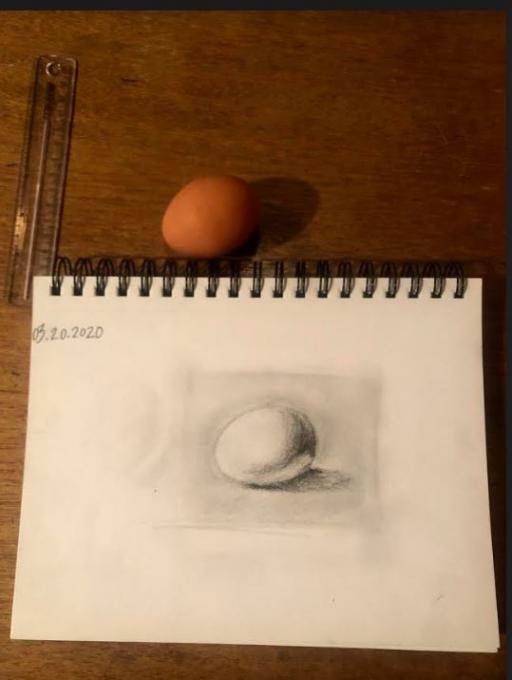 Wanted to share a sketch of an egg from back in March. I remember feeling like I was improving and I am excited to continue to practice and actually take my journal out in nature. My journal is pristine and I've been nervous to break it in, but it is happening - taking it on my 3-day backpacking trip starting tomorrow! Nature sketches to come!
 but I imagine it is a question of practice.
  Sketching with a continuous one line gave me a sense of confidence. On the other hand, the sketchy lines technique hindered me; the more I sketch a new line the more I hesitant in visualising the shape I wish to sketch. I faced this problem while outlining all of the subjects: the daisy, the acorn, the gingko and the butterfly. Have you faced the same issue, anyone?
 With the type of marks in sketching -- I sketched a blue sea crab; luckily, I found a dried one. I divided it into 5 parts to experiment with the marks ' types. I'm sharing the result with you. I'm not sure if I did well with the marks -- I tend to use tinny tip of the fine-liner pens; 0.05 and 0.1. Perhaps I need to try and sketch with a thicker pens/pencils to see the difference.
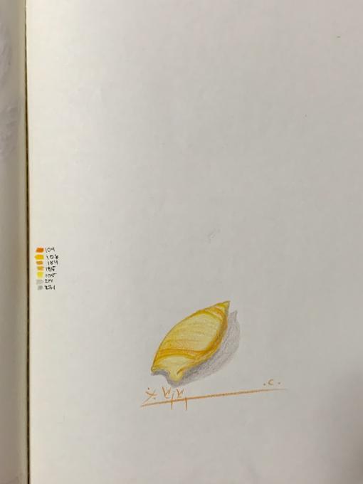 This is my attempt to try and look at the shades of a subject. I tried with this shell; Ancilla Glabrata. I used an artificial source of light instead of the sunlight - this shouldn't affect the result much but looking at the final result, I think if I was after the shades, then I should have tried to sketch it with one pencil colour.
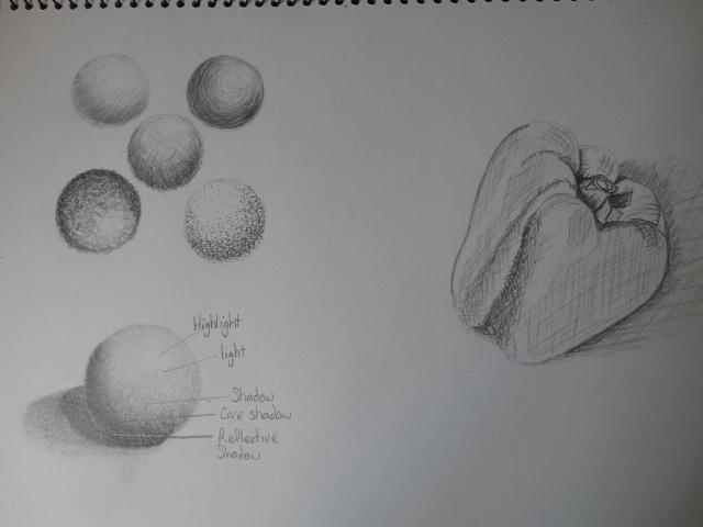
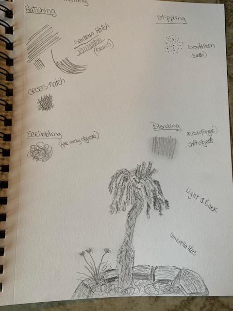
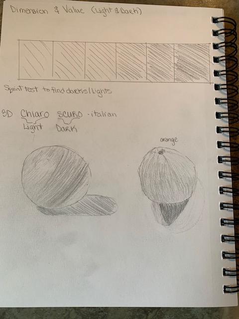
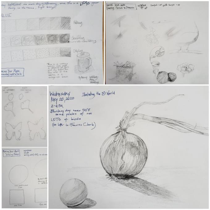 I started with "Drawing Basics" on February 23rd, after posting my Yellow Warbler entry, did a bit more on the 26th, then didn't return to finish the lesson set until May 20th. Now it's already June 2nd and I'm only just posting this entry. I tried to apply the techniques of hatching and stippling recently, when I was drawing some rocks. It takes SSSsssooo... long to draw a rock as a sketch the size of a postage stamp on paper. I really do KNOW that practice makes perfect, and that I should practice every day. In real life, though, it's not possible - especially not in the current state of world affairs, when I find myself practicing child care all over again with my grandson, while his parents are telecommuting because of the COVID 19 pandemic.
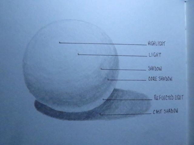
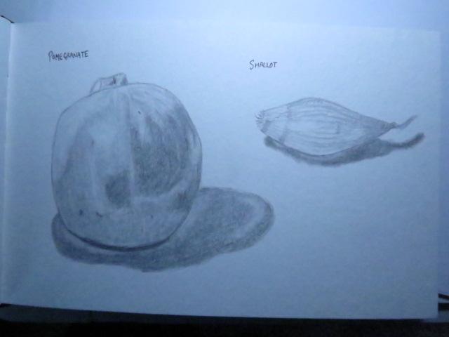
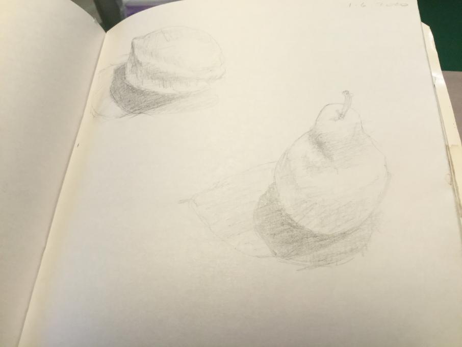
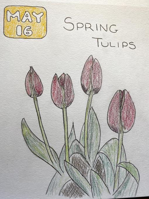 Chiaroscuro is tricky! By the time I got to the blueberry, I think I was starting to get the hang of it. I found a good black & white photo with strong shadows to use for practice.
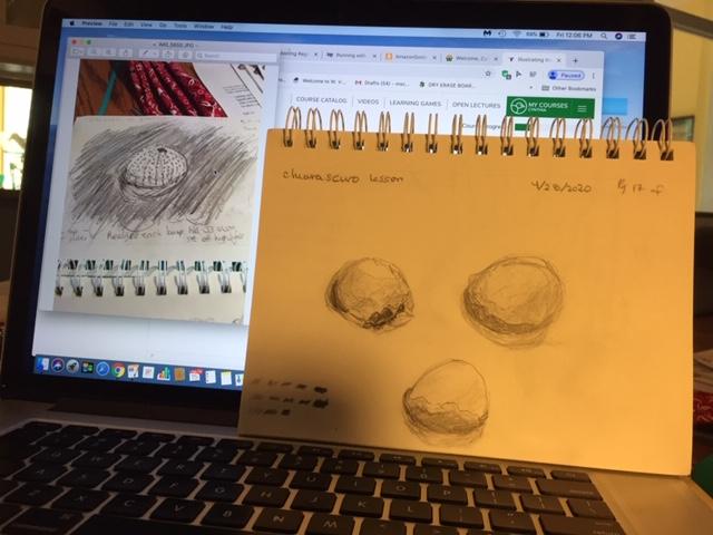 I had to laugh when my husband told me my eggshells looked like hamburgers. I experimented several more times, but have not quite mastered (well, not even close!) the values that make such a difference in definition for sketches. I know what I need to do, but can't quite meet the goal yet. I'll keep the lessons learned in this section as I go along.