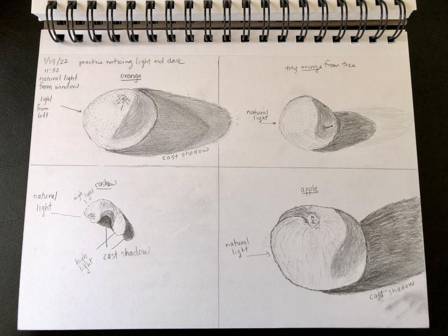
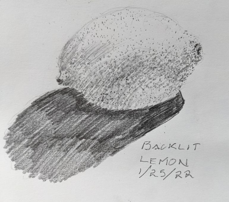
The Cornell Lab Bird Academy › Discussion Groups › Nature Journaling and Field Sketching › Illustrating the 3D World
-

-
I chose to represent the curious Citrus medica var. sarcodactylis, or the fingered citron.
The mark making techniques I used are top row from left to right: outline, side shading, contour shading; mid row left to right: cross hatching , watercolor pencils, stippling; bottom row left to right: scribbling, blending, side shading. Perhaps my outline drawing would have been better without the horizontal lines. I think I need to work on the contour shading because there are areas where I overlap lines and get crosshatching. And my cross hatching is never just bidirectional rather diverse. I like how blending using a blending stump turned out. I was taught never to use this technique in school, but it is described as a technique used by scientific illustrators in the Guild Handbook of Scientific Illustration! So I guess I will be blending away in the future. As always, I am pleased with the Faber-Castell Albrecht Dürer Watercolor Pencils. If there is lack of detail it is due to the brush I used. All in all, an interesting exercise and I look forward to the next one! -
-
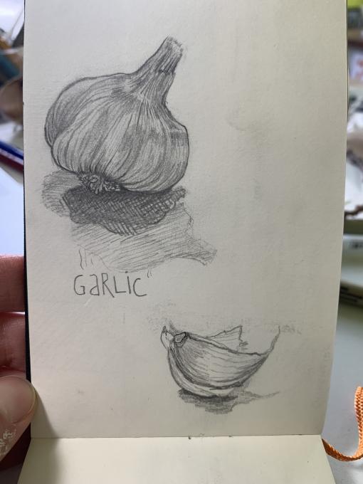
Feeling somewhat more confident, but there is still a lot of practice in my future. I am enjoying what I am learning in this course.
-
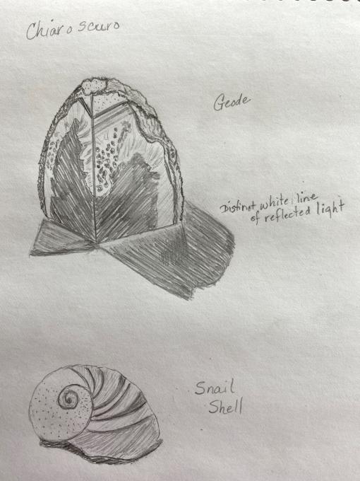
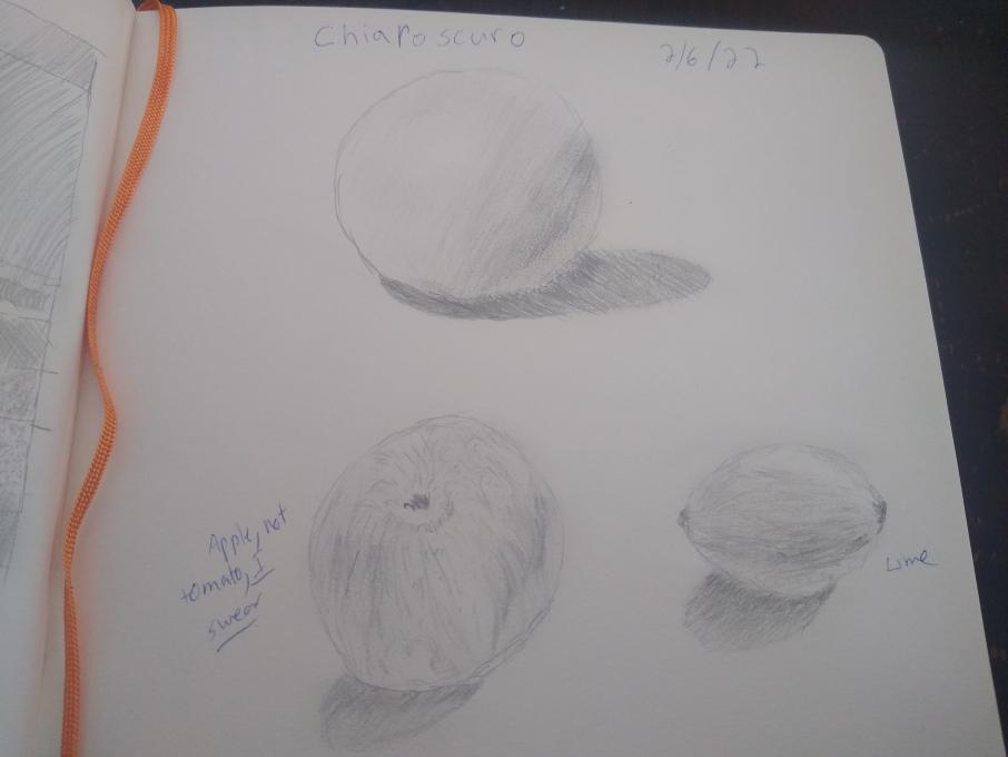
trying out the chiaroscuro technique, biggest challenge is getting the light parts to blend with dark parts. -
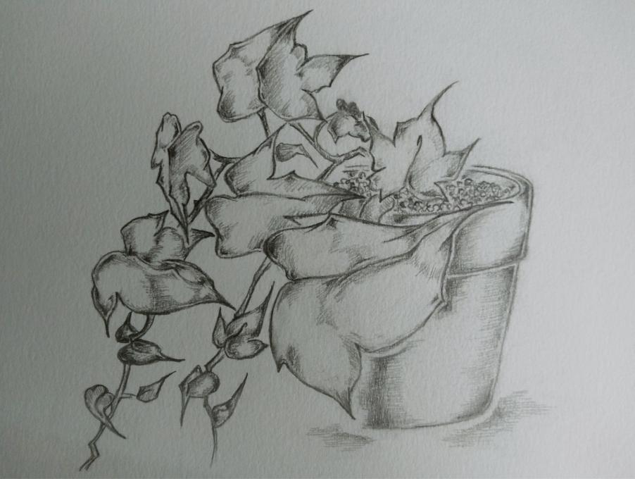
I tried to draw an orchid in a pot using the markings to create some three-dimensionality. It was not a roaring success, but that was before I listened to the chiaroscuro lesson, which made sense of the marks for me. Now I can see how to work with the hatchings, scribbles, etc. to create depth. BTW, can anyone tell me how to get my photos from my google phone transferred here? I'm android, not Mac.
-
On my phone, I just email them to myself , then go to my computer and open my email to down load the image!
-
-
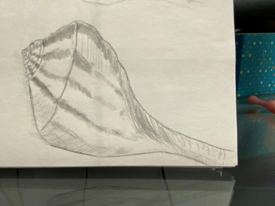
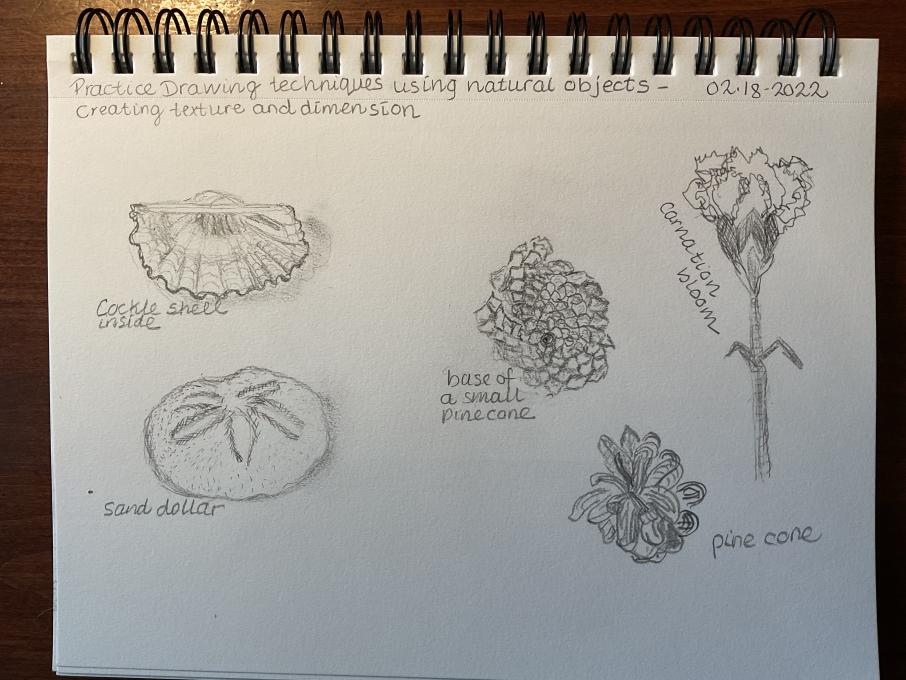
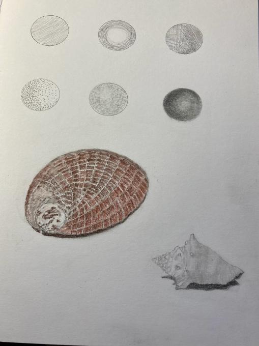
I think I picked some difficult subjects for this task, but I love my collection of seashells and want to be able to sketch them a lot better. I had difficulty trying to depict the texture lines while also trying to use the hatching and dots to depict shadows.
-
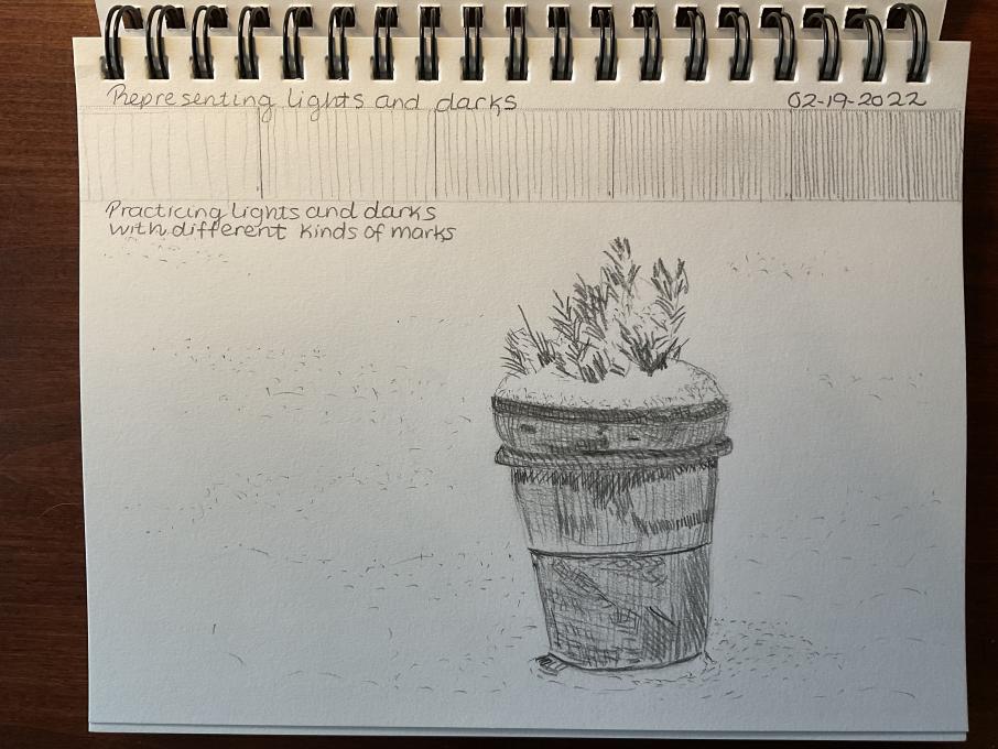
I'm getting more familiar with putting marks on my pictures. However, I'm still not very good at creating the 3D vision. -
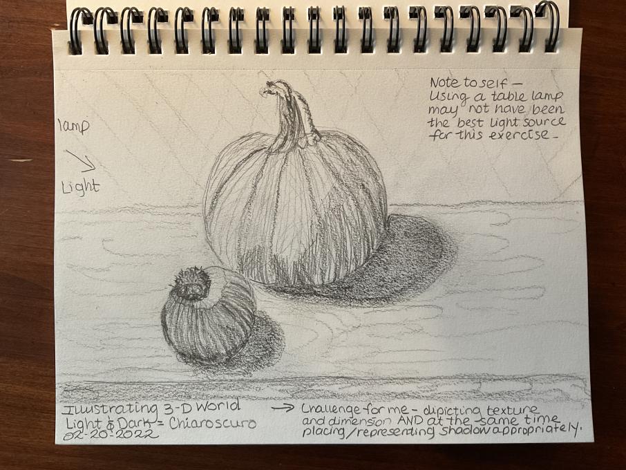
I feel most comfortable with depiction texture and dimension, however, placement of shadows on the object and at the base of the object need more practice. Study of light source and effect on subject matter will help with my drawing and my photography skill understanding and application.
-
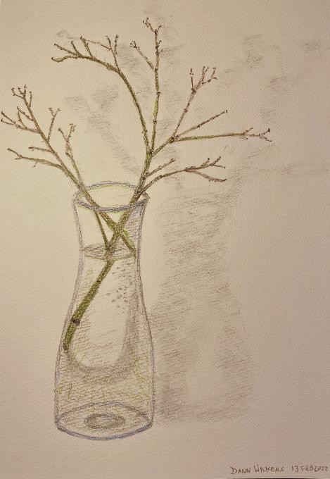
Japanese Maple Twigs -
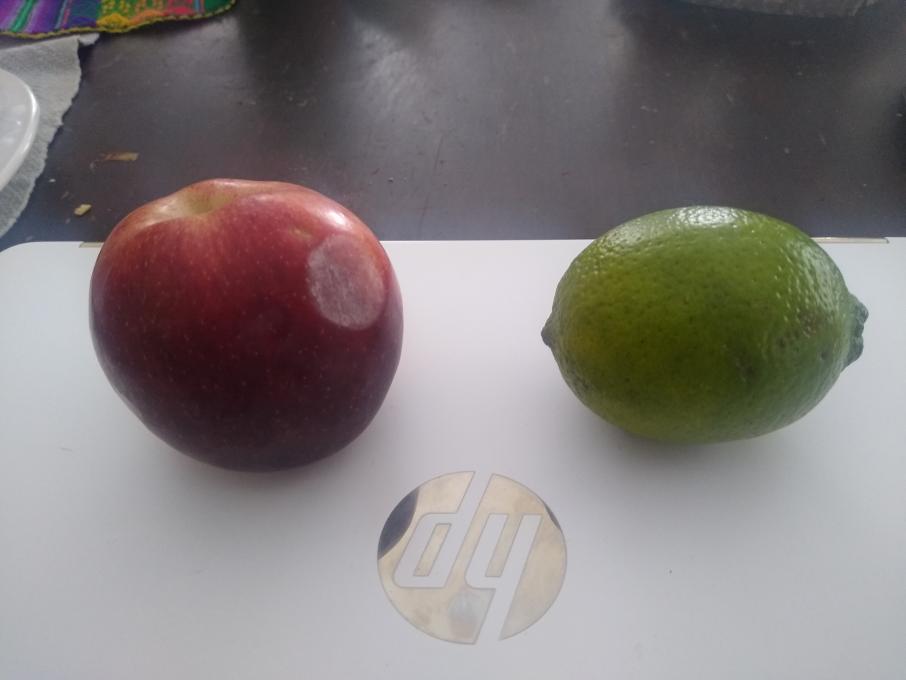
I am starting to feel more comfortable, and I'm certainly starting to see where all the different techniques can be applied. For the chiaroscuro lesson, I started with an apple. It was tricky because (in addition to me being a beginner) the apple had a variety of light and dark colors independent of the amount and direction of light falling on it. My wife suggested a lime, and I think that came out better. With the apple, I used a lot of contour hatching to try to get the indentation where the stem was that then shifted to the overall round shape of the apple. I tried to use some scribbling for the area around the light part on the bottom left of the apple. With the lime, I started with contour hatching, didn't like it, and then switched to regular/straight hatching. I figured if it worked to show the roundness of the ball, it could work for the lime as well. I liked the overall effect. I did some scribbling at the ends to get the hard/dark parts. I also tried a few circles to get the dimples, but that didn't seem to work very well. I used blending to obscure these...somewhat. I liked using hatching for the shadow, blending it, then adding more hatching. The blending helped smooth out the value shift from the darkest to the lightest parts of the shadows, and it softened the shadows' edges.
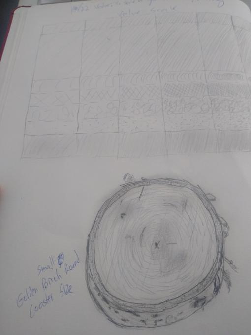
For this birch round, I used a lot of contour hatching for the growth rings. I tried to overlay that with straight hatching to show the straight grooves left by the chainsaw. I used stippling for some holes I noticed in the outer dark layer of the wood. Scribbling seemed to work well to create the lenticels in the outer bark, and a little contour hatching helped with the curls of bark spiraling every-which-way around the edges. A little blending of denser hatching at the various dark spots on the surface seemed to help with the value difference in parts of the wood. I'm guessing these were formed by slight burning from the friction of the chainsaw when I cut the round.
-
- Trying to put in practice several `hatchings´ for this drawing, but when I took the draw´s photo, lights and shadows appears in the opposite distribution as you can appreciate.- I hope next time.
- Trying to put in practice several `hatchings´ for this drawing, but when I took the draw´s photo, lights and shadows appears in the opposite distribution as you can appreciate.- I hope next time.
-
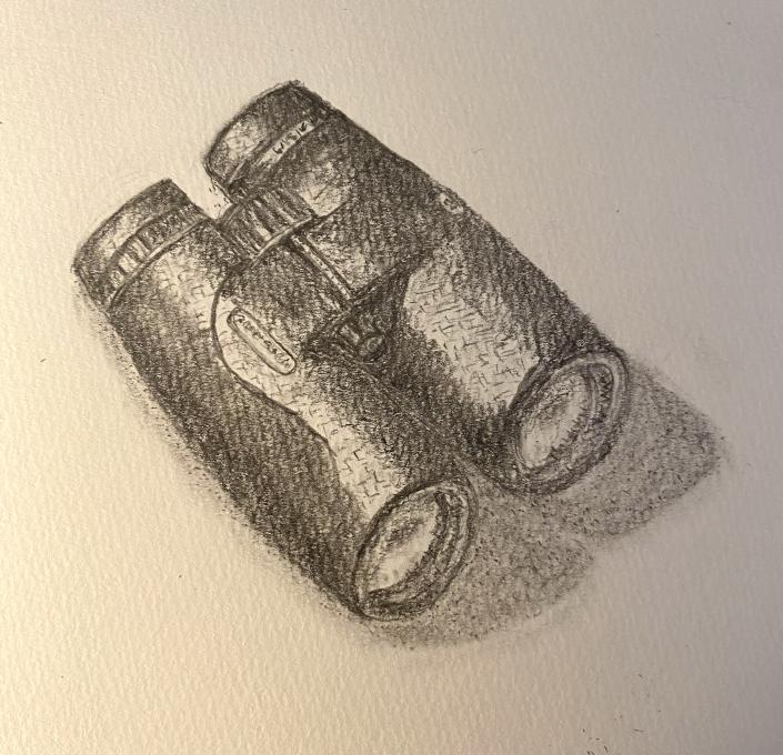
My Binoculars -
-
-
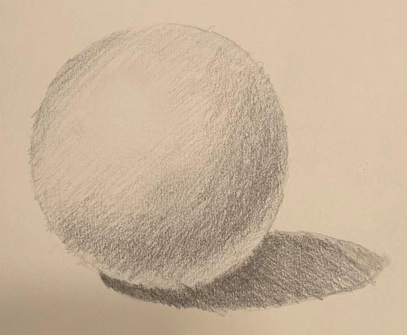
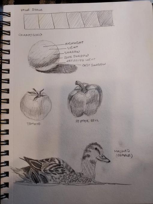
I used a combination of stippling and hatching to attempt this value exercise. The most challenging thing for me is achieving the transitions between the values. This drawing probably would have been more successful if I had stuck with just stippling. -
When I drew textured objects with light shadow contrast - I became so preoccupied with the form and light shadow that I forgot to try out the various types of shading -
While in general it was easy to see where some of these techniques would be applied, I wouldn’t say it is really apparent to me when I am looking at things. How to decide which of the shading techniques to use in which situations isn’t particularly clear yet….but I am totally new at this! Rebekah Hamilton
-
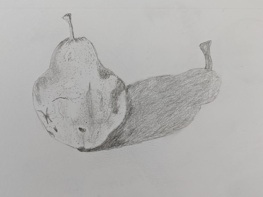
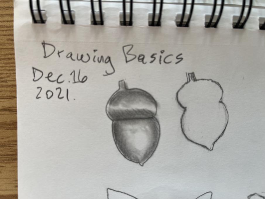
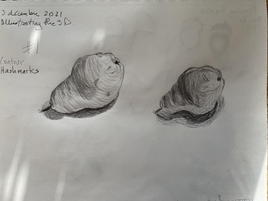
I enjoyed practicing 3D techniques. Happy with my acorn by blending with the stump. The pear was not as convincing. I used contour hashmarking for the pear and crosshatching for the shadow. Tempted to finish with the stump but I was hoping to get an effective hashmark
-
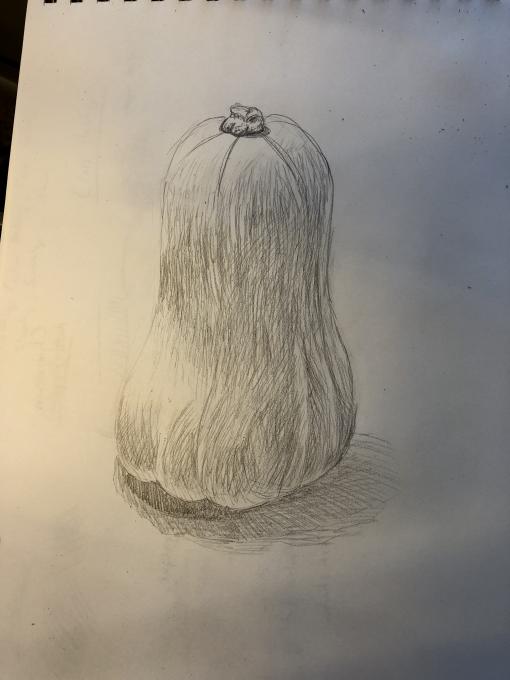
I think I need to work on contrast and values the most at this point. The chiarosco, while interesting, doesn't seem like it would be applied a whole lot to field sketching moving objects. I realized while doing this squash that my lighting is not the most desirable. I have three bulbs in cages that each act as their own light source and cast their own shadows.
-
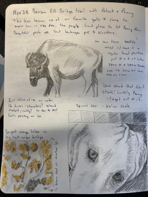
I am starting to see better how to use different kinds of marks to make the kinds of textures that I see. It was fun to scribble on the top of the bison head to make the curly hair.
I don't think I was quite able to capture the texture of the lichen that I was going for. Perhaps zooming in even more would be more effective.
It is still difficult to get the values input correctly on something that is unevenly lit like the dog close-up at the bottom.
I want to work on using the squint to get the values more accurate. When I can get them right I feel like the image is most successful. -
-
Nicely done! Your dark and light values are excellent.
-
-
This is hard but I'm enjoying the journey and playing around with the techniques
-
It's not easy, but with practice everything is possible. I tried to draww a mallard, because I´ve seen many of those lately.
-
This was great practice and now that it's on the screen I see a lot of areas that need more attention. The crosshatching, which I played with a little here, is super tricky and I'd really like to figure out how to use it well.
-
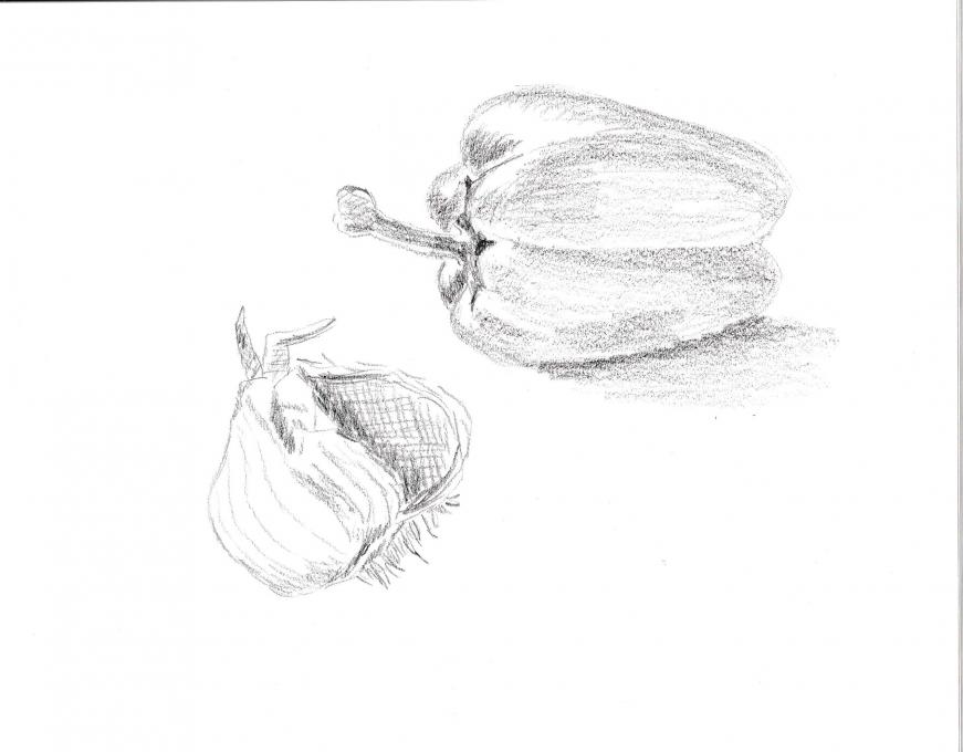
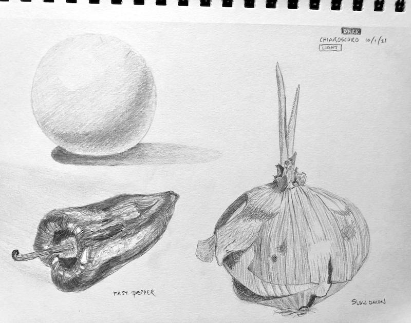
These look great to me. You have really done a good job capturing the texture of the veg. You can really feel the smooth shininess of the pepper and the dry papery onion.
-
 Feeling somewhat more confident, but there is still a lot of practice in my future. I am enjoying what I am learning in this course.
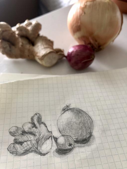
 I am starting to see better how to use different kinds of marks to make the kinds of textures that I see. It was fun to scribble on the top of the bison head to make the curly hair.
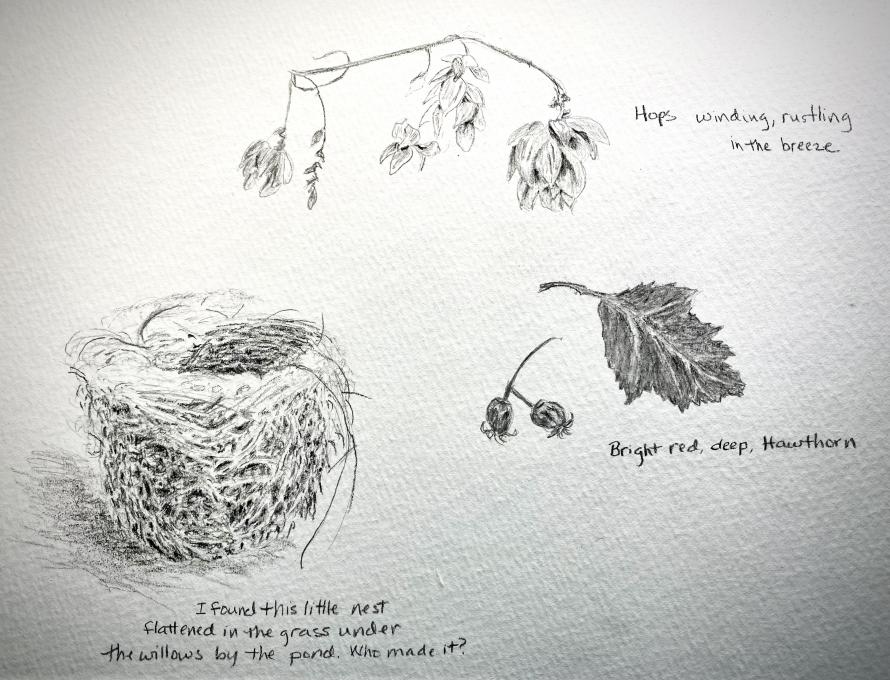
Read More: