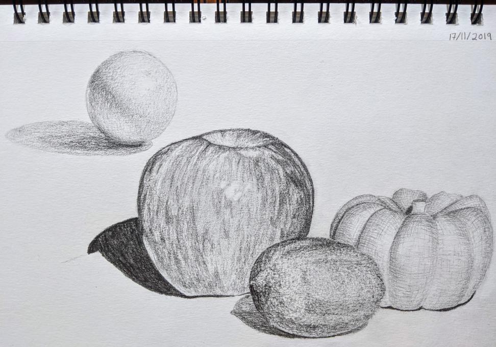
I tried to use a different style of shading for the sphere, the apple, the lemon and the miniature pumpkin to varying degrees of success. I most enjoyed stippling the lemon, which felt almost meditative after a time, though I fear the outcome looks rather more like a kiwi fruit in texture. I struggled most with miniature pumpkin and couldn't get the combination of cross hatching and contouring to work, which was frustrating.
1. How did you feel about drawing from the photo? What came easily and what was challenging?
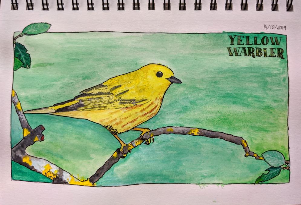
I have drawn from photos before and found I made my customary mistakes of making the feet and head too large and consequently spent far too long reworking the image, a luxury I would not have had I been drawing from life. I’ve never added ink or watercolour to a drawing before, and I found that far more challenging than I’d anticipated. I couldn’t create the colours I wanted, I lost all my details and shading and struggled to embrace the free-flowing nature of watercolours. The end result feels both garish and flat - room for improvement!
2. Was there anything in the photo that you might not have noticed if you weren’t asked to draw it? Would this make a difference when nature journaling?
I almost certainly would not have noticed the details of the branches or those of the primaries and secondaries or the olive-grey hues of the mantle.