The Cornell Lab Bird Academy › Discussion Groups › Nature Journaling and Field Sketching › Capturing Nature’s Color Palettes
-
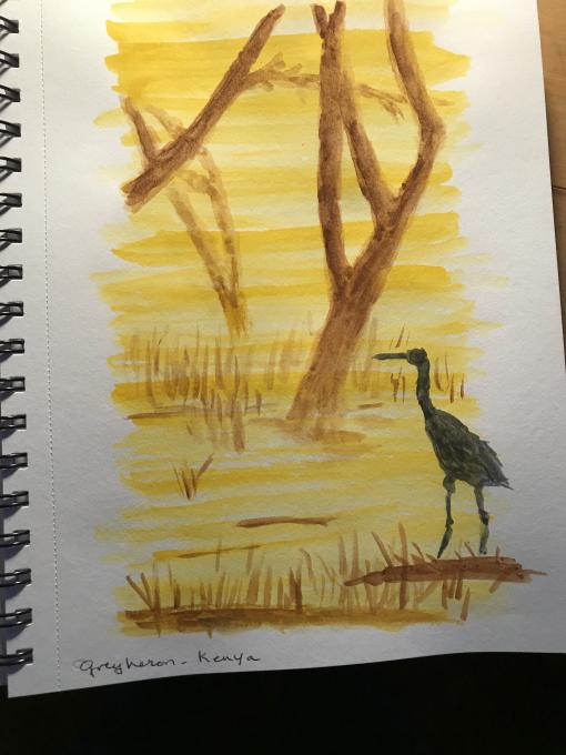
This was a new experience for me. It was delightful . I have felt like a fish out of water where color is concerned. I wear almost all blue clothes, my home is painted in all cream. So this exercise had me in uncharted territory and I loved it. All kinds of patterns and discoveries revealed themselves. I could have been mixing and fooling around forever, but need to stop for now. I would love to put in my images but failed at the drop and drag thing . The mountain scene was so complicated I had to break through fear to do it. The bird fell more into my comfort zone. I experimented with adding white or black to get the exact shade I was looking for. Thank you to Liz for the course and to all you participants who I also learn from. Marilyn
-
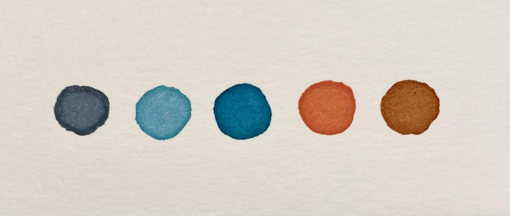
 I studied watercolor in art school and use it frequently in my work;however I still keep learning new things every time and also when I take a course like this one. I stalled on this exercise because I really did not want to do it because it was something I had done so many times in beginning classes. I marvel at how precise everyone else made perfect circles etc to put their paint test colors in but I wanted to just "jump right in". So here it is... on to the next step.
 -
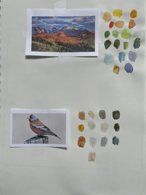
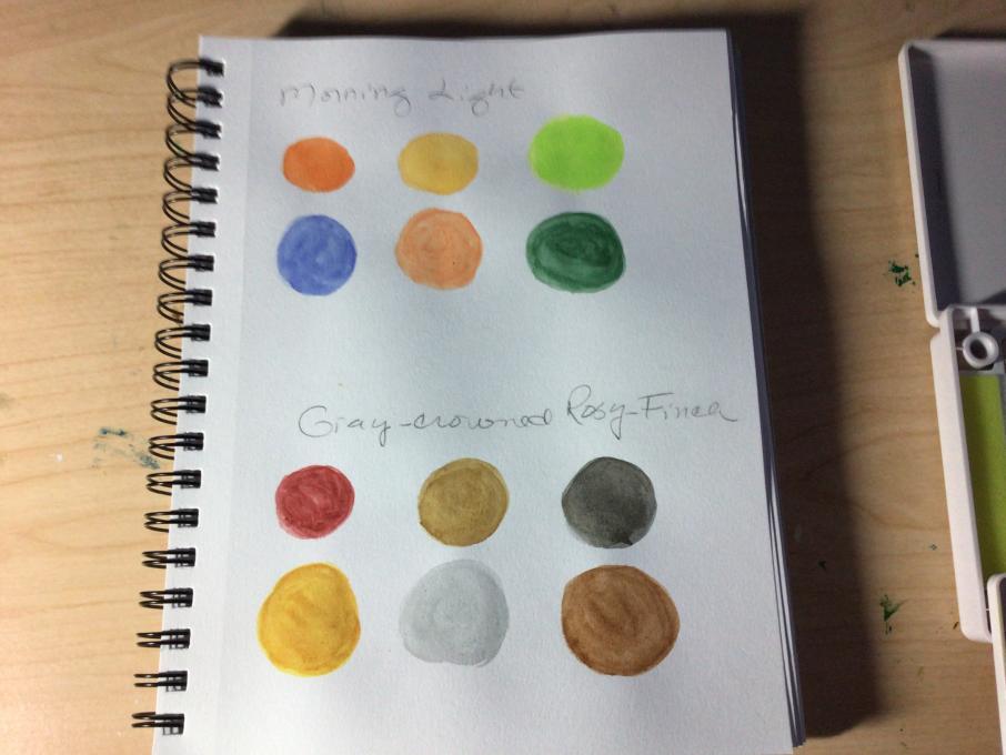
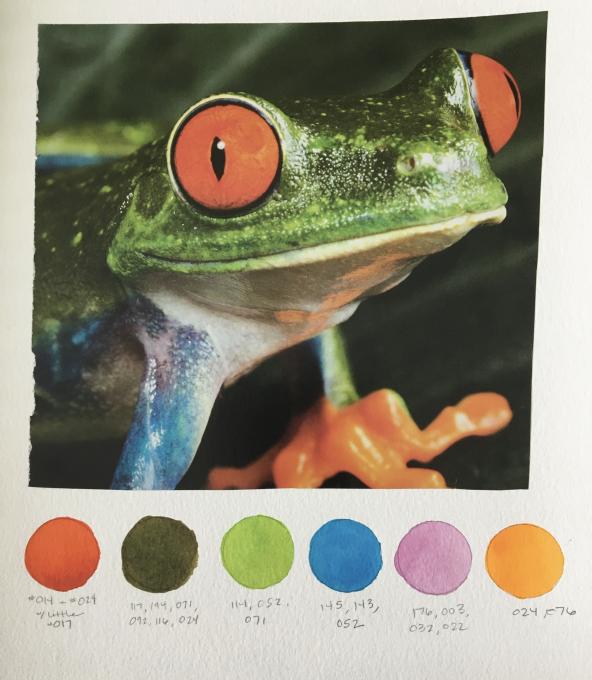
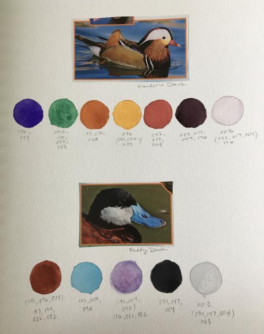
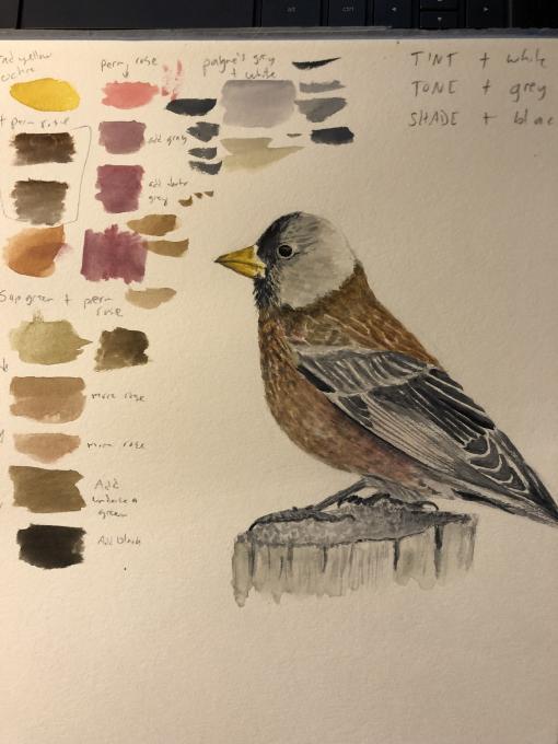
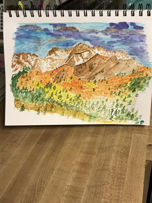
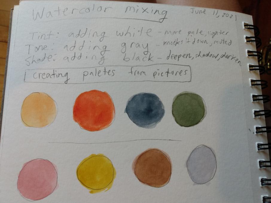
1) I have used watercolors before. I find it very useful to mix and find the right color on a test sheet before applying it to a painting. 2) I created color palettes for the above provided landscape and bird photos. For the landscape the top tow shows the colors that appear in the sky, the second row the colors of the second plan and the third row the first plan. For the bird photograph the first row shows the three colors that appear in the beak. The second row has the pinks, purples and browns that appear on the chest, abdomen and flank. The column on the right is Payne's grey with more and less water which I found appears on the head and wings. The black appears only in a few of the darkest feathers. 3) I like the two examples that we were given because of how different they are. The first photo had me using almost the entire palette, light and dark colors, while the second was more restricted and had a narrower tone range.
-
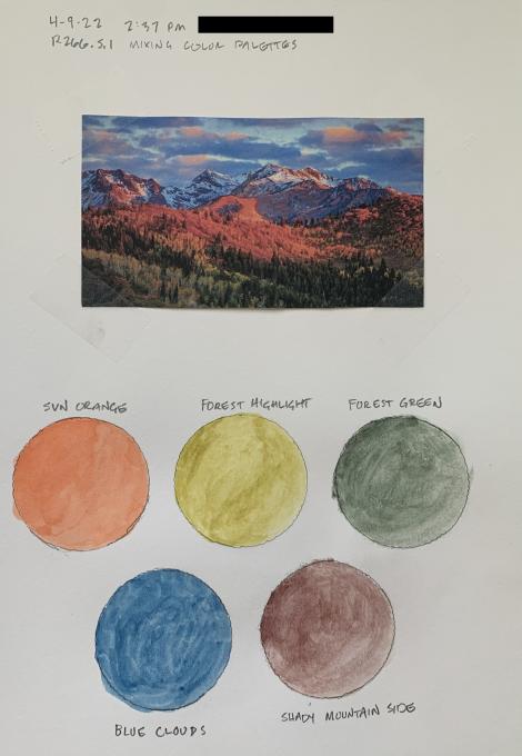
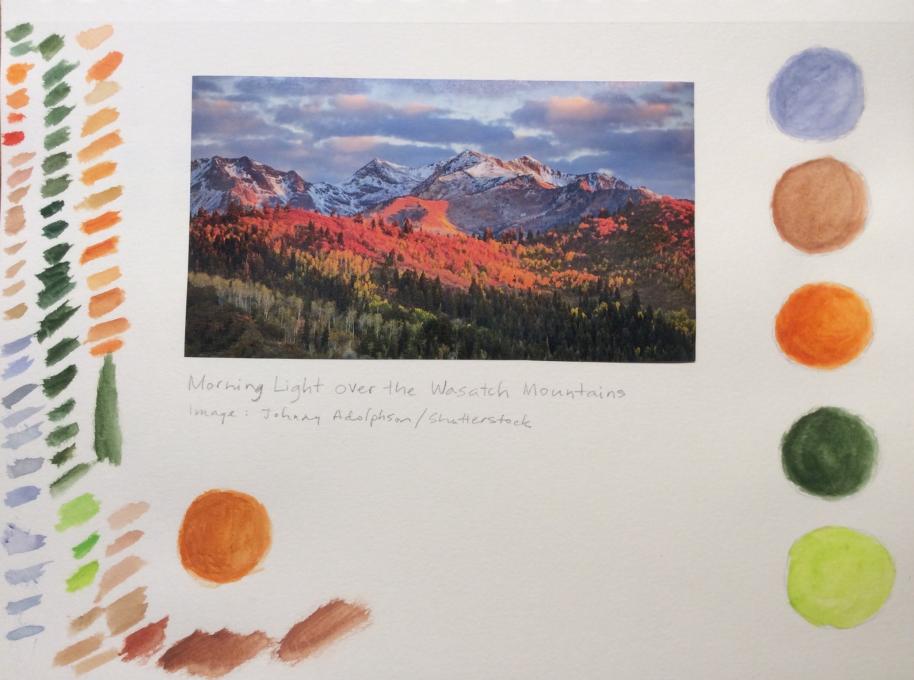
1. First experience (beyond Crayola as a kid). 2. I chose the Morning Light over the Wasatch Mountains landscape. The colors are pretty close to what I wanted. I found it difficult to pull enough paint to fill the circle, and getting the right amount of water. Some of the colors were very wet. 3. Playing with complementary colors to reduce the vibrancy was key. This picture contains a lot of warm colors, so I used yellow and orange - even in the purple mountain side - to achieve a match.
-
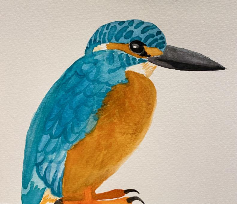
My first experience with watercolors was in preschool (and of course that wasn't a memorable experience). The first time I truly started using watercolors was in elementary, and to this day it's my favorite medium. I have (like everyone) had good days and bad days with watercolor, and today wasn't my best, but it was a lot of fun. The subject I chose was a Common Kingfisher because they have such a unique color palette with the complementary colors of blue and orange. For the most part I achieved the colors I wanted, but there was a bright aqua tint which I couldn't achieve with the color range I had.
-
I started using watercolors about two months ago, and as we progress in lessons, I can see all the possibilities that offers us. For this exercise, I created my own palette selecting
earth tones´ and other two for mixing, as the most suitable to representfossils´ focusing my attention on the left one (attached scientific names). About ¿any discovery? not sure, but draw all privilege information that fossils provide us to know about landscapes in the pass, for example, and be able to express with volumes, reliefs, shadows, etc. that watercolors offers me, it makes me feel like an enthusiastic archaeologist finding some hidden and precious treasure , thank you. -
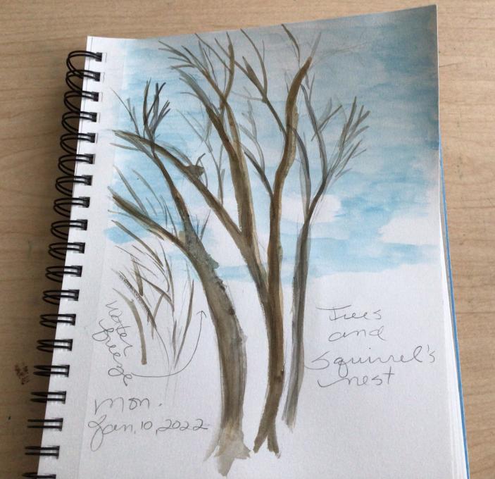
- I went outside and did a quick painting. The outdoor temperature is 27 degrees F. I was wondering why my paint was clumping when painting the tree trunk. First, I thought I was lifting the paper, but then I realized that the water was freezing on the paper. I finished indoors. Not very happy with the result, but I did capture the squirrel’s nest.
-
I have used watercolors before. I found them difficult to use. Either too wet or too dry. With Liz’s instruction I feel more confident to try watercolors again. It is exciting when I mix just the right color!
-
I've used paints and mixed before. This practice encouraged me to really look at the specific colors within the picture. I found my first assumption wasn't always correct and was amazed by the nuance I can achieve when mixing colors myself. I was surprised by how detailed even the most gross areas of an subject can be.
-
1. I have been playing around with watercolors for a little over a year now and it just gets more fun all the time. I really appreciated the tips from Liz on color mixing opposing colors and using tints, tones and shades. I have had trouble getting the right muted neutral colors that I needed before. I did get the colors that I wanted by using a very limited palette. I was able to mix yellow and permanent rose to get the browns that I wanted by adding Payne's gray and white. 3. I am realizing that I can get to the same color a number of different ways i.e. browns made from red and green or yellow and purple. I love putting different colors together and seeing what comes out. The more that I do it the better I can get at matching the colors that I want.
-
Very nice painting!
-
-
Very little experience with watercolors (usually work with colored pencils or pastels). I loved playing with the palette. I must say that the colors I got didn't reproduce well on screen - my orange and purple were much deeper for example. Don't know how that happened. This is "multi-media:" I penciled in the deciduous trees while painting the fir trees...
I also tried using a wash as a background. I like the possibilities it provides for creating a mood.
-
Very nice!
-
What watercolors do you recommend cus I have a cheap one from amazon? It's a generic brand. also if you have any watercolor tips please let me know. also, I love your water-coloring skills.
-
-
The dark evergreens and the browniest brown on the finch were the most challenging.
-
I have trouble coming up with the blaze orange. Nothing seems bright enough.
-
That was fun, just as you promised! This was the first time I've ever touched watercolors with a brush, so there was lots of learning. The main thing I struggled with was getting my colors saturated enough, and not too washed out. Also, just learning what colors the different colors in my paint set made: the way they look as dry cakes was quite different from how the look when activated.
-
-
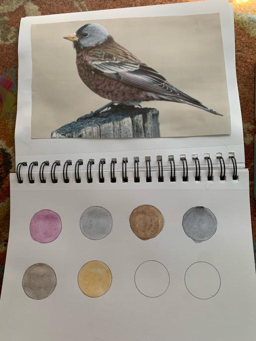
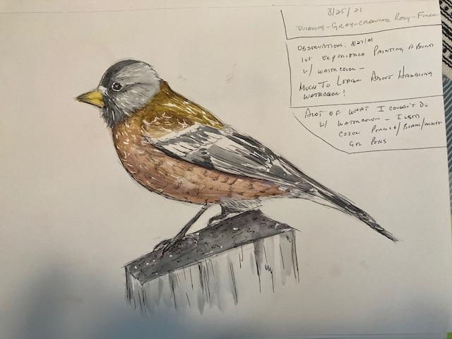
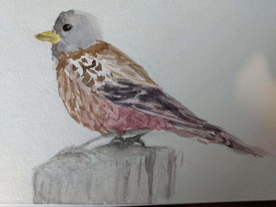
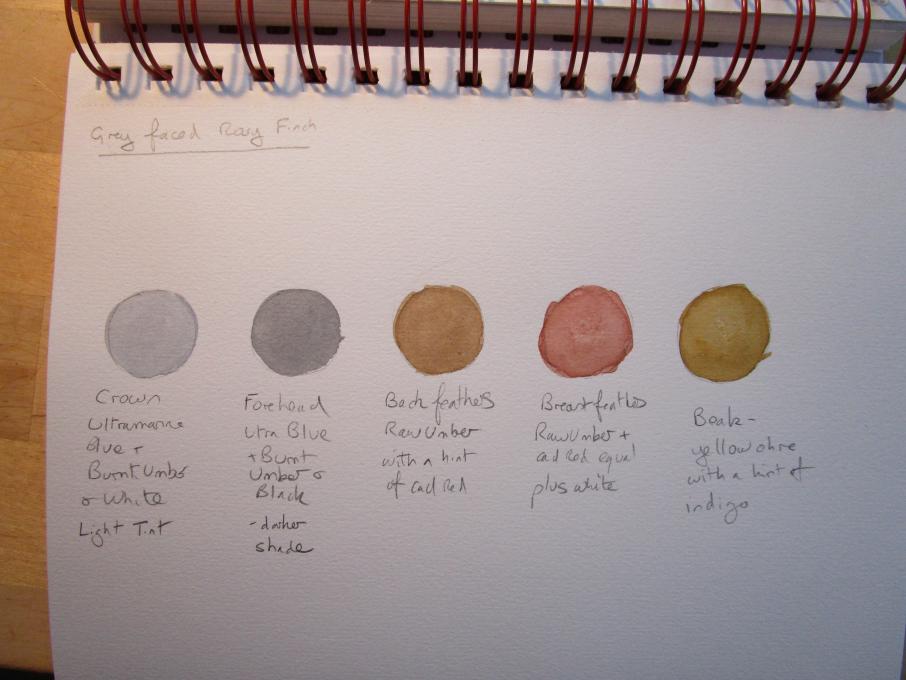
I had trouble uploading the image with the text, so I uploaded the image first. I had more success with the beautiful gray crowned Rosy Finch than the Wasatch mountains. It was my first experience with the Sakura watercolor set with water brush. I experimented with gouache earlier in the year and I had a color chart. I had to make my own color chart with the Sakura water color set. The water brush is a new experience. I am glad to have the experience with the gray crowned rosy finch with its colors of rich brown, gray, pink, gray and black. I will never see this beautiful bird unless I travel to the Pacific Northwest, maybe someday I will get the chance. Working with available light is always a challenge and with watercolor you can provide the rich tones you might not be able to see with the ambient light provided. This is a big advantage with watercolor, so I will keep working with it.
-
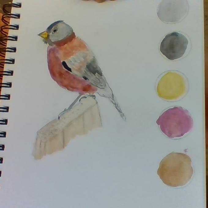
This was my firs texperience with watercolors. I've mostly used colored pencils. It was actually more difficult thanI expected. In fact after it dried I went back in with some colored pencil, a black gel pen and a white gel pen.
I did have trouble mixing the browns in my palette. I would get to a spot where the color wasn't quite right, but I don't know my paints well enough to know how to get to where I wanted.
Yes, focussing on the colors made me notice the different shades of gray as well as the different sades of brown. I also became very aware of the patterns in the feathers and my own inexperience in capturing them.
-
the finch color palette
-
-
No previous watercolor experience except during the Watercolor Basics for Birds Workshop. I really enjoy attempting to use watercolors. For me, blending seems to be somewhat difficult when trying to get the exact same colors as on photos. I seem to be more successful with blending when painting my drawings. Of course, that leaves a margin for slightly different tones, tints and shades. I worked on blending colors for the bird. Realized how many different shades of gray in that one photo and how to work with the white, gray, and black to achieve the desired colors. The breast required much blending.
-
I dabbled a little bit with watercolors before but this is the first time I created a palette for a picture. It was fun experimenting to match the color I see in the picture or of an actual subject.
-
This is the first time I have ever used a palette. I love the colors. It is a beautiful exercise.
-
-
I have used watercolors before. I am happy with my palettes even though some of the colors took a lot of experimenting. The palettes are for the two pictures from the lesson.
-
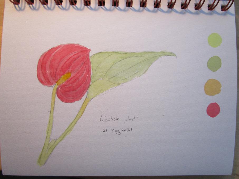
We have had torrential rain all day so I didn't go outside to practice and worked on a houseplant instead! The colours are a bit pale as I used to much water - the red in particular should be stronger. Hopefully this will get better over time.
-
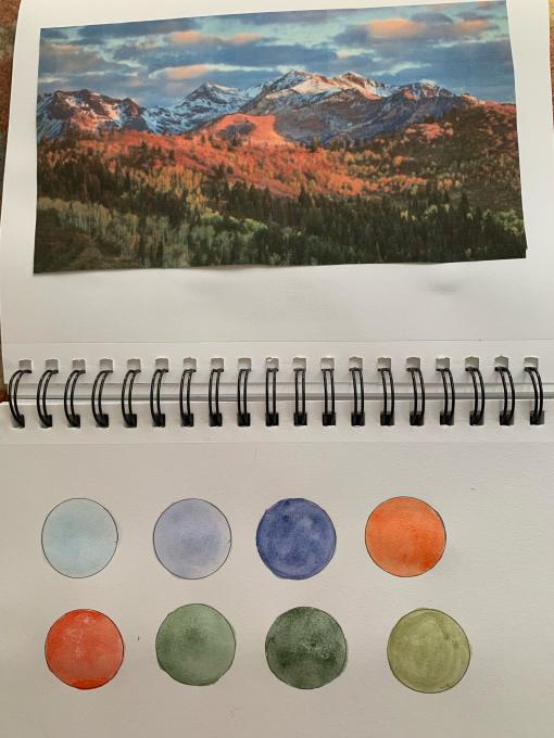
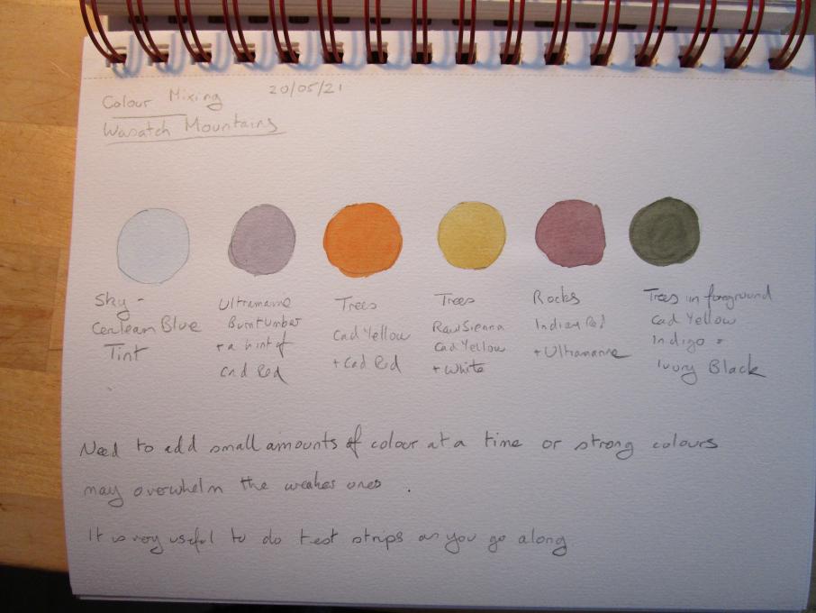
I have done watercolour previously but never got the hang of it. I have trouble controlling the water. I found these exercises very helpful in looking closely at the colours to match them - I realised that the colours weren't always what I expected eg the rocks in the Wasatch mountains have a hint of red in them, whereas I would probably have treated them as grey. As with drawing it is a matter of painting what is there. Doing the palette adding small quantities of colour at a time and testing was helpful. If you add to much of a strong colour it overwhelms the weaker one, especially when adding black to deepen the shades. I also made notes of the colours I used for future reference.
 I studied watercolor in art school and use it frequently in my work;however I still keep learning new things every time and also when I take a course like this one. I stalled on this exercise because I really did not want to do it because it was something I had done so many times in beginning classes. I marvel at how precise everyone else made perfect circles etc to put their paint test colors in but I wanted to just "jump right in". So here it is... on to the next step.
 My first experience with watercolors was in preschool (and of course that wasn't a memorable experience). The first time I truly started using watercolors was in elementary, and to this day it's my favorite medium. I have (like everyone) had good days and bad days with watercolor, and today wasn't my best, but it was a lot of fun. The subject I chose was a Common Kingfisher because they have such a unique color palette with the complementary colors of blue and orange. For the most part I achieved the colors I wanted, but there was a bright aqua tint which I couldn't achieve with the color range I had.
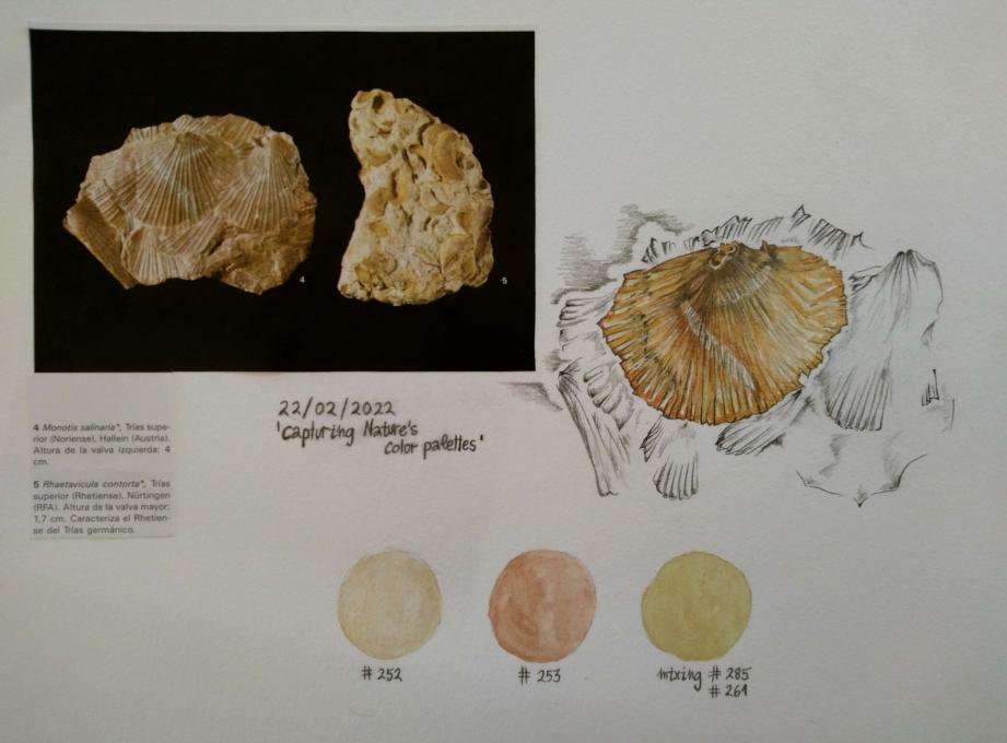
 Very little experience with watercolors (usually work with colored pencils or pastels). I loved playing with the palette. I must say that the colors I got didn't reproduce well on screen - my orange and purple were much deeper for example. Don't know how that happened. This is "multi-media:" I penciled in the deciduous trees while painting the fir trees...
 I also tried using a wash as a background. I like the possibilities it provides for creating a mood.
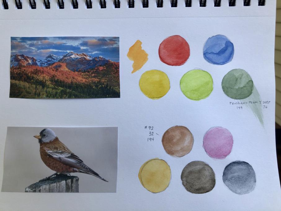
 This was my firs texperience with watercolors. I've mostly used colored pencils. It was actually more difficult thanI expected. In fact after it dried I went back in with some colored pencil, a black gel pen and a white gel pen.
I did have trouble mixing the browns in my palette. I would get to a spot where the color wasn't quite right, but I don't know my paints well enough to know how to get to where I wanted.
Yes, focussing on the colors made me notice the different shades of gray as well as the different sades of brown. I also became very aware of the patterns in the feathers and my own inexperience in capturing them.
This was my firs texperience with watercolors. I've mostly used colored pencils. It was actually more difficult thanI expected. In fact after it dried I went back in with some colored pencil, a black gel pen and a white gel pen.
I did have trouble mixing the browns in my palette. I would get to a spot where the color wasn't quite right, but I don't know my paints well enough to know how to get to where I wanted.
Yes, focussing on the colors made me notice the different shades of gray as well as the different sades of brown. I also became very aware of the patterns in the feathers and my own inexperience in capturing them. 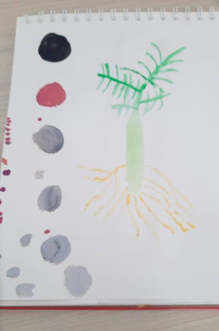
Read More: