The Cornell Lab Bird Academy › Discussion Groups › Nature Journaling and Field Sketching › Capturing Nature’s Color Palettes
-
I've tried watercolors before(limited). I think that is is hard to do but a skill that can be learned with practice. For the most part I was able to get the colors I saw, but the images on the laptop vs. desktop computers were slightly different in color. I find its hard to paint details with the water brush. I'd either get too much or not enough water. Getting the detail on the wings of the bird I found particularly challenging.

-
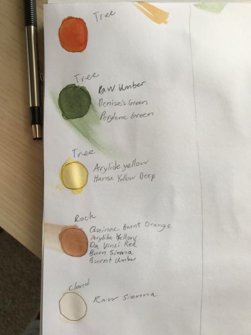
still at work trying to duplicate colors and create natural palettes
-
I was drawing/painting from the image on my computer screen. Then I attached my computer to a tv monitor with an HDMI cable and the colors in the images were very different. If I'm sketching/painting from an image, should I be using a printed image to get truer colors?
-
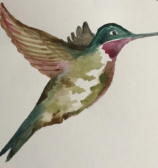
Going from sketching to watercolors helped create depth when I added paints. I’ve used watercolors (limited) before. I keep trying adding paint every day... Watercolor is not easy. I tried to create a palette that most resembles ruby throated hummingbirds and while not an exact match, I was satisfied with my results. I got a descent set of colors; i was happy with how the Olive mixed on paper as olive is subtle & difficult for me. The throat color was a challenge, but in such a prominent place, I decided not to overwork the colors. As I looked closely at the colors, it’s surprising how many undertones and nuances I usually miss. I cleaned up the sketch, painting and I was pleased at my first layered/pained bird. It’s much different than using watercolor straight from tube or 1/2 pan.
-
This was a great new experience for me (I have been using watercolor pencils). What I noticed was sometimes the color mixed on the palette tray did not turn out as expected on the paper, so I used it as an exercise to try and figure out what I could have added or subtracted to get closer to what I wanted. Also first experience with the water brush.
-
Really love these colors
-
-
This was my first experience with watercolours and the water brush pen. Quite different to acrylics and oils! It's been great to make a start on this whole other world of painting. The brush pen took some getting used to in terms of controlling the water content in the brush but I can see that, as a painting implement, it increases the contact time with the page and allows me to get a lot of colour down quickly. The colours are fresh and surprisingly nuanced. I'm also surprised by the amount of control I can get in tint, tone and shade. The weather has been terrible in Heidelberg this last week so I've been referencing colour palettes from a book on the Amazon rainforests. The dry pigment can look a little different when wet. The white page is much more effective in conveying whiteness than the white paint. Light purples are an interesting alternative "tone-maker" to grey with a touch of warmth or coolness to them. The watercolour palette seems very flexible in that it can capture the intense oranges of a sunset as well as the soft umber hues of a bird feather. The black colour seems very strong on the page - one to use carefully!
-
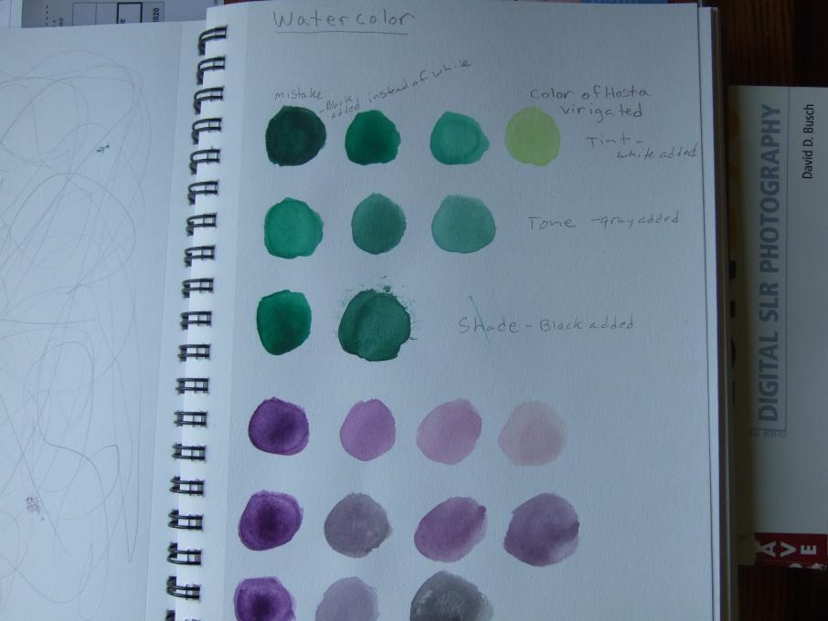
Using white with watercolors was a new experience for me and very useful to achieve the colors that I wanted
-
Beautifully done!
-
-
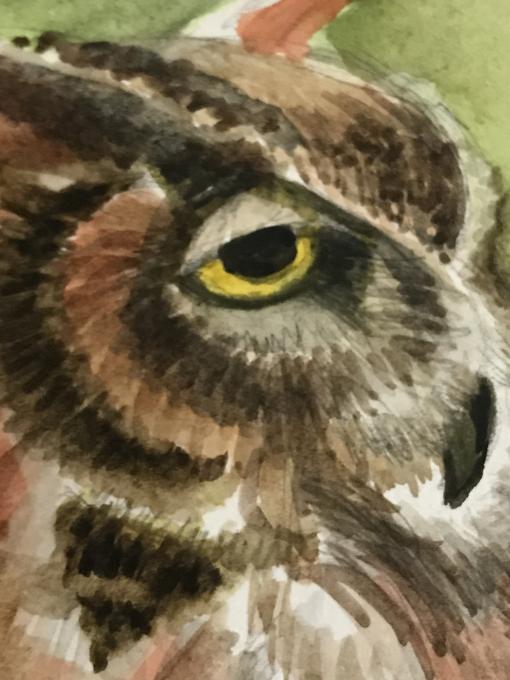
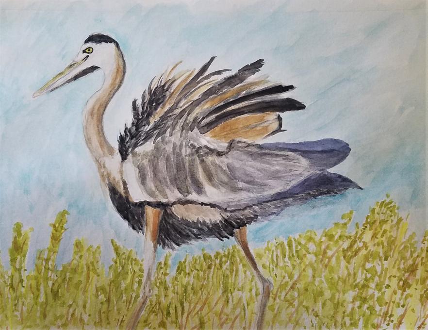
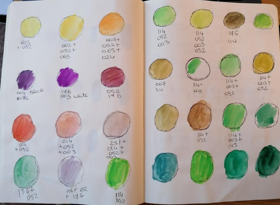
This was not my first experience with watercolors but it was with this new palette and the new brush. I wanted to really get to know how my palette, brush, and paper work together. I pushed the limits but was very pleased with it all. I first created a page of all my original colors then adding all the tints (white, gray, and black), then I mixed all the compliment with each of the types of colors. For instance, I have 3 yellows with 1 purple, 4 oranges with 4 blues, 4 reds with 4 greens. This provides a couple of good reference charts so I could find the closest match and what to use. I decided to practice by paining the two pictures provided. Then I selected a photograph I took in May of a Great Blue Heron just as it ruffled it’s feathers on top of the nesting tree. My challenge is the detail of execution. As a landscape painter, I do a lot of marks to indicate rather than exact markings, but with birds and such specific makings I get lost in the details. I need to nail what causes birders to recognize what I paint. I can however see that if I use shape for distant elements within a landscape the birds have a great shot at revealing the species. Still think I will need to get better at defining the parts of the birds. Pat
-
I first used watercolors with my grandmother as a child, in college, and again in the last few years. I find greens and oranges to be challenges to keep colors vibrant with out over mixing. The play of contrasting colors draw my eye in as the viewer.
-
I like the lightness of your colors
-
-
I never took a watercolor class or a color theory one, even though watercolor is my media to paint birds. Since I am self-taught, I mostly mix my colors on the paper, so this was a completely new experience.
-
Lovely
-
-
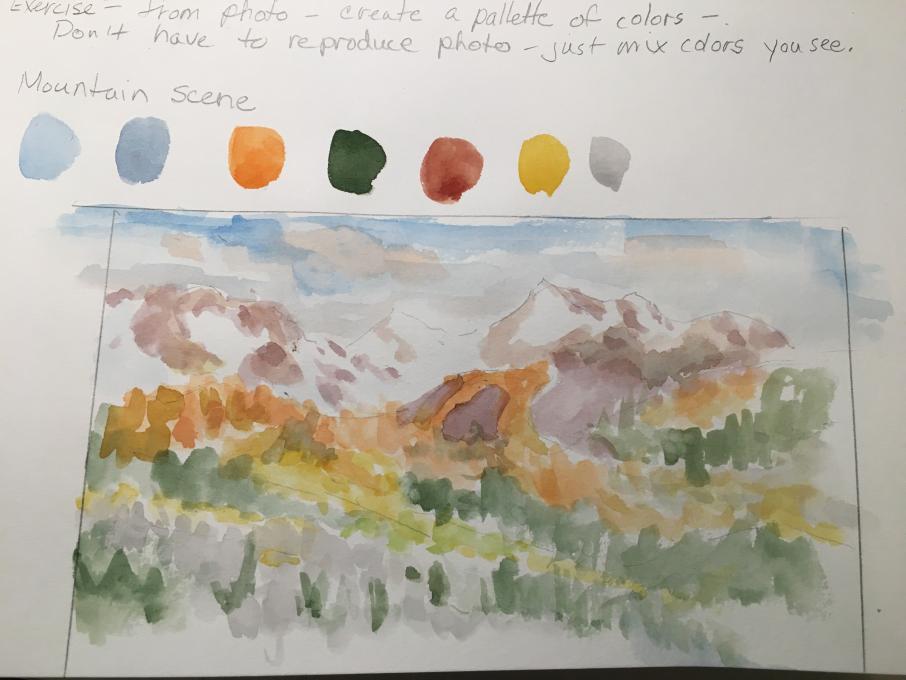
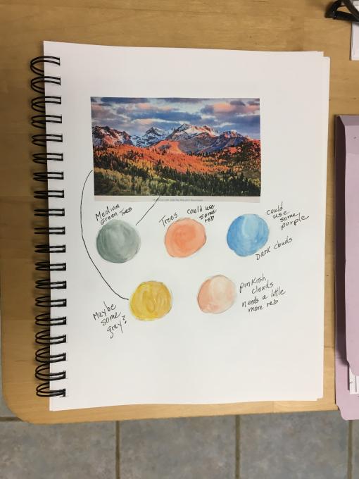
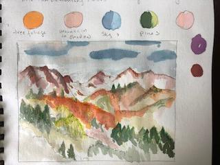
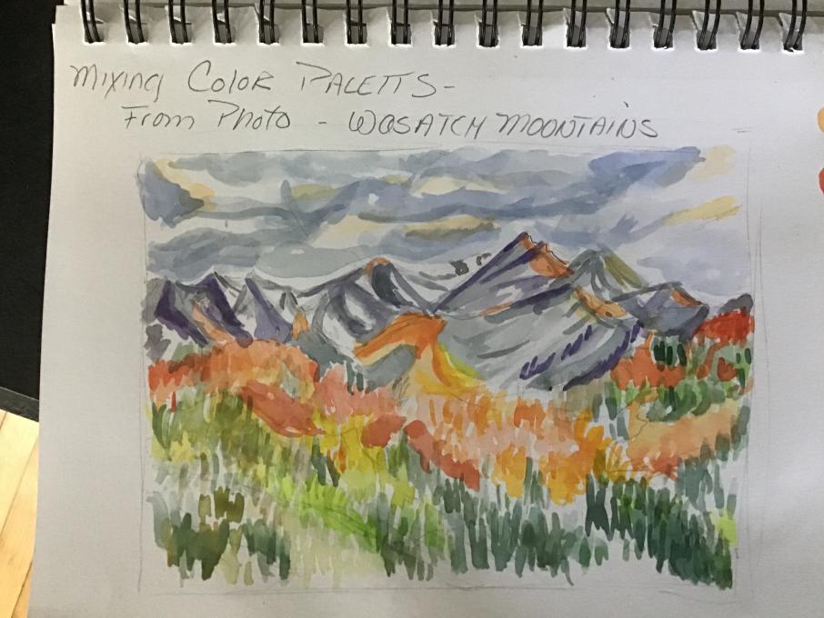
This was my first time with water colors. I found that I really like it, although it does take some getting used to. It’s hard to control them on the mixing palette, the paint wants to keep beading up. I have been trying to add some extra water with it and that seems to be helping. Mixing colors is definitely fun! Liz is right, it’s almost like solving a puzzle. I did run into a few difficulties though. The paint set I have is an earth friendly one that does not contain gray, black, or white. So, I have to try to work around that. Also, I have found that when on paper, some of the colors change in brightness, does anyone have any tips to anticipate that? (for the mountain photo)
-
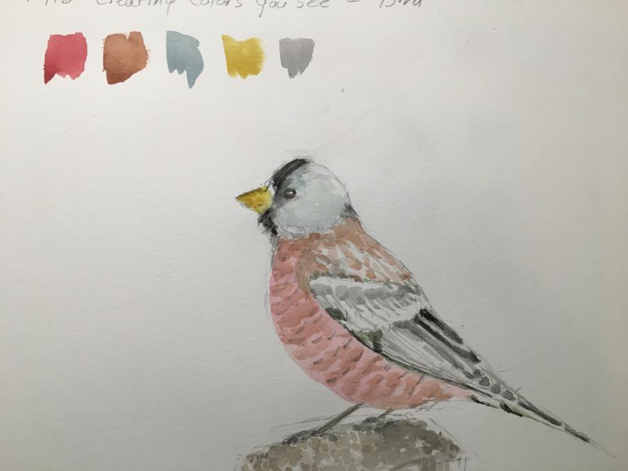
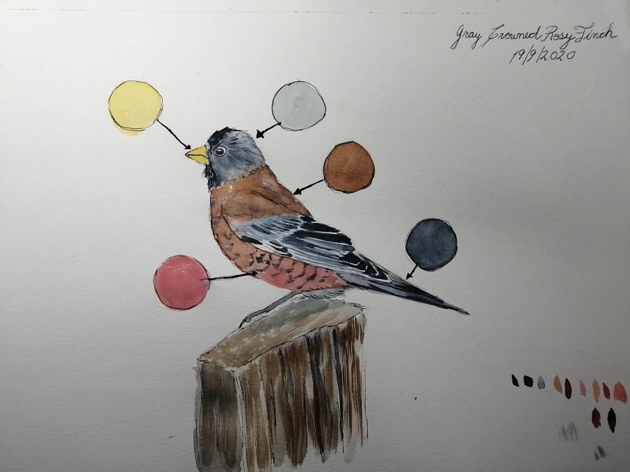
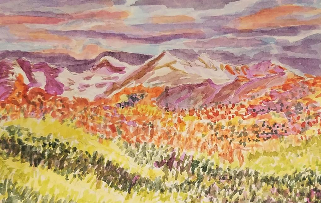
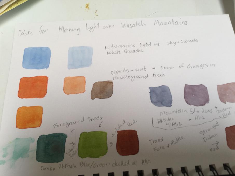
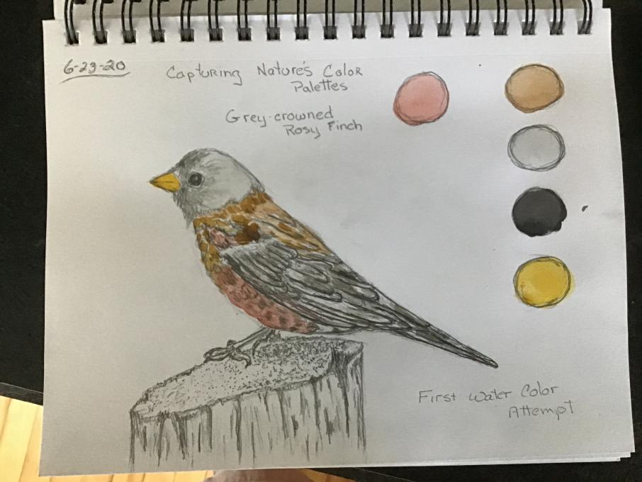
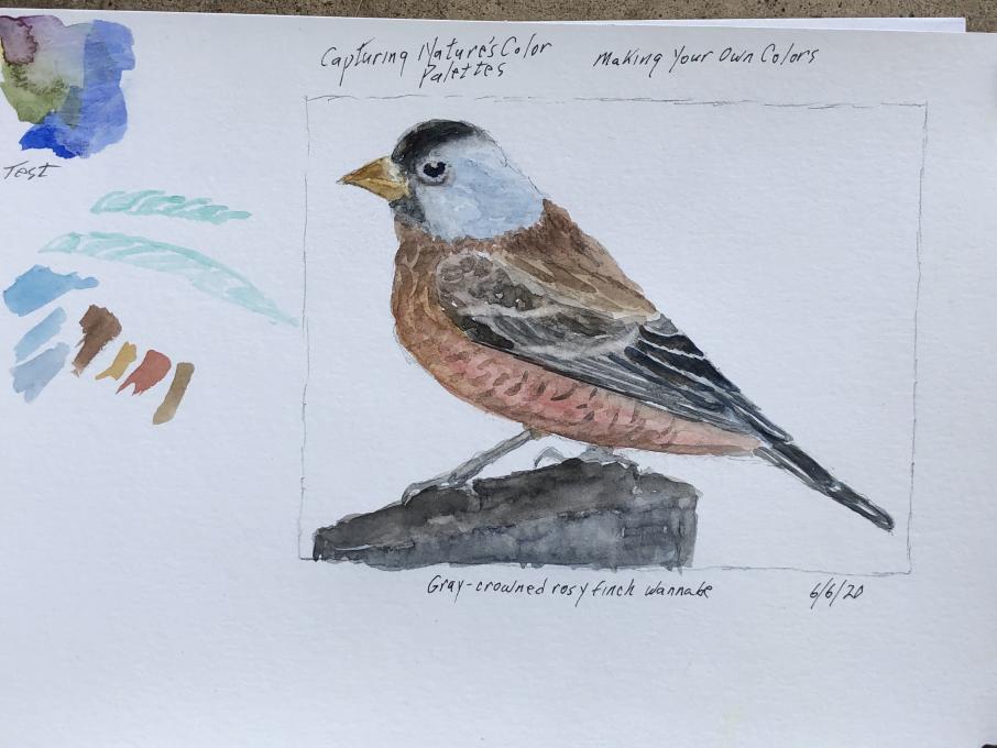
only could download three of my images; the fourth image was the Gray Crowned Rosy Finch, I was finding that the pink would not come out the way I wanted, but close. The "Morning light over the Wasatch Mountains" I thought had colors I could work with and when working with colors I usually don't have trouble so I had to go my own route that I usually do to make colors (just go and join colors from my own mind) which I have doing since a young age. taking this course is actually helping me work with colors more and open the horizons to create colors that match.
-
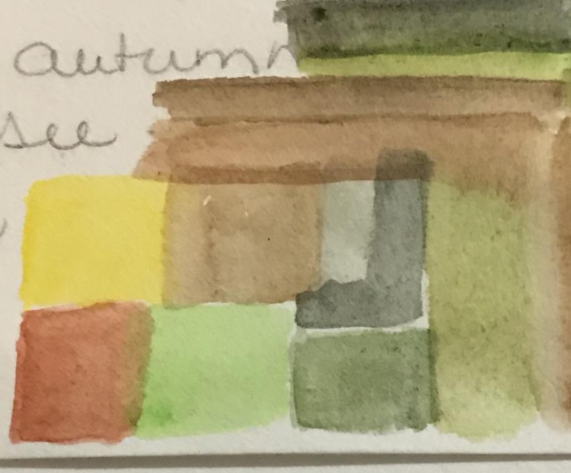
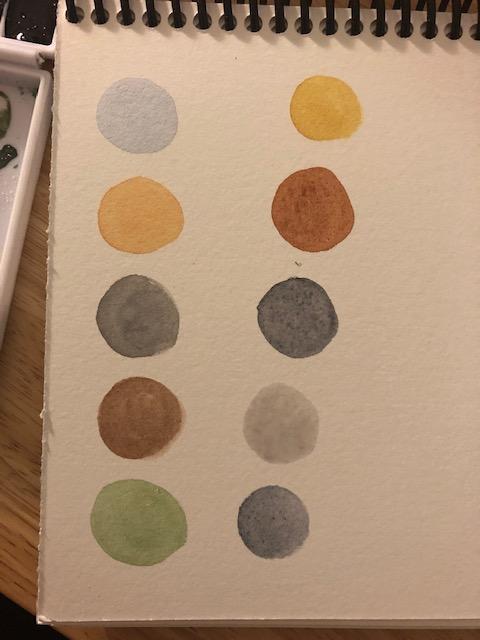
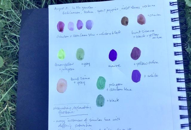
I am using a set of 12 gouache water paints, bought a couple of years ago and not really used so they are nearly new. I used watercolour many years ago but so long ago that I don’t remember much of the technique. The gouache paints are nice, the colours are fresh, and they are smilar to watercolour. What I find most challenging is getting the right proportions when mixing hues. My observation was that there are many instances of the same or similar hue in nature but in a scene, they occur with differing saturation. The quality or intensity of the light affects the perception of hue. This might be due to differing reflectance characteristics of foliage or flowers. I do not have nearly enough different shades/tones in my palette for the range in the scene but I was uncertain exactly how to add the right kind of variation. The image of the palette page doesn’t show the hues correctly but gives an idea of what I did.
-
I mixed colors but and tried to keep track so I would remember my combinations. I am not having much luck painting but that will come, I hope.
-
This was not my first experience with watercolors but it was great to see Liz’s thought process. I have several watercolor sets so did not purchase the recommended one but think it should still be a useful process to play with what I have. I would try to make a note of the colors used for sure.
-
1. Unless you count messing around with watercolors as a child, this was a new experience for me. I didn't know what to expect so it wasn't easy or difficult. 2. I was very confused about what "Then take your watercolors and nature journal outside and try them on a subject of interest" meant! From the posts, I think others were confused also. Finally, I decided to take a couple photos outside and create color palettes for them. This seemed a reasonable interpretation and a helpful experience in blending colors. I don't have any idea how to start an actual painting yet. My subjects were a wreath and phlox in the garden. I suppose I found a decent palette for both. I don't know if the shades were exact matches, but I am not sure that it matters as along as they are pleasing. 3. The phlox that I originally planted were all the same color, but they are not any more. How and why did they change into different colors?
-
Pretty tones
-
-
This is my first experience with watercolor. The paints are beading up on the palatte, and I'm having trouble making them spread out as Liz did in the demonstration. What am I doing wrong?
-
Perhaps you are not using watercolour paper ? Susan
-
-
Trying to apply the color mixing lesson to an actual image was challenging. I have no formal training in watercolors and had one college figure drawing class a long, long time ago. I've been fascinated to learn the techniques offered in this class for both drawing and painting. I couldn't really figure out how to get the luminous glow from the sunrise or the light on one side of the trees. Went back over some of the painting with colored pencil, which helped sharpen up the peaks and the tips of the trees.
-
I find the color combos very appealing
-
-
What a lesson for a B&W lifetime approach . More fun.
-
Such a subtle, beautiful series of colors - beautiful!
-
Nice control of neutrals
-
-
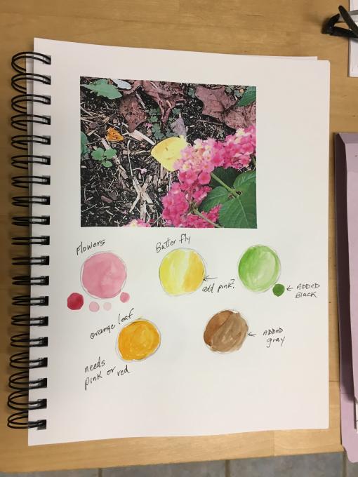
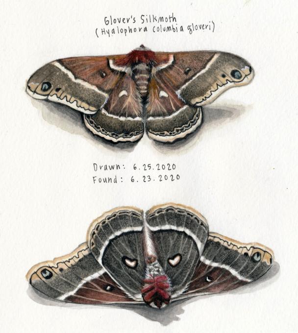
I found this beauty in the woods the other day, dead, but intact, and decided to memorialize the specimen for my watercolor exercise. It's interesting to analyze the moth next to the finished painting to see where colors were most accurate/inaccurate.
-
Wow!
-
Gorgeous!
-
I’d say this is your specialty!
-
-
This was very challengingly, but fun! Creating just the right color does take practice. This is my first attempt using water colors. Creating the proper colors for the Wasatch Mts is surprisingly difficult. Differentiating the sky colors from mountains a challenge.
-
What a great job!
-
I find these pallets vibrant and exciting
-
-
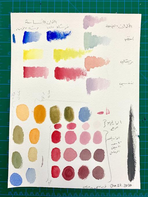
I’ve been avoiding watercolours for ages - there were attempts to get into it but I never produced something good by itself; i had to add ink or other medium to feel good-. This is my reference sheet. I experiment with the brush that mini-water-container, the regular brush, with paste watercolour and cubes water colour. Each has its own feeling. While mixing colour, I found it interesting to see the results on the sheet. I wasn’t satisfy with the tone mixing, I felt there was something wrong with the grey. However, after I left the sheet, went away, and came back I was fully satisfied with the tone and tint. Looking at the shades, I think my hesitation is visible n all of the shades, most probably I had fear of ruining the colour with the black - and so I did ruin the sheet because I brushed over it twice or more. I guess this is a very sensitive medium, if i’m to use it I have to understand all my tools’s pros and cons; that goes for the brushes, colours, sheets and the WATER - yes, I need to understand how the water interacts with the tools. I fell in love with the brush which has been recommended for the class. In fact, I bought 4 types ages ago but I never used them. This session motivated me to try them - and now I know I’ll stick with it!
-
-
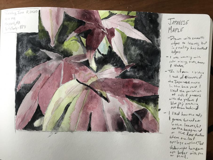
Pretty colors, Matt. I like the realistic look you were able to depict with not all perfect shaped leaves and the depth and variety of looks to your leaves. Thanks for sharing.
-
Very nuanced. Wow.
-
-
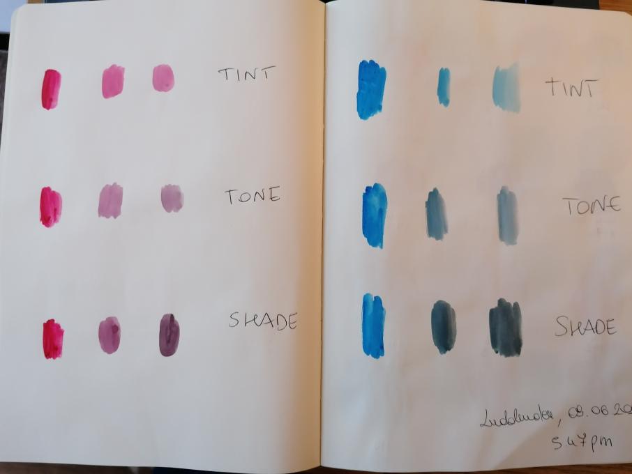
1. It was my first experience with watercolors and I enjoyed them very much. I liked to experimetn the tint, tone and shade and to find different colors. By experimenting many possibilities I realised I tend to experiment with dark colors even if I would like to have more lighter colors. In the future I want to use more white and yellow to see how things work. I struggle to make violet. I truly enjoyed this exercise very much.
-
This was a labor that wore me out. I have never been successful at drawing and painting, primarily because I could never keep my attention focused long enough to complete a project ... ADD or whatever, but I stuck with it until I couldn't any longer. I am happy with what I accomplished, but I wanted it to be better, but I reached the point of No More so I quit. I have never followed a photograph that so clearly showed so many specific feathers and it was overwhelming. Matching colors is a beautiful mystery, so much to know and so many possibilities. Thank you for looking.
 still at work trying to duplicate colors and create natural palettes
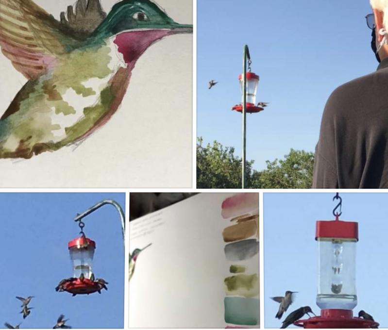
 Using white with watercolors was a new experience for me and very useful to achieve the colors that I wanted
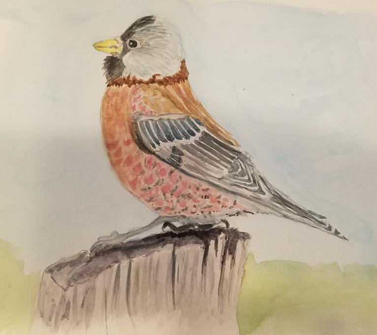
 I first used watercolors with my grandmother as a child, in college, and again in the last few years. I find greens and oranges to be challenges to keep colors vibrant with out over mixing. The play of contrasting colors draw my eye in as the viewer.
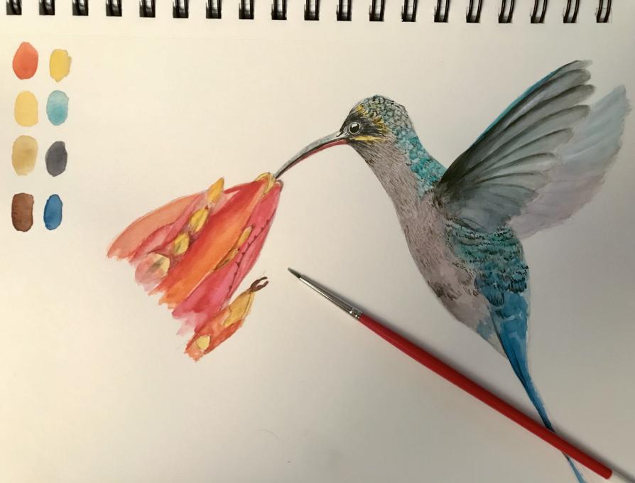
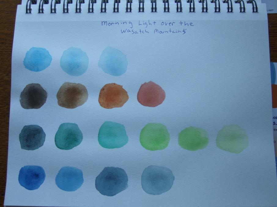 only could download three of my images; the fourth image was the Gray Crowned Rosy Finch, I was finding that the pink would not come out the way I wanted, but close. The "Morning light over the Wasatch Mountains" I thought had colors I could work with and when working with colors I usually don't have trouble so I had to go my own route that I usually do to make colors (just go and join colors from my own mind) which I have doing since a young age. taking this course is actually helping me work with colors more and open the horizons to create colors that match.
 I mixed colors but and tried to keep track so I would remember my combinations. I am not having much luck painting but that will come, I hope.
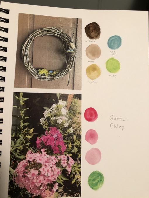
 Trying to apply the color mixing lesson to an actual image was challenging. I have no formal training in watercolors and had one college figure drawing class a long, long time ago. I've been fascinated to learn the techniques offered in this class for both drawing and painting. I couldn't really figure out how to get the luminous glow from the sunrise or the light on one side of the trees. Went back over some of the painting with colored pencil, which helped sharpen up the peaks and the tips of the trees.
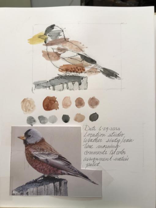
Read More: