The Cornell Lab Bird Academy › Discussion Groups › Nature Journaling and Field Sketching › Capturing Nature’s Color Palettes
-
I found it easier to work with the muted colors than the saturated colors.

-
Wow, you nailed It! Beautiful color contrast in the landscape, you could sell that.
-
Love this! Great job!!
-
-
I love the water filled brush. Never used them before. I haven’t painted a water color in 25-30 years. Rediscovering the fun during this pandemic is an amazing experience. Thank you so much!
-
I need to work on actually painting, but I love making colors. I used to spend a lot of time color matching paint colors to the photographs I took of landscapes. This reminded me of a time in my childhood when I took time out to paint. I'm enjoying this part of the course so far!
-
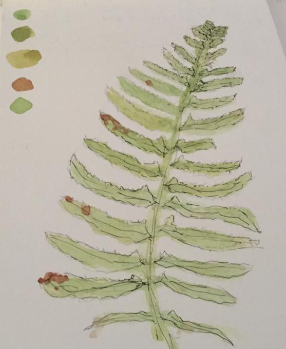
This was my first experience with watercolors since childhood, many decades ago..it was more difficult than I thought it would be, but it was an enjoyable process. I actually dove into some practice lessons before I attempted this exercise from some other resources in order to gain some confidence using the brush and playing with palettes. I chose a fern for my subject, and learned from another course that sometimes mixing many colors together can actually mimic colors in nature pretty well. I’m struggling with shading and getting my sketches to look polished, but I had fun playing with colors and I was pretty happy with the results for this exercise. -
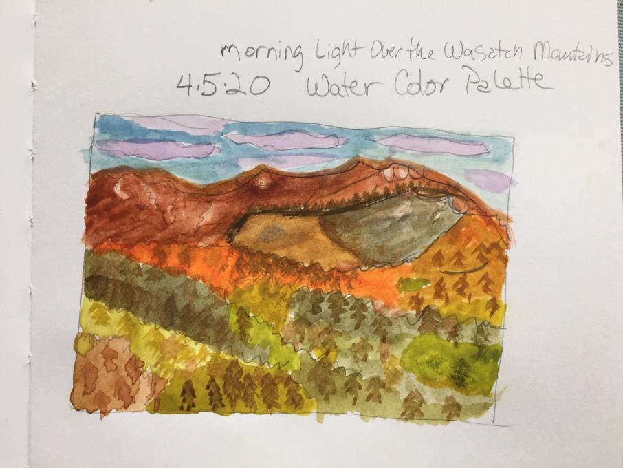
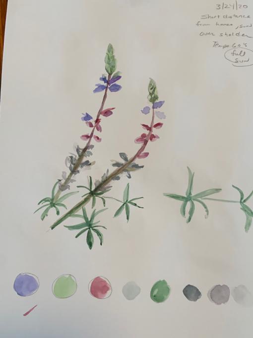
This was my first experience with watercolours so the tips and demonstrations were particularly helpful. The first thing I did was to make colour swatches of the paints so I would have some idea of what they looked like. When it came to mixing the grays it was hard to decide whether blue or purple should be added and which one. The pink was also a challenge but drawing the surrounding colours into the pink helped to blend it in. It was a fun experience and I look forward to tackling the crocuses which are now appearing in our yard. The mountain picture is pretty daunting but I will start its pallet and see how it goes. -
1. This the first water color painting I ever made. I should frame it so that I can later smile to it, remembering how clumsy my start was. I expected it to be difficult and I got immediate confirmation. Water color painting is much more intolerant to errors than drawing. No eraser to save you!
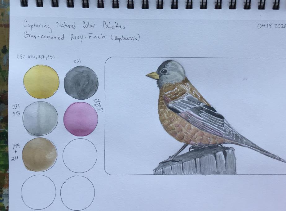
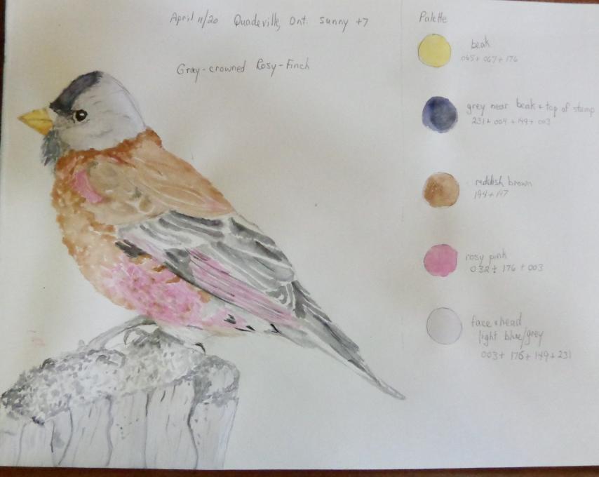
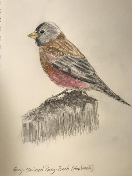
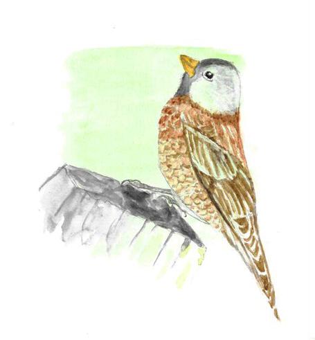
2. I went for the Rosy finch. Making the right colors was more based upon observation and gut feeling than on logic's, but in general, I could approximate the color quite quickly. I can’t remember exactly how I made them. So , I should make more notes and a sort a personal color recipe book for future. I also noted that the colors change when transferring from the palette to paper and there is also a difference between different paper types . In addition, the darkening of the color after drying is not only dependent from the color type, but also from the dilution of the paint on the palette. So I have to mix a more than sufficient amount of paint on the palette, because it is difficult to make exactly the same dilution for a second time.
3. It is also difficult to make smooth transitions between colors and shades. I cheated a bit with overlaying the water color painting with pencil patterns. The wing feathers are a disaster. I have no clue how you can make these delicate stripe patterns. How do you male fine white or pale patterns on a dark background? I tried with a white pencil, but it is still too transparent.. -
This wasn't my first experience before, but I haven't really done anything like this activity that I just did. My color palette was for a Steller's Jay, and it consisted of many blue, black, grey, brown, and white shades. I think that I was able to get the colors that I desired, but it was challenging to put the right amount of the color I wanted to use to make the color needed for my palette. When I was focusing on the colors, I noticed that the Steller's Jay that I was drawing didn't just have a black head, the head was black, brown, grew, and white, which I never really noticed before. Overall, I thought this was quite fun!
-
-
This actually was the first time I have used watercolors, at least that I can remember. I *must* have used them back in grade school, but all I can remember using then was tempera. The palette for the painting below was made up of browns (for the chest and shoulder feathers), grays (for the head, wings, tail, legs and the tree stump), pinks (for the belly and the top of the wing) and a light golden yellow (for the bill). I came pretty close to the colors that I saw, I think, particularly for the belly, head and beak, at least. This is going to take a *lot* more practice, I see!
-
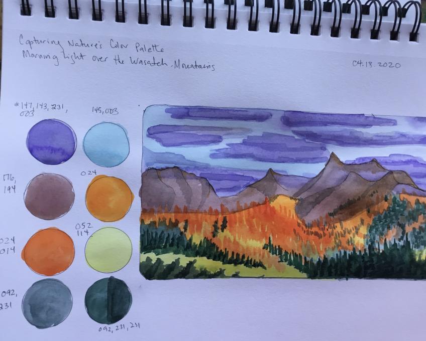
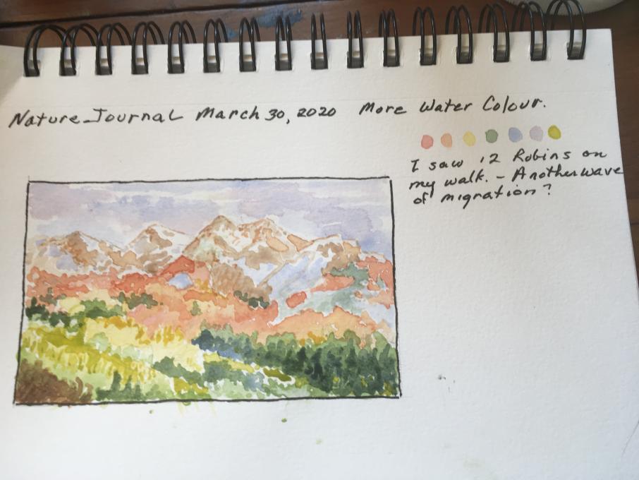
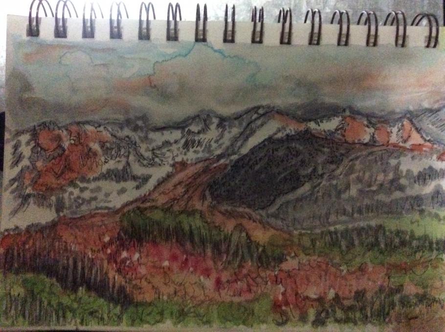
A cool and cloudy day today, perfect for staying in the house and painting the exercise. Thanks to the participant who wrote about a muddy sky I managed to restrain myself sufficiently to avoid that . The shadow of the mountain still eludes me. It was a fun exercise. I look forward to getting more proficient with this medium. I had posted another painting I did yesterday. i thought it was in this lesson but who knows where it ended up. Sigh! Computers.
-
Here is my attempt at the sunrise mountain drawing. Mixing the colors was wild and so much fun. Never drew anything like this before. Great thinking about sunrise and new day in this difficult time. -- Trudy
-
I painted a light green background square and then did the watercolor of the gray-crowned rosy finch. I mixed the watercolors to get the browns and grays. It is true that you notice so much more of the bird or subject when you draw it. I noticed feather patterns and head shape and beak, etc in a way that I never would have by just taking a photo. I am enjoying this class so much and wish there would be a second part to it. --Trudy
-
I had to try to paint my favorite bird. They have just changed color from winter to summer bright yellow.
-
I am truly amazed at how much better I am - looking and seeing so that I can draw. Painting with watercolors will be a challenge - I can see that by playing with shades and mixing colors. Too much water on my brush - not enough of one color and making sure I clean the brush after using every color. More water - lighter shade. To help me remember what the colors look like I made a painting palate in my book.
-
Is it reasonable to expect you would do all of your work with the one brush that comes with the kit or are there many different tips for the water brushes that you might buy?
-
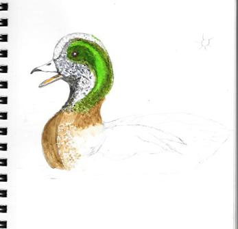
My first ever watercolor effort. His eye looks a bit evil :(
-
I imagine, if you were doing a formal picture, you might have to make a seperate key for yourself to remember how to go back and remix the colors to continue at a later date? Otherwise, it's fun just to experiment.
-
I tried drawing a red-breasted merganser, often seen near my home on Lake Ontario, coloring it in with colored pencils. Yes, I know we're supposed to be practicing watercolor techniques, but my nature journal is made of drawing paper, not watercolor or mixed media paper. I'm really happy with this result. I'll try it again on watercolor paper, and maybe glue it into my journal...
-
I love this merganser --you've captured an expression I've seen on mergansers and it is great. - Trudy
-
Great drawing, love it's expression.
-
I am a colored pencil person and find watercolor messy and with results that I can't easily control with the water in the brush. I have made several attempts with watercolor but will keep trying. I appreciate your color pencil drawing of the merganser.
-
-
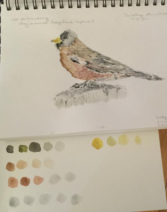
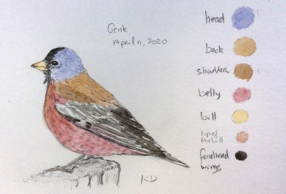
My references were yours sugestions. I think my palette of the bird is fairly accurate. Reserve the space for the white on the wings was the most challenging. The landscape was much more difficult to do. I see too much colours and hues that I need to expand the picture too wide, to do it well. Even so, I share some of the most common colours of the picture in the palette I created.
P.S. I noticed that under the wing of the bird colours is diferente than the one I use for the whole belly.
PPS: The colours of the pictures uploaded are different from the original one's.-
Beautiful drawing. You got the wings which are hard to do. -- Trudy
-
-
I have tried watercolor before. I never felt that I could accomplish what I set out to do. I've purchased many books and have followed instructions as closely as I could but never seemed to get the results I wanted. I like Liz's teaching method, her demonstrations are clear, and I liked the way she showed how to mix colors and get the colors as close as possible. Liz's explanation for tints, tones and shades was very helpful for me as well, and I've practiced by making a color wheel with primaries, secondaries, and tertiary colors. I made primary & secondary combination squares, and mixed primary & secondary colors. This has been a great experience for me. My bird watercolor was pretty straight forward and I was able to mix the colors that seemed to match the photo reference and added the palette to the border of the picture. I had trouble with the landscape, the sky ended up muddy, and I didn't feel as good about it as I did with the bird. I had so many color mixes and ran out of enough color for each section so I kept making a new mixture and finally gave up trying to put the palette down onto paper. It's such a small painting, 1/4 sheet of 9"x12" paper, how do you ever do it on a full sized page? -
I drew the American Wigeon duck trying to show how sunlight coming from the right side makes the greenish color on the duck's head seem to almost glow. I used viridian green and hansa yellow light to make the bluish green and then added payne's gray to darken the green. I used burnt umber and burnt sienna to create the brown for the rest of the head and the top of the body. I'll continue working on it, but it was fun to see how to make the lighter color seem to glow by adding more darks around it. --Trudy
-
Very nice.
-
-
Have not used water colors in over 15 years, always painted indoors using a photo, what was difficult was painting in full sunlight, and focusing on just one or two flowers even though there were several there, had to also deal with the slight movement from the wind. I was happy with some of the colors but just could not get the flowers that had already lost their color, drying out. Loved being outside! -
-
Definite room for improvement! I thought I was starting with a simple, not too difficult group of colours to mix. But I have a bit of a challenge with purples. My pallet doesn't have a purple, so I started mixing reds and blues and there were lots of "mud" colours as a result. I didn't notice the colour of the surf around the rocks until much later in this process, what a great discovery!
-
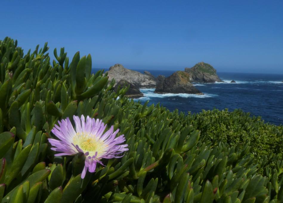
I enjoyed this image as it reminds me of Australia.
-
-
I love the water filled brushes. I've never tried them before.-
This is a beauty!
-
 I love the water filled brush. Never used them before. I haven’t painted a water color in 25-30 years. Rediscovering the fun during this pandemic is an amazing experience. Thank you so much!
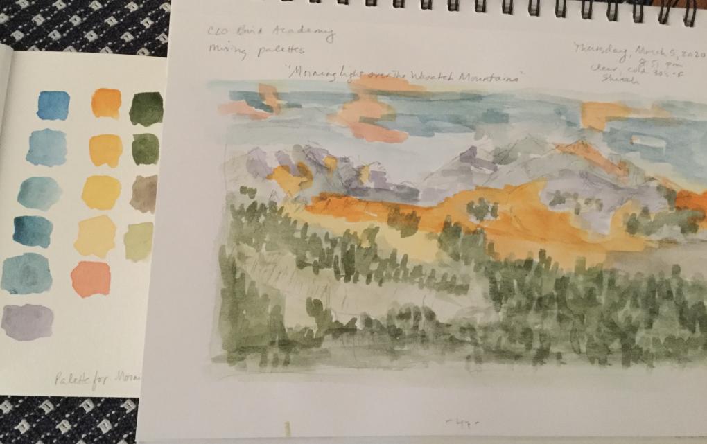
 A cool and cloudy day today, perfect for staying in the house and painting the exercise. Thanks to the participant who wrote about a muddy sky I managed to restrain myself sufficiently to avoid that . The shadow of the mountain still eludes me. It was a fun exercise. I look forward to getting more proficient with this medium. I had posted another painting I did yesterday. i thought it was in this lesson but who knows where it ended up. Sigh! Computers.
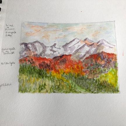
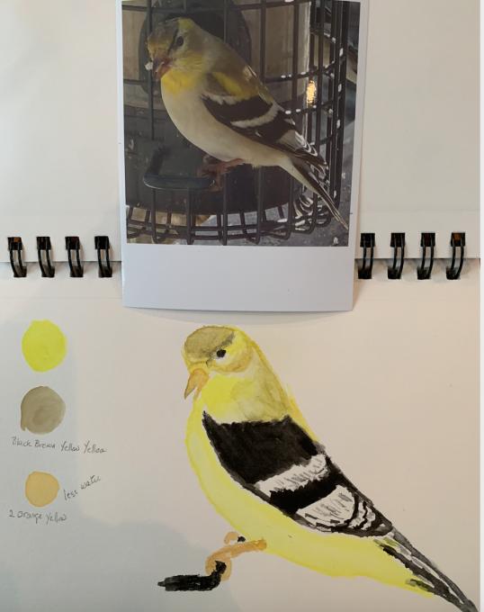 I had to try to paint my favorite bird. They have just changed color from winter to summer bright yellow.
 My first ever watercolor effort. His eye looks a bit evil :(
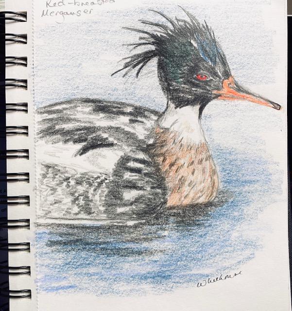 I tried drawing a red-breasted merganser, often seen near my home on Lake Ontario, coloring it in with colored pencils. Yes, I know we're supposed to be practicing watercolor techniques, but my nature journal is made of drawing paper, not watercolor or mixed media paper. I'm really happy with this result. I'll try it again on watercolor paper, and maybe glue it into my journal...
 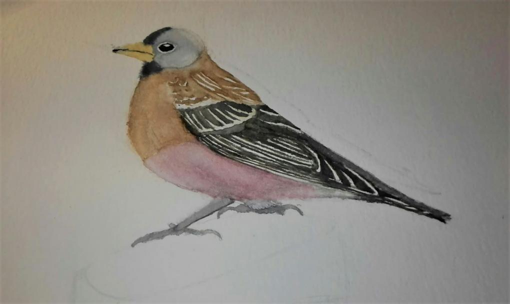 hat under the wing of the bird colours is diferente than the one I use for the whole belly.
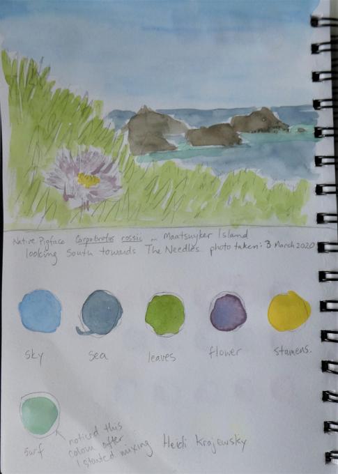 Definite room for improvement! I thought I was starting with a simple, not too difficult group of colours to mix. But I have a bit of a challenge with purples. My pallet doesn't have a purple, so I started mixing reds and blues and there were lots of "mud" colours as a result. I didn't notice the colour of the surf around the rocks until much later in this process, what a great discovery!
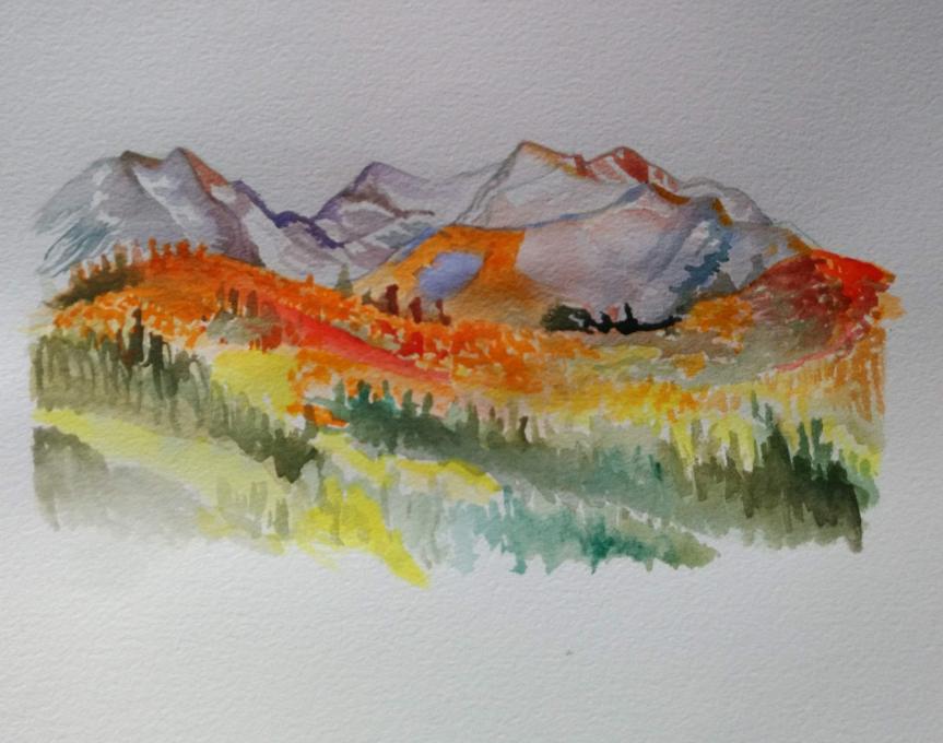
Read More: