The Cornell Lab Bird Academy › Discussion Groups › Nature Journaling and Field Sketching › Capturing Nature’s Color Palettes
-

-
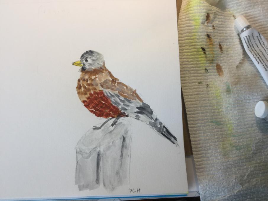
So rusty. Thanks to Bird Academy for getting me to get my paints out again.
-
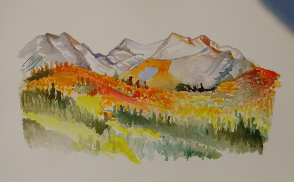
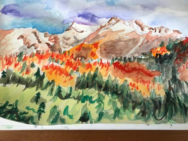
Your mountains are quite beautiful. You inspired me.
-
Gorgeous. The mountains and the bird--wonderful. I hope you keep out your watercolors now.
-
-
This was not my first time using watercolors and the tips were great. Easier than expected. The color palette I chose was from a photo of a meijiro in cherry blossoms. The colors came out well. I dont think my lightest pink was light enough, however. Sometimes when mixing a color I found I had to think carefully what other colors were underlying.
-
This was my first experience with watercolor. I've always shied away from the medium. It was easier in some ways and more difficult in others. I'm used to working with more opaque paints. The transparency of watercolor is intimidating, but I can see where it could be beneficial for some applications. Color mixing went fairly well, but I'm used to mixing colors in other mediums.
-
-
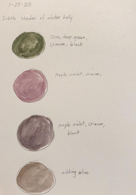
Yes, not since childhood have I used watercolors. I'm not finding it too difficult to mix the colors. For my own color palette I chose winter holly leaves, with part green, deep maroon/purple, with some brown parts. They are subtle colors, or colors with subtle differences. Olive, crimson, purple violet, and black seemed to be all I needed to work up four colors. I'm finding that my work with the color sliders in the HLS panel in Lightroom has helped me identify the colors present, especially in photographs. It's surprising sometimes to slide a slider and find no change because that color isn't present. Often it's the subtle shades of yellow that masquerade for green or red.
-
I really enjoyed mixing colors. I find I need better brush control.
-
Wow, I'm really enjoying this but it's a lot harder than I thought it would be. I love the attention to detail and am trying to spend the time to practice the skills we've been taught.
-
Never have worked with watercolors before - well as a kid, but I don't think that counts! Anyway, I am having fun with the mixing etc, but I keep finding that I end up with a washed out color. Maybe adding too much water. I did not try to do the whole pics - just made palettes for each picture as that seemed to be more my speed.
-
My water colour set has 8 colours which is forcing me to blend more and I have had to borrow some white acrylic to made the tints. Very good exercise. The landscape was especially tough, not only different coloured leaves but the sun on the leaves added a lot of other tones. Thanks to folks for sharing. Good to know we are all at variable levels and that it will take practise.
-
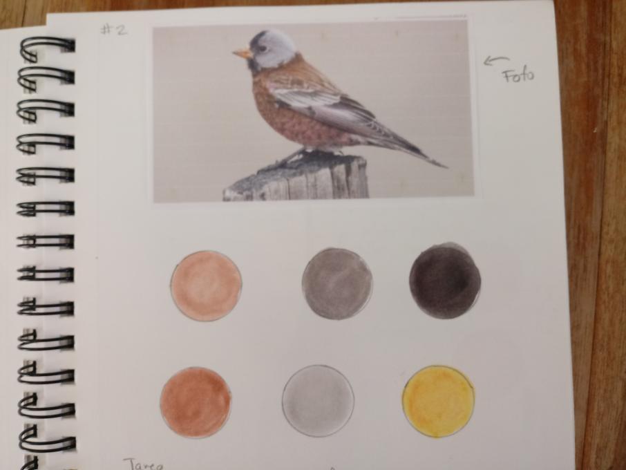
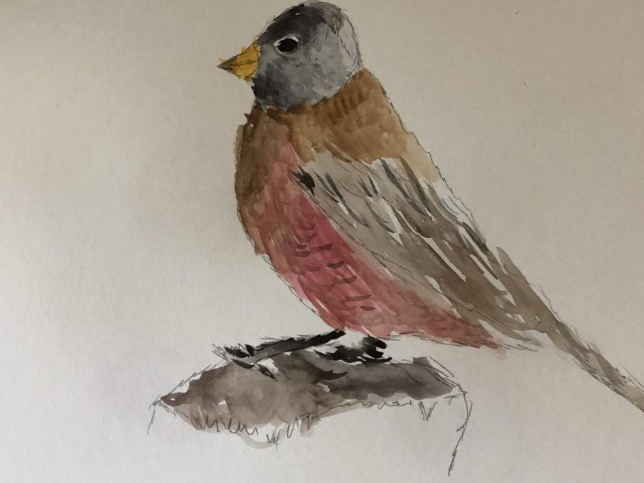
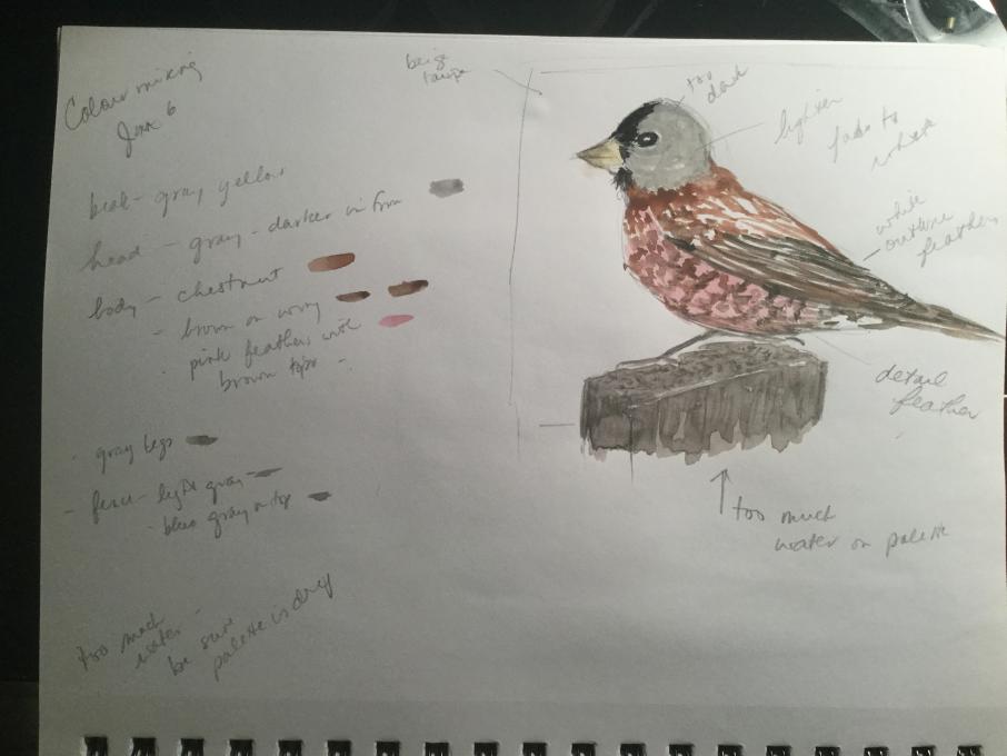
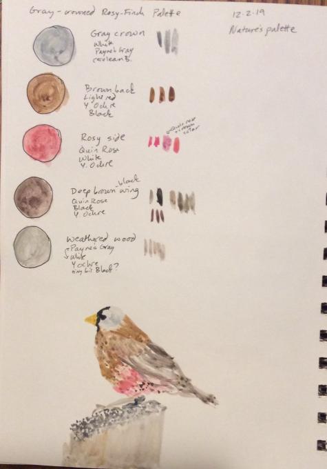
I have been trying to learn how to use watercolors, but it is challenging. I worked on this finch until I realized I had forgotten to leave the crisp white edges of the feathers unpainted. Colors are not as true as I wish, the red brown was especially hard to try to match. Still do not understand which colors to mix to create my desired color. The red-brown for example was too gray, add red? or yellow? I will keep at it!
-
I'm enjoying this but am a total novice--have not used water colors at all (as an adult). Even the bare mechanics are a bit of a challenge: for instance, the thread on my brush seems off and I can't screw it on tightly. Nonetheless. color is amazing and I'm enjoying stepping into it.
-
-
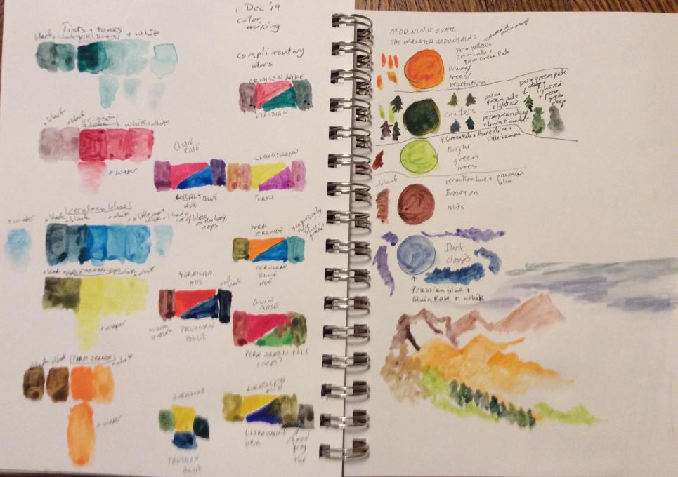
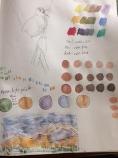
This was my first watercolor since second grade. I thought by restricting my effort to one tree, it would be easy to mix a few shades of green. But there are so many shades of green in this Western Red Cedar and the low angle of the sun this time of year in Seattle added even more variation. I was able to mix a light gold for the side where the sun was hitting the tree, but I never got a dark enough green on the far side; I just kept getting black rather than the dark green I wanted. As far as technique, I had trouble transferring a sufficient amount of color to the plastic palette so I could mix up the amount of color I would need--I need to work on that, too. As far as patterns of color, I should have been more methodical and gone back to the first color lesson. I should have mixed a variety of tints, tones, and shades since this is all so new to me. But, it was really enjoyable and I learned so much.
-
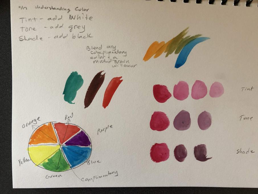
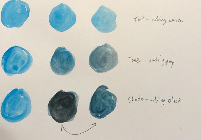
I have used watercolors before, briefly, but never really spent time learning to mix colors. Previously, I would use a "close" color from the colors I had, but not spend the time to mix my own. I was definitely able to achieve the colors I wanted, and found that the exercises on tint, tone, and shade made a huge difference for me in getting the colors "right." Focusing on colors forced me to think about tint, tone, and shade, as well as color gradations. Learning how to mix colors was actually quite exciting for me because I now realize that I can create virtually any color I want with a few basic colors. It will radically reduce the size of my field drawingkit, as well!!
-
I will admit - this lesson was a little overwhelming. I have never tried watercolors or painting. I did mix watercolors and was able to match a few of the colors in the sample finch. that allowed me to see the value of mixing. The mountain scene is beautiful - but there are SO many shades and nuances in shadow and light that I didn't even really know how to start. In the end, I decided to do a bit less mixing and play - so that I might start to learn from this raw start - how to handle a brush, what happens with this or that stroke, how does the color change as it fades and is that fading useful as a possible tool? etc. I have glanced now at the next lesson so I see some technique is coming and I look forward to a making gains.
-
-
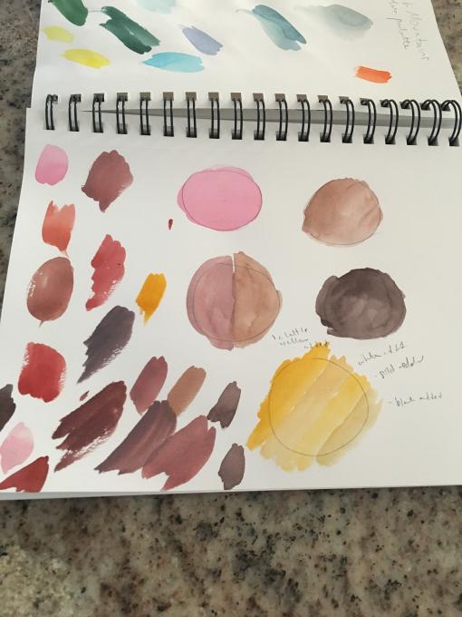
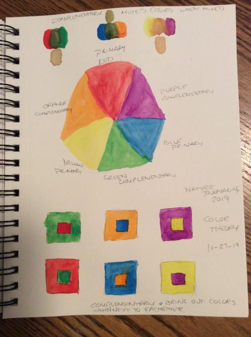
Here are the fruits of my labors. I enjoyed trying different combinations of complimentary colors. They turned out really differently depending on how much of each color I used.
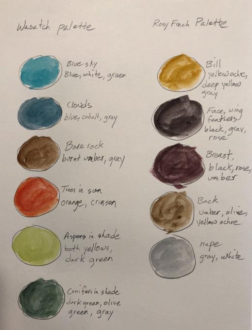
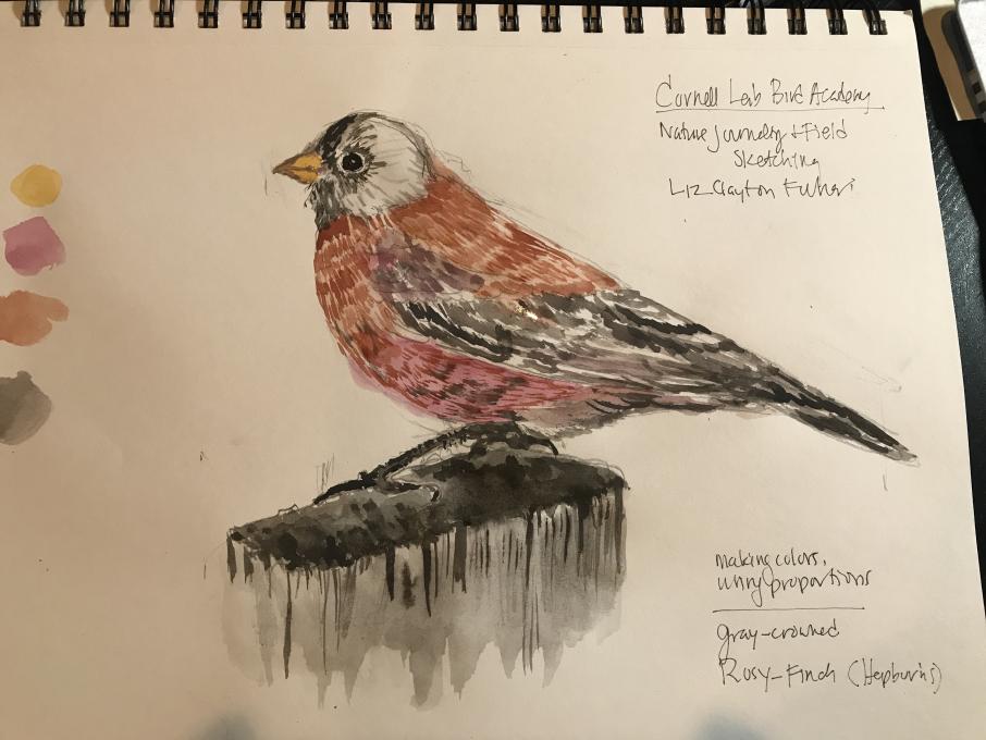
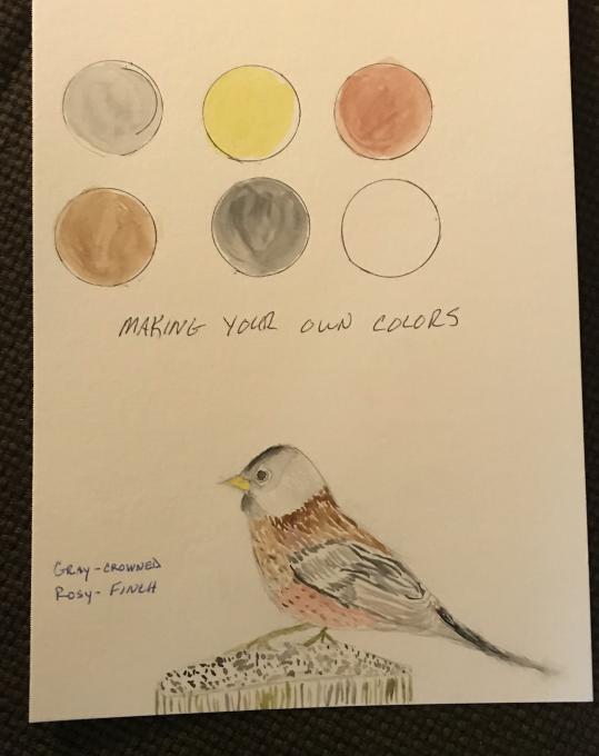
I did a little with watercolors as a youngster, but I didn’t know much about color mixing. And handling the brush and getting the right amount of water is challenging. But the color mixing is getting easier as I get to know the colors. The Rosy-Finch was especially interesting because I used a lot of the same base colors, just in different combinations and quantities. I’m looking forward to trying this with actual objects.
-
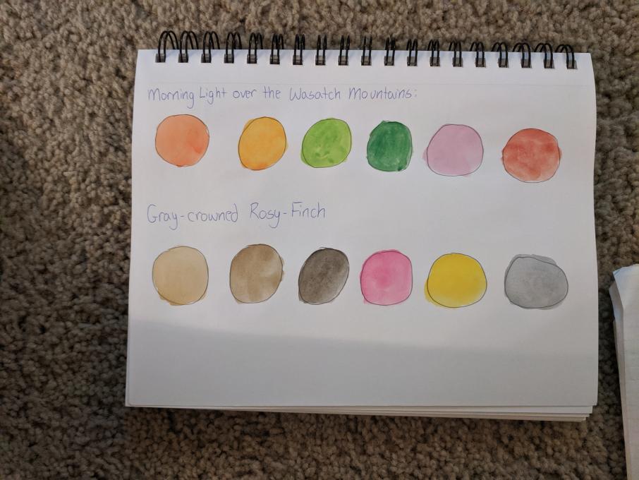
This was my first experience with watercolors. It became easier as I progressed in developing the palette.
-
I really enjoyed this. I had to wipe tray clean and start over a few times, but I found this exercise very useful and gave a lot of thought to it.
-
The watercolors were easier than I thought, plus the brush was very useful when using different colors and blending it into the correct shade. I tried using my color palette at the beach, I think I got similar colors but I felt that I couldn't get the proper tone with certain colors. However, I think this was a good start in understanding how to paint with watercolors and encourages me to practice my shades.
-
I'm so happy we finally got to the color. The palette making is pretty tricky when there are soo many colors to choose from. I want to squint to see what the largest areas of color are, but that doesn't really help.
-
I've played around with watercolors on my own with no real training. I tend to use colors right out of the pan (I have more color options) so this was very helpful to learn properties of mixing, tinting, toning, etc.
I've created small palettes for the two images above and two birds see in the field today. Once I started picking out colors in the landscape I got overwhelmed with how many colors are actually there. I think I'll focus future palettes on picking out the most dominant and what best exemplifies field markings for quick studies, then go more into depth for finish pieces.
-
Getting depth is not easy-I have never done watercolor but I really like it. My Palette was not difficult to do. This is a great class
-
I really like this! Did you get the wood effect by letting certain colors dry before adding others, or just adding them all in at once? Also, were you able to get those dark lines at the top of the wood by using a pen?
-
-
A little rainy day color theory practice. Never really used water color before much, I like these brushes, but waiting for the paint to dry is tough. On to the palettes this week.
-
This was difficult - took me days to complete. I think it was premature to ask for a complicated watercolor at this stage after only a lesson on mixing colors. There is so much more to painting this bird than just mixing colors. I won’t even attempt the landscape at this point.
-
Wow!
-
 So rusty. Thanks to Bird Academy for getting me to get my paints out again.
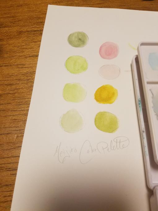
 Wow, I'm really enjoying this but it's a lot harder than I thought it would be. I love the attention to detail and am trying to spend the time to practice the skills we've been taught.
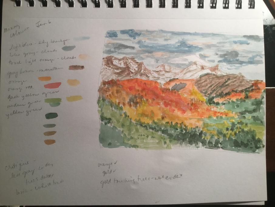
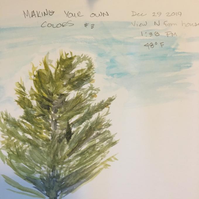 This was my first watercolor since second grade. I thought by restricting my effort to one tree, it would be easy to mix a few shades of green. But there are so many shades of green in this Western Red Cedar and the low angle of the sun this time of year in Seattle added even more variation. I was able to mix a light gold for the side where the sun was hitting the tree, but I never got a dark enough green on the far side; I just kept getting black rather than the dark green I wanted. As far as technique, I had trouble transferring a sufficient amount of color to the plastic palette so I could mix up the amount of color I would need--I need to work on that, too. As far as patterns of color, I should have been more methodical and gone back to the first color lesson. I should have mixed a variety of tints, tones, and shades since this is all so new to me. But, it was really enjoyable and I learned so much.
 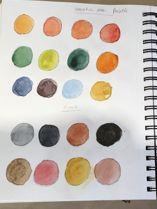 kit, as well!!
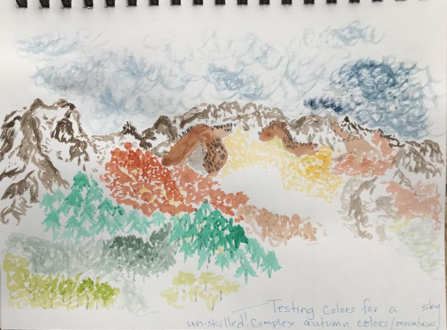
 Here are the fruits of my labors. I enjoyed trying different combinations of complimentary colors. They turned out really differently depending on how much of each color I used.
I did a little with watercolors as a youngster, but I didn’t know much about color mixing. And handling the brush and getting the right amount of water is challenging. But the color mixing is getting easier as I get to know the colors. The Rosy-Finch was especially interesting because I used a lot of the same base colors, just in different combinations and quantities. I’m looking forward to trying this with actual objects.
Here are the fruits of my labors. I enjoyed trying different combinations of complimentary colors. They turned out really differently depending on how much of each color I used.
I did a little with watercolors as a youngster, but I didn’t know much about color mixing. And handling the brush and getting the right amount of water is challenging. But the color mixing is getting easier as I get to know the colors. The Rosy-Finch was especially interesting because I used a lot of the same base colors, just in different combinations and quantities. I’m looking forward to trying this with actual objects. 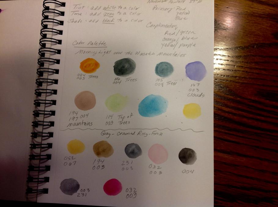 This was my first experience with watercolors. It became easier as I progressed in developing the palette.
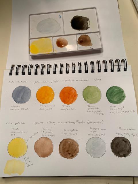
 I'm so happy we finally got to the color. The palette making is pretty tricky when there are soo many colors to choose from. I want to squint to see what the largest areas of color are, but that doesn't really help.
 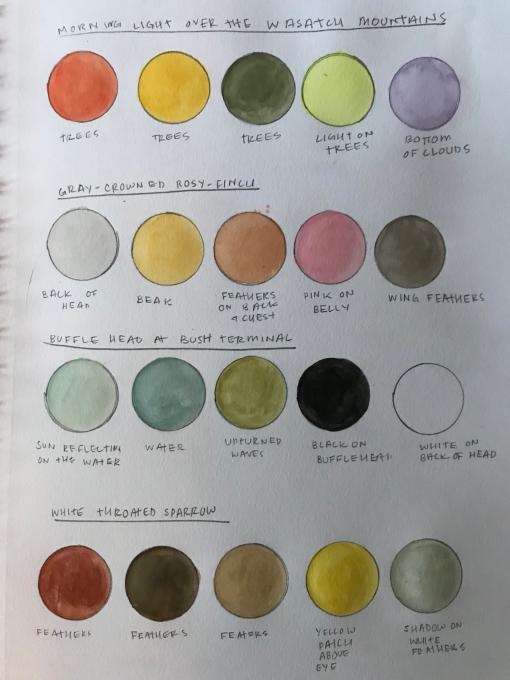 I've played around with watercolors on my own with no real training. I tend to use colors right out of the pan (I have more color options) so this was very helpful to learn properties of mixing, tinting, toning, etc.
I've created small palettes for the two images above and two birds see in the field today. Once I started picking out colors in the landscape I got overwhelmed with how many colors are actually there. I think I'll focus future palettes on picking out the most dominant and what best exemplifies field markings for quick studies, then go more into depth for finish pieces.
I've played around with watercolors on my own with no real training. I tend to use colors right out of the pan (I have more color options) so this was very helpful to learn properties of mixing, tinting, toning, etc.
I've created small palettes for the two images above and two birds see in the field today. Once I started picking out colors in the landscape I got overwhelmed with how many colors are actually there. I think I'll focus future palettes on picking out the most dominant and what best exemplifies field markings for quick studies, then go more into depth for finish pieces. 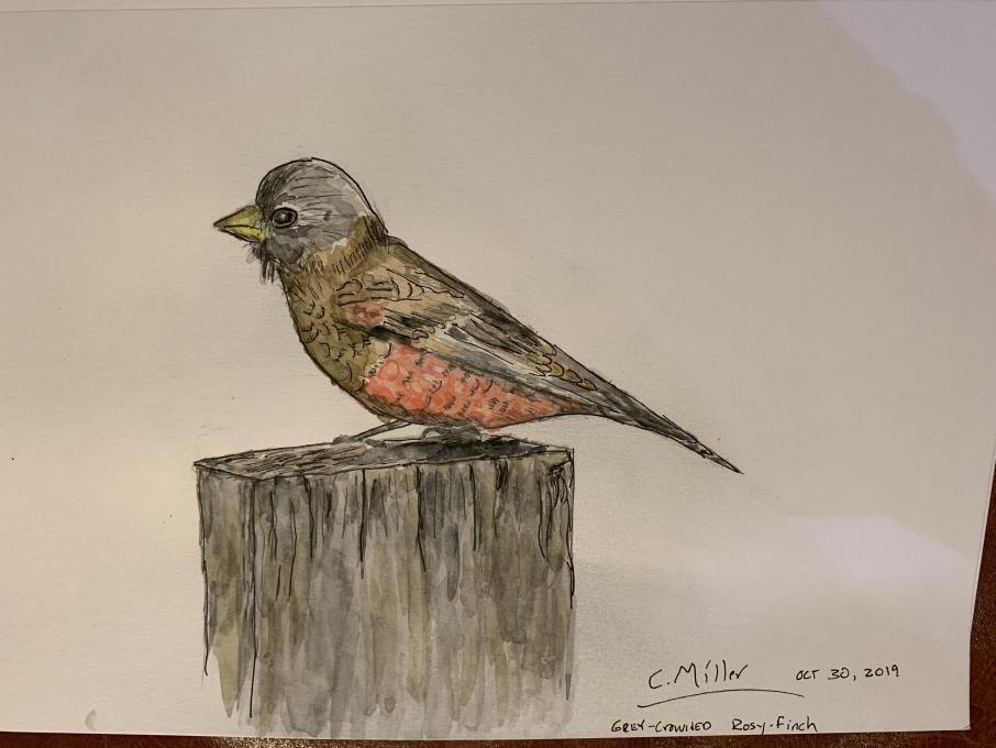
 A little rainy day color theory practice. Never really used water color before much, I like these brushes, but waiting for the paint to dry is tough. On to the palettes this week.
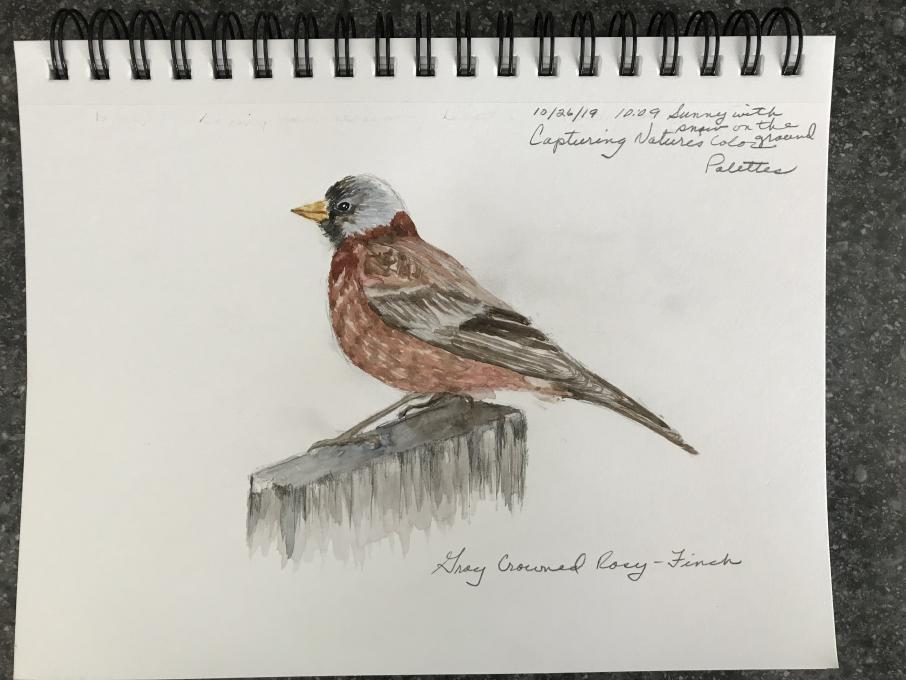
Read More: