The Cornell Lab Bird Academy › Discussion Groups › Nature Journaling and Field Sketching › Capturing Nature’s Color Palettes
-

-
-
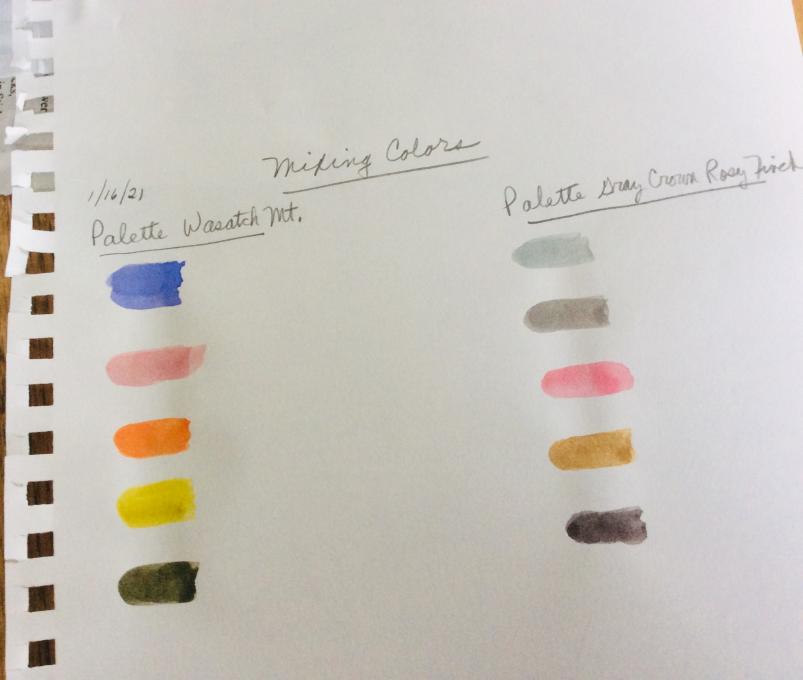
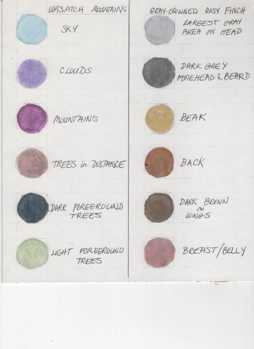
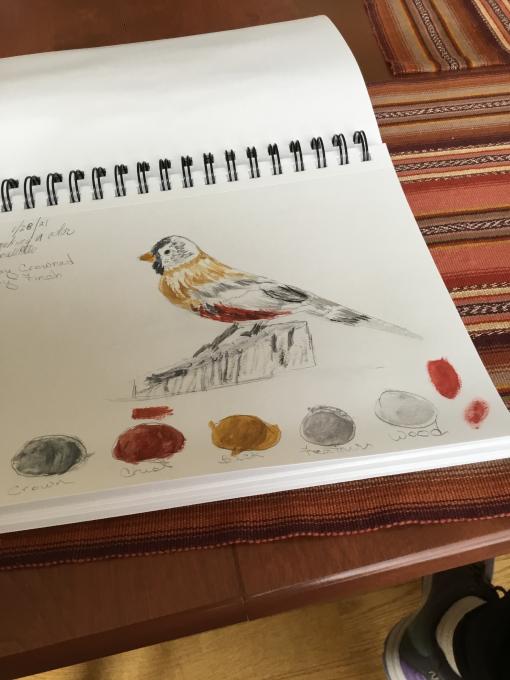
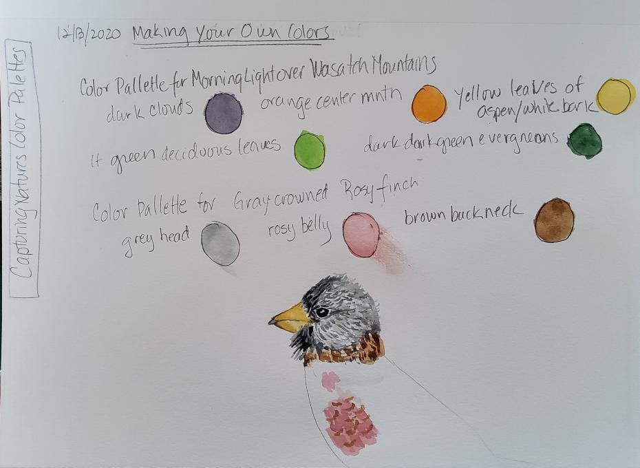
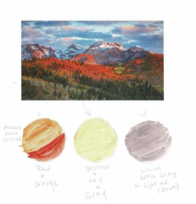
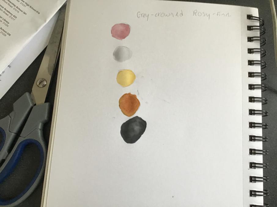
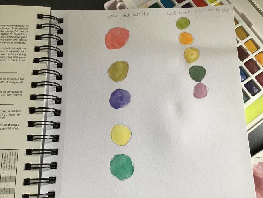
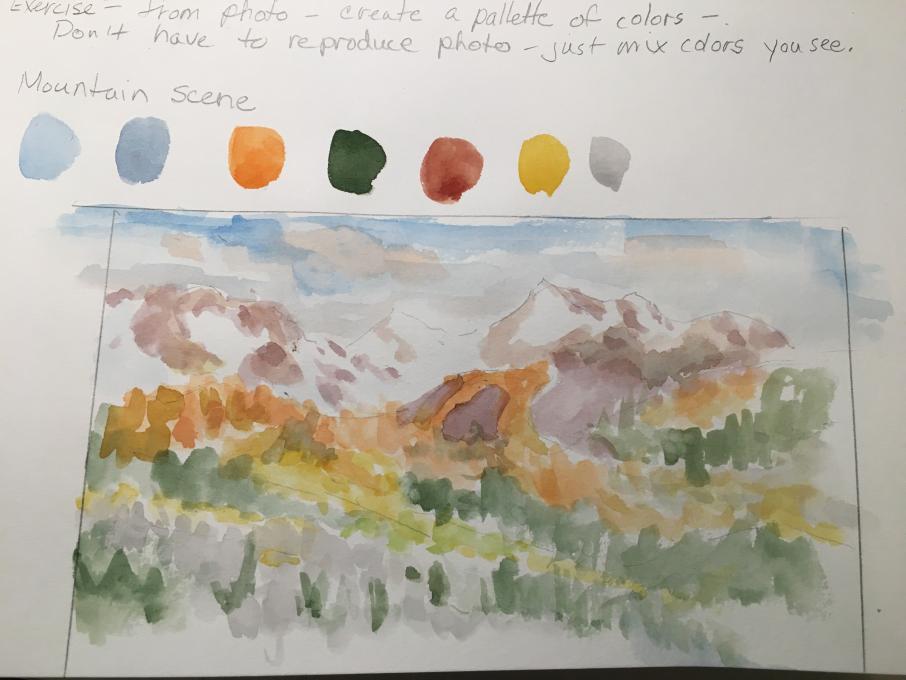
I mixed five colors for each of the paintings Wasatch Mt. and the rosy finch. Each of these colors is mixed, none is straight from the paint set. I would use them in different values, lighter or darker as I rendered the painting . I would also need to mix more colors as needed if I was doing these paintings.
-
-
This is my first experience with water colors and am looking forward to playing with tine, tone, and shades. My biggest challenge is getting the water amount right as I seem to be putting in too much and my paint is very runny. I am impressed and overwhelmed with the pictures posted to this group.
-
-
I haven't used watercolors in 25+ years. Very fun to mix colors!
-
@Karen I enjoyed viewing the above two images of your watercolor experience.
-
-
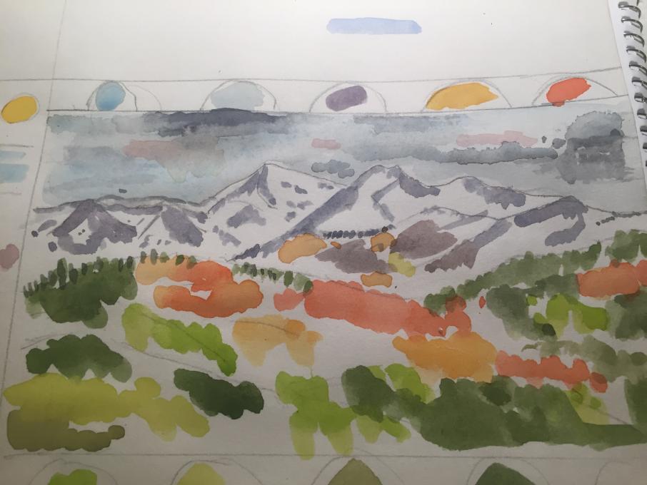
This is not my first watercolor experience at all. I took a watercolor class during my Master's degree in drawing/(oil) painting, BUT that was 40 years ago! So, this is great review. I ran into trouble, though, because the set I ordered did not have black....but found some in a tube to use. I can see some of the colors looked good while mixing but needed some tweaking. For example, the cloud color should be a little more blue and the mountains should be more neutral. The scanning seems to be a problem for colors sometimes because the orange trees look purple-grey on the scan but look orange on my original paper. But it feels great to be doing watercolors again and I look forward to doing a watercolor bird!
-
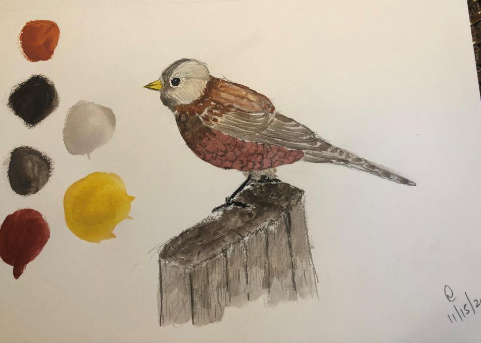
Here is my attempt at a watercolor of a white-throated sparrow based on a photo. Still too cold here to do anything outside. I have played around with watercolors a little in the past. I do find it difficult, but I was relatively happy with the colors here. Doing the legs and feet with watercolors was the most challenging part of this.H
-
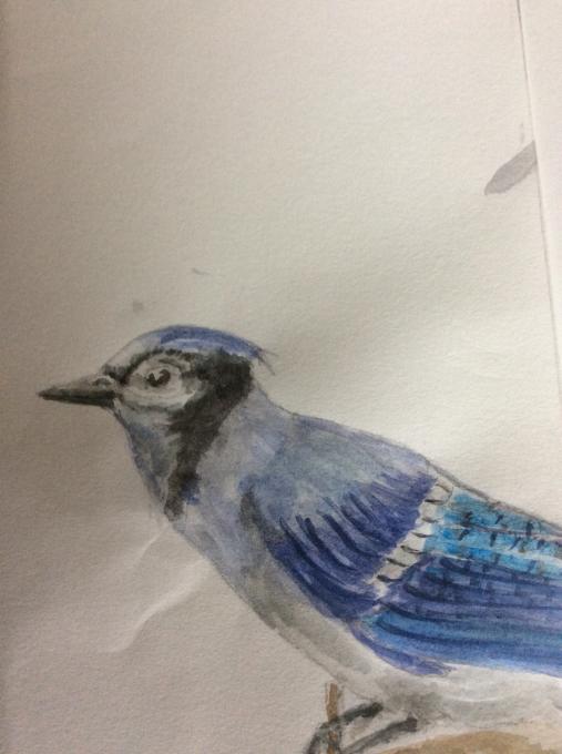
This is My first time with watercolors but have taken a class in oils years ago. My biggest challenge is applying white to the eye of birds -the underneath and the reflective dot in the pupil. Oils allow you to just paint over after it has dried. Maybe I need to relax the finished product.
-
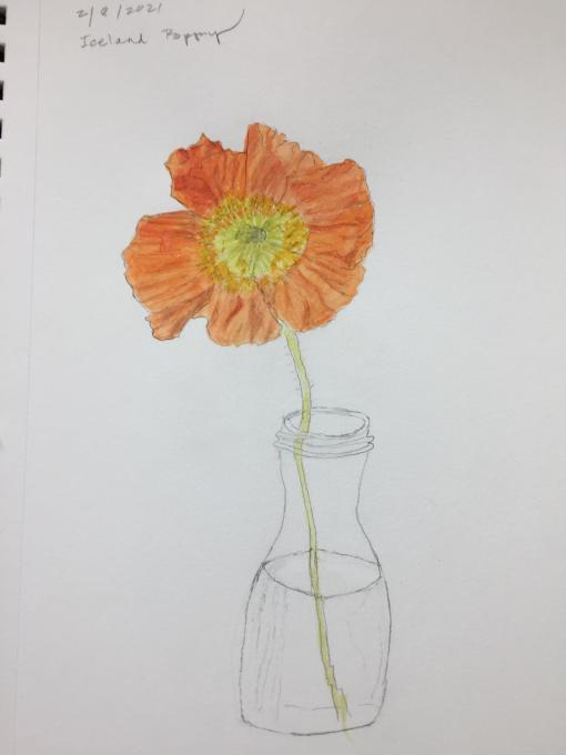
I decided to use watercolors with an Iceland Poppy growing in the garden. I have very little experience with watercolors. It was difficult for me to create depth and detail with watercolors (vs. line drawings). I felt I was able to get some color variation with the petals but the challenge I wasn't up for was using watercolors on the glass vase. Question: how to use watercolors with transparency.
-
I usually work in acrylics and have only played around with water colors - its so much harder! Mixing colors is challenging but I think just requires more practice. I found it hard to keep the water from shrinking back into a droplet rather then spreading into a larger amount, if I add more water it washes out, so it requires a lot more color from the palette than you think. The amount of brush washing is more than you think as well. You touch a color every few seconds, and you need to wash out the old before adding more of another. just a lot more steps than you would think. But overall its been fun to experiment and I think just requires more practice!
-
Previous image could not get the rose color right.
-
-
I’m used to using acrylic paints. I tend to over work watercolor instead of relaxing and let it flow. I will improve with practice. I hope.
-
So far from perfect, but I really enjoyed this after being intimidated by it a bit haha. I've never worked with watercolor before now. I decided to just dive in and do a quick 10-15 minute watercolor only "sketch" of this (no pencils). What I loved most about this is that in that short amount of time it gave me the confidence to feel comfortable trying this in the field. The watercolor can be almost as quick as sketching it seems if I don't overthink it when I want to record what I'm seeing quickly out in the field. I like that it's a way to quickly get colors down on the paper and add notes to id later. I'm looking forward to experimenting more with this.
-
I'm really impressed with everyone's work. So far I hate watercolor. I really don't understand color theory and I can't seem to *see* color the way I can see to draw. I feel like the color mixing lesson went really quickly and I don't have enough information to move forward. I'm really frustrated. Because I'm frustrated, it's also really hard to get myself to try. Just sit down and try. It's a rough combo. Trying to push myself to work through it.
-
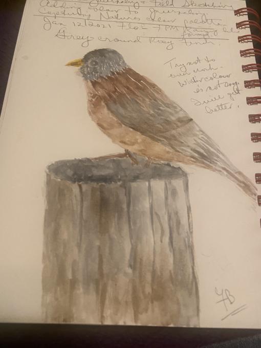
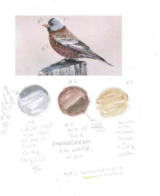
Not my first experience but haven't used them in years. In the scene I couldn't get that bright blue sky, mine was more muddy. The orange and yellow and greens are harder to copy. The greys are easier to mix as I have Payne's grey. It mixes and gave me some colours for the browns on the rosy finch. I didn't have too much trouble with the pink using grey and white and rose madder.
-
Long ago I used watercolors but not much. This class is very helpful! I have a hard time seeing difference between Tone and Shading mixtures.
-
Very cool. I did have to order and ship another KOI watercolors box because my first one too did not have black, gray, or white.
-
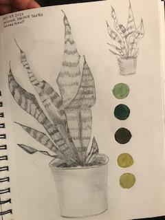
Below are some of my experiments with the colours in the KOI set, I never really understood the colour wheel and mixing before! Its definately challenging to mix colours, and add ones you wouldn't expect. I really concentrate on what I'm seeing and notice, for example, the orange in the trees are actually orange, some are red, depending on the light and shadows etc.
-
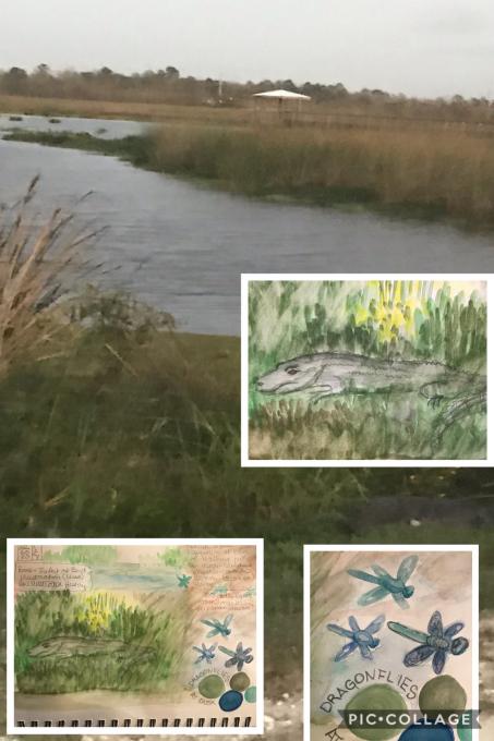
Hidden Grey-green gator 🐊 in the rushes at edge of marsh. He’s between the two images on lower right — barely even visible. I had to use colors to make him at least slightly visible in my journal — best I could do with colors and still make the point.
-
First watercolor ever!! Pretty Exciting.....did procrastinate for a couple of weeks before tackling but was actually quite fun!
-
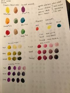
I have been painting with watercolour for a couple of years. Your instruction videos on sketching and mixing colour have been very helpful! I did not know the theory of Tint Tone & Shade. This is going to be a great help as I continue my journey in watercolour. Thank you for offering this affordable course.
-
I am quite new to water color, though I have worked with water color pencils before.This was very difficult for me because I do not have a black or gray in my pallet. I am also wondering if it is ok to go back with the fine point marker to add some tree detail.
-
1. I’ve used watercolors before, my mom is obsessed with the result. 2. My palette actually turned out okay, but sometimes the colors were way too light. 3. My paint set has 48 colors, more than suggested, so the colors I mixed were closer than the ones shown in the video.
-
I tried watercolor some time ago and was not very successful. I have trouble getting the correct amount of water on the brush. Something I need to work on. It was raining so did this from our lesson on the computer. Colors were a little hard to distinguish but the suggestion of color was ok. I would have liked to blend the colors more but wasn't really able to . Anyway, will try some more and hopefully more successful.
-
I've tried watercolors before(limited). I think that is is hard to do but a skill that can be learned with practice. For the most part I was able to get the colors I saw, but the images on the laptop vs. desktop computers were slightly different in color. I find its hard to paint details with the water brush. I'd either get too much or not enough water. Getting the detail on the wings of the bird I found particularly challenging.
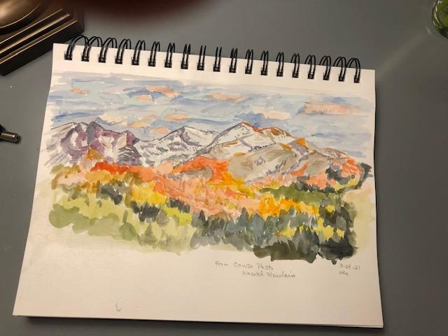
 This is not my first watercolor experience at all. I took a watercolor class during my Master's degree in drawing/(oil) painting, BUT that was 40 years ago! So, this is great review. I ran into trouble, though, because the set I ordered did not have black....but found some in a tube to use. I can see some of the colors looked good while mixing but needed some tweaking. For example, the cloud color should be a little more blue and the mountains should be more neutral. The scanning seems to be a problem for colors sometimes because the orange trees look purple-grey on the scan but look orange on my original paper. But it feels great to be doing watercolors again and I look forward to doing a watercolor bird!
 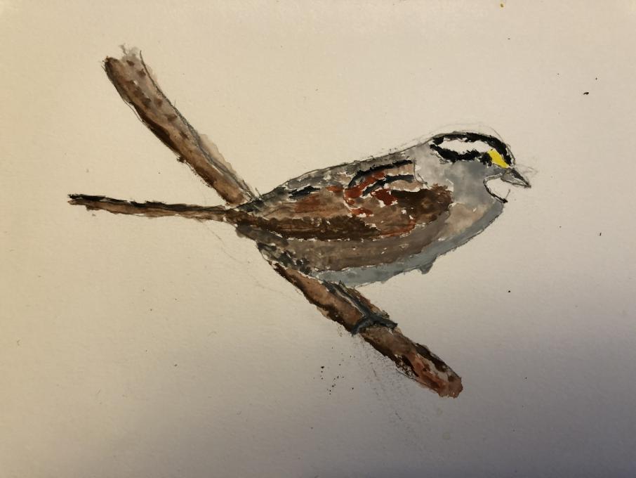 H
H 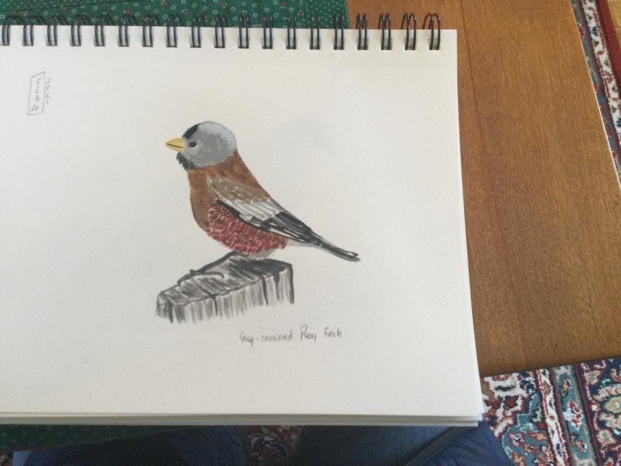
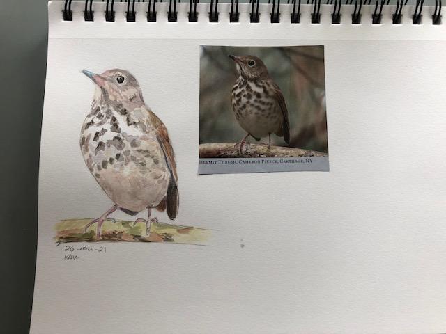
 So far from perfect, but I really enjoyed this after being intimidated by it a bit haha. I've never worked with watercolor before now. I decided to just dive in and do a quick 10-15 minute watercolor only "sketch" of this (no pencils). What I loved most about this is that in that short amount of time it gave me the confidence to feel comfortable trying this in the field. The watercolor can be almost as quick as sketching it seems if I don't overthink it when I want to record what I'm seeing quickly out in the field. I like that it's a way to quickly get colors down on the paper and add notes to id later. I'm looking forward to experimenting more with this.

 but was actually quite fun!
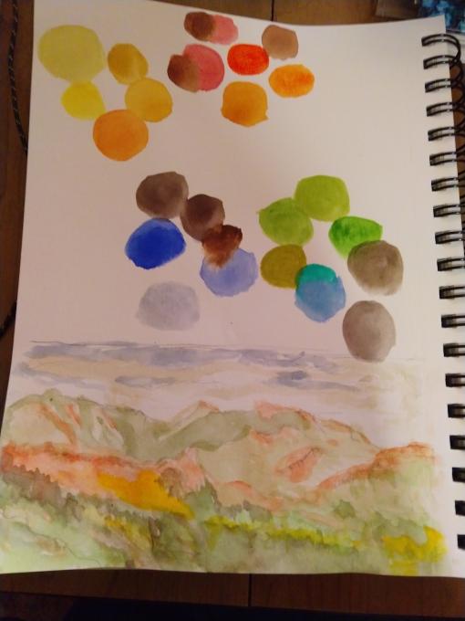
 were closer than the ones shown in the video.
 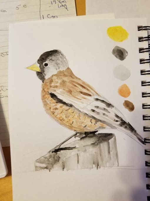 I tried watercolor some time ago and was not very successful. I have trouble getting the correct amount of water on the brush. Something I need to work on. It was raining so did this from our lesson on the computer. Colors were a little hard to distinguish but the suggestion of color was ok. I would have liked to blend the colors more but wasn't really able to . Anyway, will try some more and hopefully more successful.
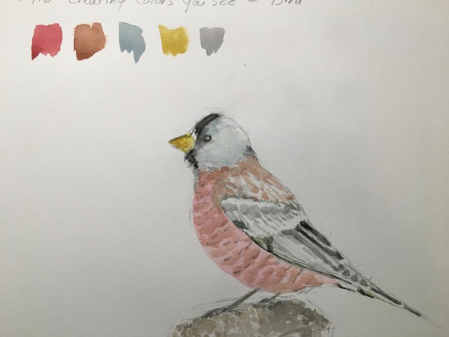
Read More: