diana
Forum Replies Created
-
dianaParticipant
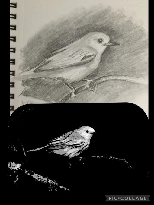
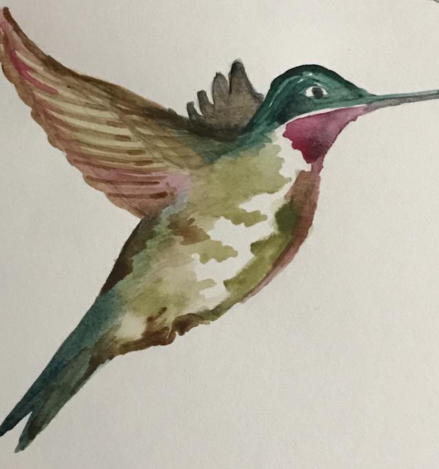
 Sketched proportions of bird aren’t exactly right & still need fine tuning.
The 3D quality needs work through shading. Too flat looking.
Overall, the bird does feel cohesive though — like it could actually fly. But the bird needs much tweaking and refinement for accuracy.
Ready for next learning steps…
in reply to: Jump Right in! #866693
Sketched proportions of bird aren’t exactly right & still need fine tuning.
The 3D quality needs work through shading. Too flat looking.
Overall, the bird does feel cohesive though — like it could actually fly. But the bird needs much tweaking and refinement for accuracy.
Ready for next learning steps…
in reply to: Jump Right in! #866693 -
dianaParticipant
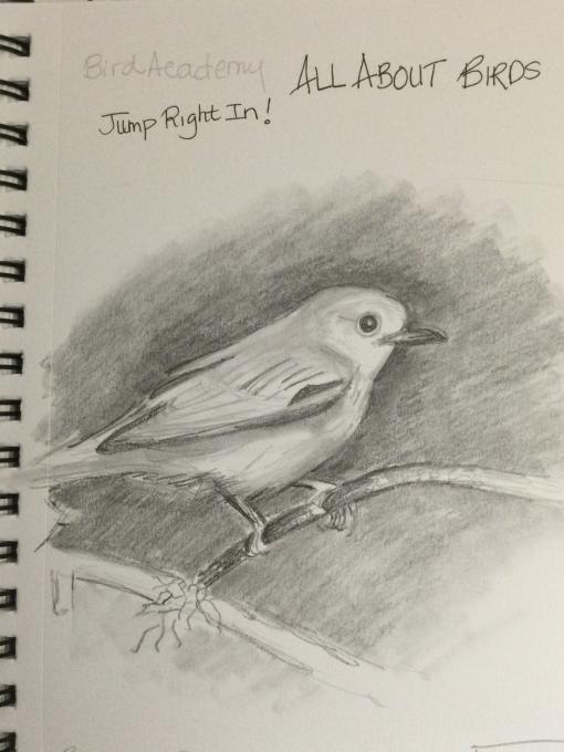
Liz didn’t say to paint, only to draw — so that’s exactly what I did. I worked quickly and tried to capture some dimension in B&W.
1. I loved drawing from the photo … it helped see details & proportions more easily.
The feathers individually were challenging - so I just blocked them in - and the basic shape was fairly easy.
2. The little circle around the eye is never seen unless I draw a bird. The nuanced feathers and markings would not be noticed in detail except for drawing. The beak is very different when drawing from photos than seeing on the wing. All those details would slow me down and possibly cause me to ask WHY/purpose (form follows function) questions in my journal. in reply to: Jump Right in! #866692
-
dianaParticipant
REBOOT: I’m restarting through this program in the new year to refresh my skills.
- I was inspired to nature journal by migrating wild birds in Texas & other floral/fauna on Gulf Coast - by contrast I’m “rebooting” in the winter Midwest / Jan.Feb.
- I like how in video Shayna takes a STUDY approach & learns factually through journaling. This parallels my approach. I focus less on the art now and “pretty pages” and more on paths to learning.
- ALSO I like how she says her style continues to evolve and be less rigid over time, as that’s also true for me & so she’s validating.
- on my page in the photo (wind chill below zero), I wasn’t going outside, so I had to work harder to journal & from inside my window, studied skies and researched tips to help me briefly re-enter nature when it’s harsh
- ALL of the journal videos/styles & journalists are helpful for different reasons & especially helpful as I reboot during winter & continue to evolve as a nature journalist
in reply to: Style Your Journal Your Way #866688
-
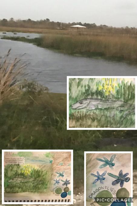
dianaParticipantHidden Grey-green gator 🐊 in the rushes at edge of marsh. He’s between the two images on lower right — barely even visible. I had to use colors to make him at least slightly visible in my journal — best I could do with colors and still make the point. in reply to: Capturing Nature’s Color Palettes #748095
-
dianaParticipantLike how you played with the color and line I’m smaller imagesin reply to: Getting Comfortable with Watercolor #740511
-
dianaParticipant
still at work trying to duplicate colors and create natural palettes in reply to: Capturing Nature’s Color Palettes #740295
-
dianaParticipant
I’m coming back to this lesson and this work with entry(ies), but this is my attempt at building up 3D form through color and shading while using reference images. This snow bird (Arctic White Ptarmigan) seemed like an obvious choice to try to make standout through subtle shading and minimum coloring. in reply to: Filling Your Sketches with Color #738806
-
dianaParticipantReally love these colorsin reply to: Capturing Nature’s Color Palettes #738749
-
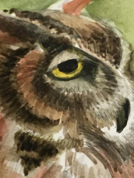
dianaParticipantGoing from sketching to watercolors helped create depth when I added paints. I’ve used watercolors (limited) before. I keep trying adding paint every day... Watercolor is not easy. I tried to create a palette that most resembles ruby throated hummingbirds and while not an exact match, I was satisfied with my results. I got a descent set of colors; i was happy with how the Olive mixed on paper as olive is subtle & difficult for me. The throat color was a challenge, but in such a prominent place, I decided not to overwork the colors. As I looked closely at the colors, it’s surprising how many undertones and nuances I usually miss. I cleaned up the sketch, painting and I was pleased at my first layered/pained bird. It’s much different than using watercolor straight from tube or 1/2 pan. in reply to: Capturing Nature’s Color Palettes #738746
-
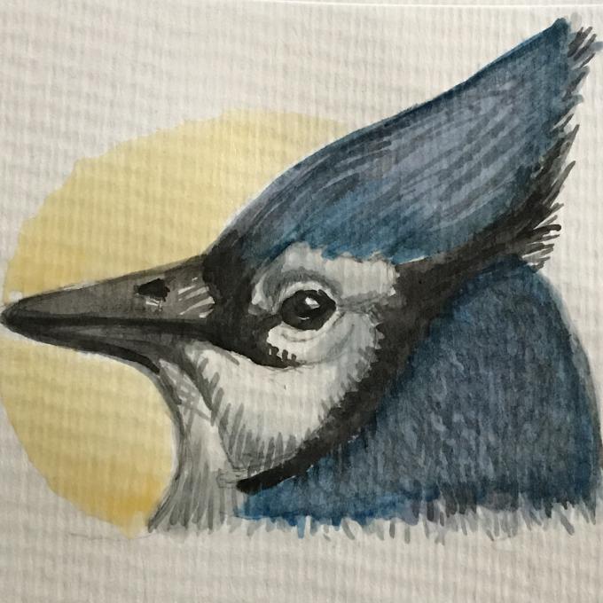
dianaParticipantUsed wet on dry on the Jayand then wet on wet with the golden light behind.
Also I layered many various colors in the feathers, especially back of neck area. in reply to: Getting Comfortable with Watercolor #738743
-
dianaParticipantI like how you’ve used multiple colors in the rushes which could look static otherwise. Sky is lovely and has a nice 3D feel. Also like the tidy, coordinated feel of your color page.in reply to: Capturing Nature’s Color Palettes #736523
-
dianaParticipantOops.surprise!in reply to: Capturing Nature’s Color Palettes #736522
-
dianaParticipantOh I love these combinationsin reply to: Capturing Nature’s Color Palettes #736521
-
dianaParticipantVery nuanced. Wow.in reply to: Capturing Nature’s Color Palettes #736520
-
dianaParticipantI find these pallets vibrant and excitingin reply to: Capturing Nature’s Color Palettes #736519
-
dianaParticipantI’d say this is your specialty!in reply to: Capturing Nature’s Color Palettes #736518
-
dianaParticipantNice control of neutralsin reply to: Capturing Nature’s Color Palettes #736517
-
dianaParticipantI find the color combos very appealingin reply to: Capturing Nature’s Color Palettes #736516
-
dianaParticipantPretty tonesin reply to: Capturing Nature’s Color Palettes #736515
-
dianaParticipantI like the lightness of your colorsin reply to: Capturing Nature’s Color Palettes #736514
 Sketched proportions of bird aren’t exactly right & still need fine tuning.
The 3D quality needs work through shading. Too flat looking.
Overall, the bird does feel cohesive though — like it could actually fly. But the bird needs much tweaking and refinement for accuracy.
Ready for next learning steps…
Sketched proportions of bird aren’t exactly right & still need fine tuning.
The 3D quality needs work through shading. Too flat looking.
Overall, the bird does feel cohesive though — like it could actually fly. But the bird needs much tweaking and refinement for accuracy.
Ready for next learning steps…
 Liz didn’t say to paint, only to draw — so that’s exactly what I did. I worked quickly and tried to capture some dimension in B&W.
1. I loved drawing from the photo … it helped see details & proportions more easily.
The feathers individually were challenging - so I just blocked them in - and the basic shape was fairly easy.
2. The little circle around the eye is never seen unless I draw a bird. The nuanced feathers and markings would not be noticed in detail except for drawing. The beak is very different when drawing from photos than seeing on the wing. All those details would slow me down and possibly cause me to ask WHY/purpose (form follows function) questions in my journal.
Liz didn’t say to paint, only to draw — so that’s exactly what I did. I worked quickly and tried to capture some dimension in B&W.
1. I loved drawing from the photo … it helped see details & proportions more easily.
The feathers individually were challenging - so I just blocked them in - and the basic shape was fairly easy.
2. The little circle around the eye is never seen unless I draw a bird. The nuanced feathers and markings would not be noticed in detail except for drawing. The beak is very different when drawing from photos than seeing on the wing. All those details would slow me down and possibly cause me to ask WHY/purpose (form follows function) questions in my journal. 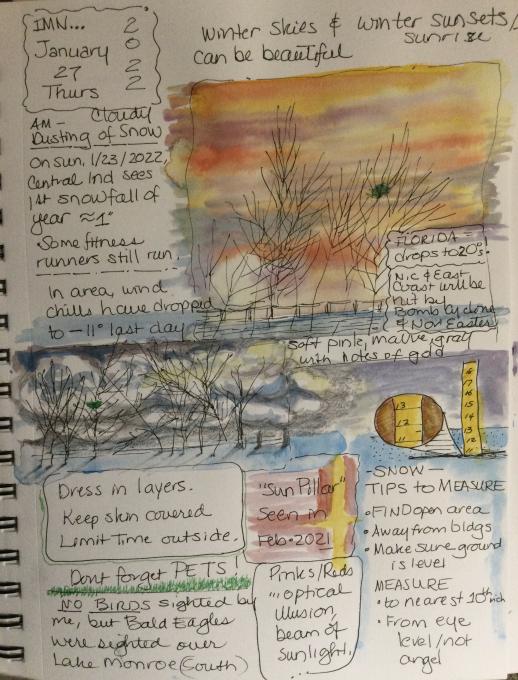 REBOOT: I’m restarting through this program in the new year to refresh my skills.
- I was inspired to nature journal by migrating wild birds in Texas & other floral/fauna on Gulf Coast - by contrast I’m “rebooting” in the winter Midwest / Jan.Feb.
- I like how in video Shayna takes a STUDY approach & learns factually through journaling. This parallels my approach. I focus less on the art now and “pretty pages” and more on paths to learning.
- ALSO I like how she says her style continues to evolve and be less rigid over time, as that’s also true for me & so she’s validating.
- on my page in the photo (wind chill below zero), I wasn’t going outside, so I had to work harder to journal & from inside my window, studied skies and researched tips to help me briefly re-enter nature when it’s harsh
- ALL of the journal videos/styles & journalists are helpful for different reasons & especially helpful as I reboot during winter & continue to evolve as a nature journalist
REBOOT: I’m restarting through this program in the new year to refresh my skills.
- I was inspired to nature journal by migrating wild birds in Texas & other floral/fauna on Gulf Coast - by contrast I’m “rebooting” in the winter Midwest / Jan.Feb.
- I like how in video Shayna takes a STUDY approach & learns factually through journaling. This parallels my approach. I focus less on the art now and “pretty pages” and more on paths to learning.
- ALSO I like how she says her style continues to evolve and be less rigid over time, as that’s also true for me & so she’s validating.
- on my page in the photo (wind chill below zero), I wasn’t going outside, so I had to work harder to journal & from inside my window, studied skies and researched tips to help me briefly re-enter nature when it’s harsh
- ALL of the journal videos/styles & journalists are helpful for different reasons & especially helpful as I reboot during winter & continue to evolve as a nature journalist
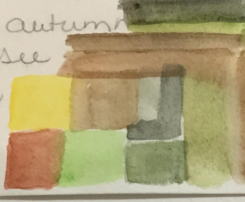
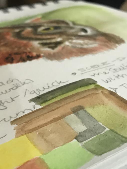
 still at work trying to duplicate colors and create natural palettes
 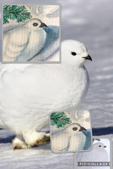 I’m coming back to this lesson and this work with entry(ies), but this is my attempt at building up 3D form through color and shading while using reference images. This snow bird (Arctic White Ptarmigan) seemed like an obvious choice to try to make standout through subtle shading and minimum coloring.
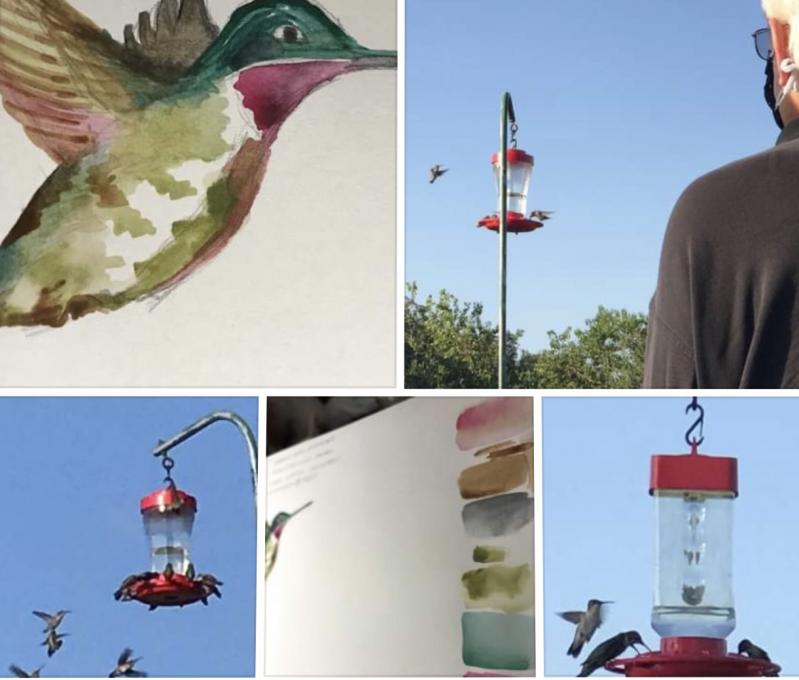
 and then wet on wet with the golden light behind.
Also I layered many various colors in the feathers, especially back of neck area.
and then wet on wet with the golden light behind.
Also I layered many various colors in the feathers, especially back of neck area.